


Check me out my blog feedmedata and follow me on @FeedMeData_
SPOILER ALERT: I like Power BI. Of course it has pros and cons, but overall, not too shabby.
Woah, we’re half way there! Woahhhhh!
It’s day 3 of Dashboard week which means we’re at the halfway point! See my viz from yesterday here.
Last night, Andy commented on Twitter that today’s project will be an ‘adventure’ (Figure 1). Immediate alarm bells!

Fig 1. Day 3 will be an adventure? Hmmmm that can’t be good.
And what an adventure it was.
The Challenge
Andy: Create a visualisation of foreign donations made to US universities
Me: Okay….
Andy: In Power BI. *massive grin*
The dataset we got today was pretty much clean and not particularly interesting (Figure 2). All there was to do was learn a new software and make something presentable in 6 hours. Easy-peasy. Come on, Andy! Challenge us! (note: this is sarcasm.. we are sufficiently challenged)
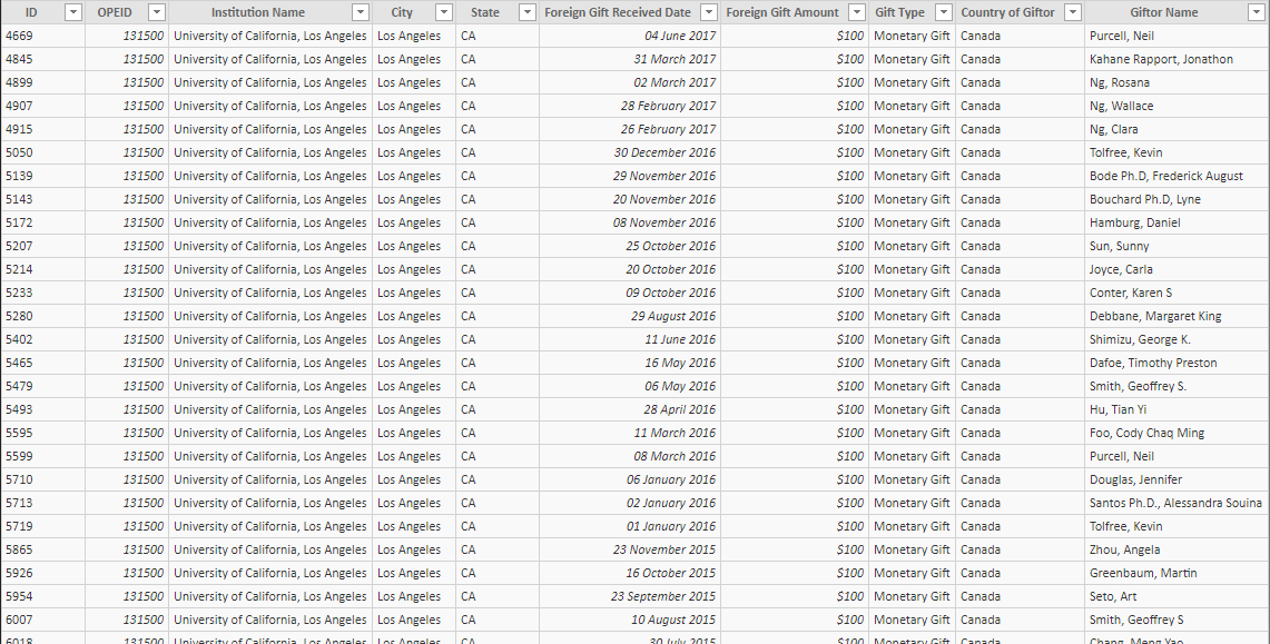
Fig 2. Today’s data… funsies
My Approach
Plan, plan, plan. Since I had to learn a whole new software and visualise the data in a short time, I should not waste any time deciding what charts I want. So, busting out the pen and paper, I mocked up a quick plan for my dashboard (keeping it super simple). See Figure 3 for my plan. Having a look at the Power BI gallery (equivalent to Tableau Public Gallery) helped me get a better idea of what’s capable in Power BI and gave me inspiration.

Fig 3. My legible dashboard plan
After creating my plan, I watched a couple ‘Getting Started’ videos to familarise myself with the layout. If I went straight into Power BI and figured it out on my own, I would be overwhelmed.
From the videos, I learned how to input data and how to make a map. I am now an official beginner. Let’s dig in!
How Did It Work Out?
There was the initial disorientated/ overwhelmed feeling you get when you do something completely new and unfamiliar. Learning to navigate the interface was tricky. It took me ages to find the window that lets you prepare your data but after an hour or so, I was more comfortable.
My Favourite Bits
- You can title case your data! See Figure 4. This is a feature that’s not available in Tableau but really should be.
Fig 4. Title casing an all uppercase field
- It’s easy to arrange your dashboard. There’s no need to make containers or make sure everything is pixel perfect. In fact, there are no sheets at all! You create multiple charts directly in the dashboard. It’s great being able to think about your final dashboard layout throughout the building process. This helps prevent me making unnecessary charts and gives me a better idea of how much space I’ve got.
- There are some handy native charts. For example, doughnuts, big ass numbers and KPI charts (see figure 5). Note: there’s a time series line chart in the background! And it colours the number depending on the goal/target values you set for comparison. Although Tableau doesn’t have these in their ‘Show Me’ chart types, it’s pretty quick to whip up a doughnut chart, and you don’t need to download extra chart types to do it in Tableau.
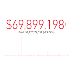
Fig 5. A native KPI chart (there’s a line chart behind the number)
- Also, you can download all sorts of chart types as templates. For example, violin plots, sankeys and more! Stuff that might have taken a multitude of calcs to pull off, someone else has done it for you!
- Labelling is so good. Just look at it!
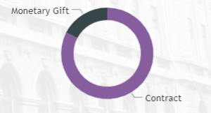
Fig 6. Labels are so perfect! There’s no overlap
- Dashboard actions are automatic! I was surprised to click on one of the bars in my bar chart and saw my line chart and map filter automatically. Really useful. You’d have to turn them off individually if you don’t want any filtering action.
My Least Favourite Bits
- The native maps are ugly. Now this is subjective of course. I don’t think the map styles installed in Power BI are aesthetically pleasing; though I believe you can download map styles online.
- You can’t edit map layers. I am stuck with unnecessary labels on my map because there isn’t an option to remove layers, like there is in Tableau.
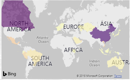
Fig 7. In case you didn’t know which continents are which
- Formatting is a pain in the ass. Tableau isn’t nearly perfect when it comes to formatting but I found Power BI formatting more annoying. This could partially be because I was unfamiliar with where the formatting options were.
- It’s slow. This may be because of my computer, but I felt Power BI was slower than Tableau to compute my views. Only slightly but noticeably.
- It’s not very flexible. There are lots of little things which I wished I could do but was not possible in Power BI (mostly to do with formatting). For example, it was quite difficult to do a percent of total calculation that recalculated depending on the user’s dimension selection. This would have been more straightforward in Tableau.
Overall Impression?
I don’t think, after 6 hours of exploring, I know enough about Power BI to make informed decisions on whether its better than Tableau. When I opened Tableau for the first time, it took me some time to find where everything is. The same applies here (though I do think Tableau is more intuitive for beginners).
I will revisit this topic in the next few weeks after I’ve explored Power BI more. Watch this space!
What’s My “Finished” Product?
Here you go! What do you think of my first attempt at Power BI? Explore this viz here!

As you can see, the Gifter Names in the bar chart on the left are squished and I couldn’t figure out how to adjust it. Also, I don’t know how to add a % symbol on my “% of Total Gift Amount” chart on the left as it is a calculated measure. If anyone knows, please let me know!
That’s all, folks!
Louise