


Check me out my blog feedmedata and follow me on @FeedMeData_
It’s day 4 of dashboard week and I am starting to fatigue. No matter! We push on.
The Challenge
Today’s dataset counts the number of cyclists riding through the roads of Seattle. Potentially very interesting for a Seattleite (/satellites) or a keen cyclist. For me, a person who learned to ride a bike at 12 and has hardly touched one since, it didn’t excite me. The data is as shown in Figure 1 below.
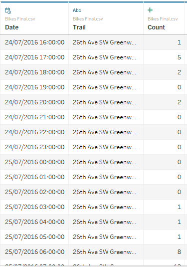
Fig 1. 1 cyclist, 5 cyclists, 2, 0, 2, 0, 0, 0, 0….
My Approach
Looking at this dataset didn’t immediately give me ideas (well.. besides a map. But I’ve overdone that). So I decided to make a colourful infographic-type viz to make the cycling data pop. I did a quick google search on cycling infographics for inspiration and came across this one:

Fig 2. My inspiration for today’s viz
I thought I’d take the calendar idea from this viz about housing and replace the icons with charts based on the cycling data. Here’s my plan:

Fig 3. Verrrrrry rough I know
To figure out what I wanted for each of the charts, I explored the data with the focus of finding something on the monthly level.
How Did It Work Out?
I’d say 60% of today was spent formatting, 30% creating charts and 10% distracting myself. I am quite happy with the my dashboard though!
What’s My “Finished” Product?
Presenting…..

In this viz (link here), I use a variety of charts (including some bonus viz-in-tooltips for you to find! One thing I’m not too happy about is how the viz is “heavy” on the right side of the viz. There just wasn’t anything interesting that I could find for the months on the left side of the calendar *cries*.
Final day tomorrow! Something about Backstreet Boys me thinks…
That’s all, folks!
Louise