


Ah… The much-awaited Part Two of my ‘Making Every “Show Me” Chart From Scratch” series (see part one here). Thank you for following my series so far! To recap, we have so far gone through text tables, heat maps, highlight tables, symbol maps, filled maps and pie charts.
In this post, I will go through how to create a bar chart, stacked bar chart, side-by-side bar chart, treemap, circle view and side-by-side circles. For this series, I will be using the “EU Superstore” dataset found in My Tableau Repository.
Let’s get started!
Horizontal Bar Chart
Tableau’s Show Me bar chart is known as “Horizontal Bars”, though really, bar charts can be both vertical and horizontal. I will show you both. For this bar chart, I want to look at the profit for each sub-category.
Step One
Drag the measure “Profit” to the Columns Shelf and the dimension “Category” to the Rows Shelf. As we want to look at sub-category, we can either drag the dimension “Sub-Category” to the Rows Shelf next to “Category” or the quicker way: click the little plus sign shown in Figure 1. This expands category to its next level of detail, sub-category. This only works because sub-category is below category in its hierarchy. If these dimensions aren’t in a hierarchy together, the regular drag-and-drop works too.
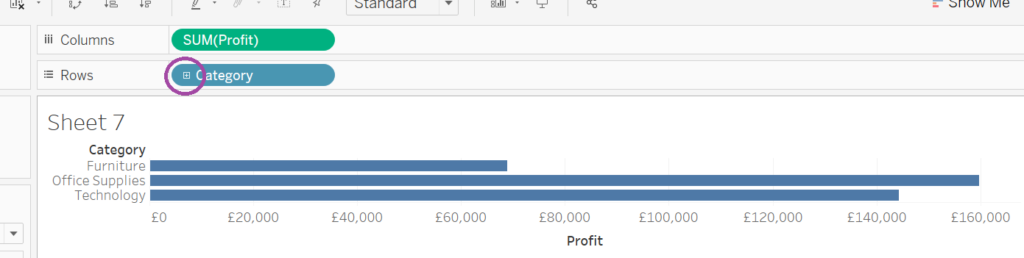
Figure 1. Building a horizontal bar chart
Step Two
You now have a horizontal bar chart! In this case, a horizontal bar charts works better than a vertical one would. However, should you want a vertical bar chart, you can click the swap button in the ribbon as shown in Figure 2. Alternatively, you can drag the dimension and measures pills into the opposite Row/Column Shelf.
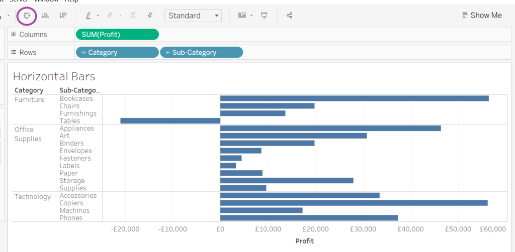
Figure 2. Completed horizontal bar chart
Stacked bars
A stacked bar chart does exactly what it says on the tin; it stacks bars on top of each other. For this stacked bar chart, I want to, as previously, look at the profit for each sub-category.
Step One
As with the horizontal bar chart, drag the measure “Profit” onto the Columns Shelf and Category onto the Rows Shelf. Instead of putting sub-category onto rows like for horizontal bars, drag the dimension “Sub-Category” onto the Colour Shelf in the Marks Card. Stacked bar chart: done! As seen in Figure 3, the bars for each sub-category are not next to each other as in the horizontal bars example but are instead stacked on top of each other. The profit of each sub-category are summed to give the total profit for each category.
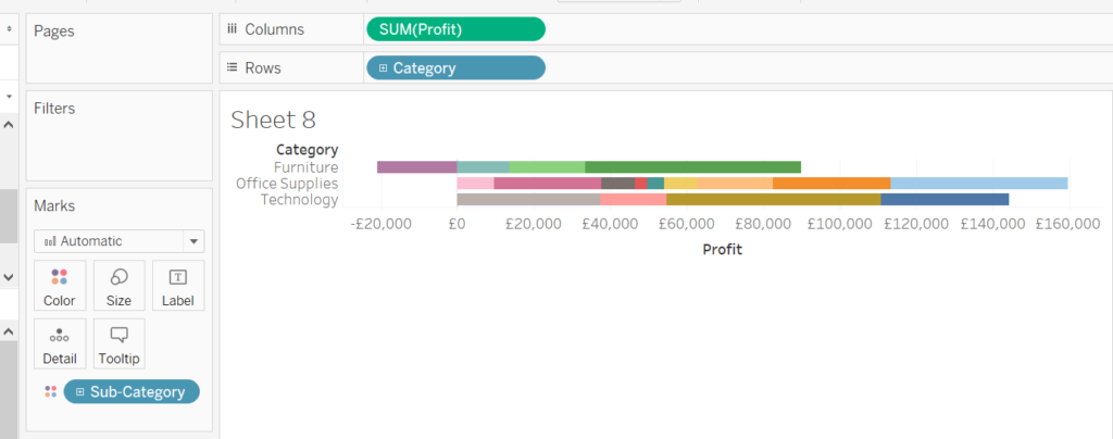
Figure 3. Stacked bar chart
Side-by-side bars
Side-by-side bars are regular bar charts with separate bars for two or more measures next to each other. For this chart, I want to compare profit and sales for each category on the same chart.
Step One
Drag the dimension “Category” onto the Columns Shelf and the measure “Sales” (or “Profit”) onto the Rows Shelf (Figure 4).
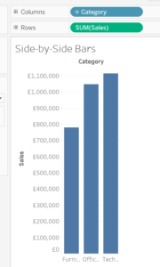
Figure 4. Vertical bar chart
Step Two
Now drag the measure “Profit” (or “Sales”) over to the x-axis in the view until you see the two rules (Figure 5). When you see the rulers, drop the pill you are dragging. Note that the pill in the Rows Shelf has changed to “Measure Values” and the pill “Measure Names” has appeared in the Filters Shelf. Your side-by-side bar chart (Figure 6) is complete!
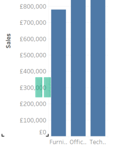
Figure 5. Drag and drop on the two rulers
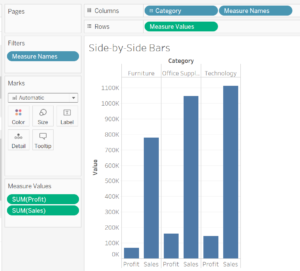
Figure 6. Completed side-by-side bar chart
Treemap
Treemaps organise a dimension by size and colour using a measure. For this treemap, I want to see which manufacturers produced the most sold items.
Step One
Treemaps have nothing on the Columns or Rows Shelves. Instead, all pills are in the Marks Card. First, drag the measure “Quantity” onto the Colour Shelf. Then drag the “Quantity” pill from the Data Pane again, this time to the Size Shelf. Lastly, drag the dimension “Manufacturer” onto the Label Shelf. Tableau will automatically show you a treemap (Figure 7) in your view! If you want, you can change the type from “Automatic” to “Square” in the Marks Card.
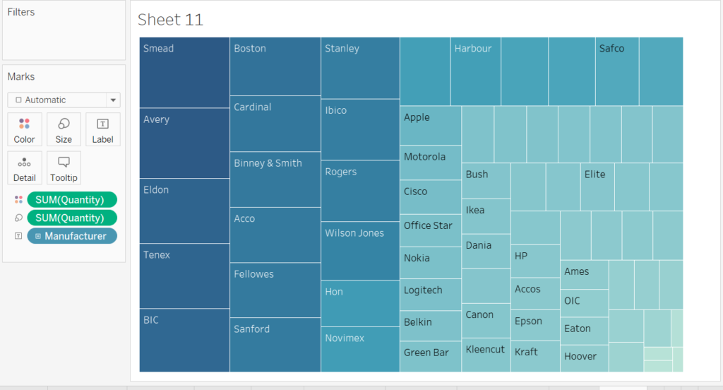
Figure 7. Completed treemap
Circle View
This chart is very similar to a bar chart but with each bar separated into individual values by a dimension. For this circle view chart, I want to look at the sales for each sub-category for each month of the year.
Step One
First, drag the measure “Sales” to the Rows Shelf and the dimension “Order Date” to the Columns Shelf and change it from Year to Month by right-clicking on the pill and selecting the discrete “Month” option. This will give you a line chart automatically (Figure 8).
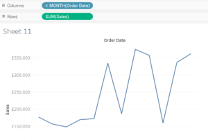
Figure 8. Building a circle view chart
Step Two
Next, change the type in the Marks Card from “Automatic” to “Shape” using the drop-down menu. You have now created Tableau’s circle view (Figure 9)! If you prefer filled in circles over rings, change the type to “Circle” instead of “Shape” in the Marks Card (Figure 10).
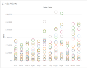
Figure 9. Completed circle view chart
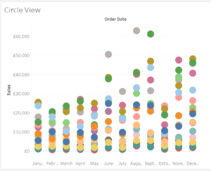
Figure 10. Circle view chart with circles filled in
Side-by-Side Circle
This chart is very similar to a side-by-side bar chart but with circles on a single point instead of a bar. For this chart, I would like to look at the same information as previously but split by category also.
Step One
First, drag the measure “Sales” onto the Rows Shelf and the dimension “Category” onto the Columns Shelf. Next, drag the dimension “Order Date” onto the Columns Shelf next to “Category” and change the pill to “Month”. You will not have a side-by-side circle chart that looks similar to a bar chart (Figure 11).
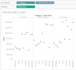
Figure 11. Building a side-by-side chart
Step Two
To add sub-category information, drag the dimension “Sub-Category” onto the Colour Shelf in the Marks Card. You are done! As you can see, this chart type can be rather confusing (Figure 12) but can look great if used appropriately.
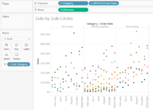
Figure 12. Completed side-by-side chart
That’s it for part two! We are now half-way through this Show Me series. Stay tuned for part three, where we will go over continuous and discrete line charts, dual line charts, area charts, discrete area charts and dual combination charts!
Happy vizzing!
Louise
Check me out my blog feedmedata and follow me on @FeedMeData_