Welcome back to the blog and the third installment of DS32's Dashboard Week, with today's focus being on accessibility. Accessibility is extremely important data visualisation to account for in our work so that we ensure nobody misses important information or insights. The entire reason we visualise data is so that we can help people understand data, what good would it be if we exclude an entire group of people?
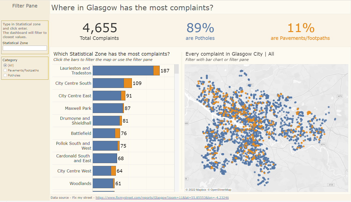
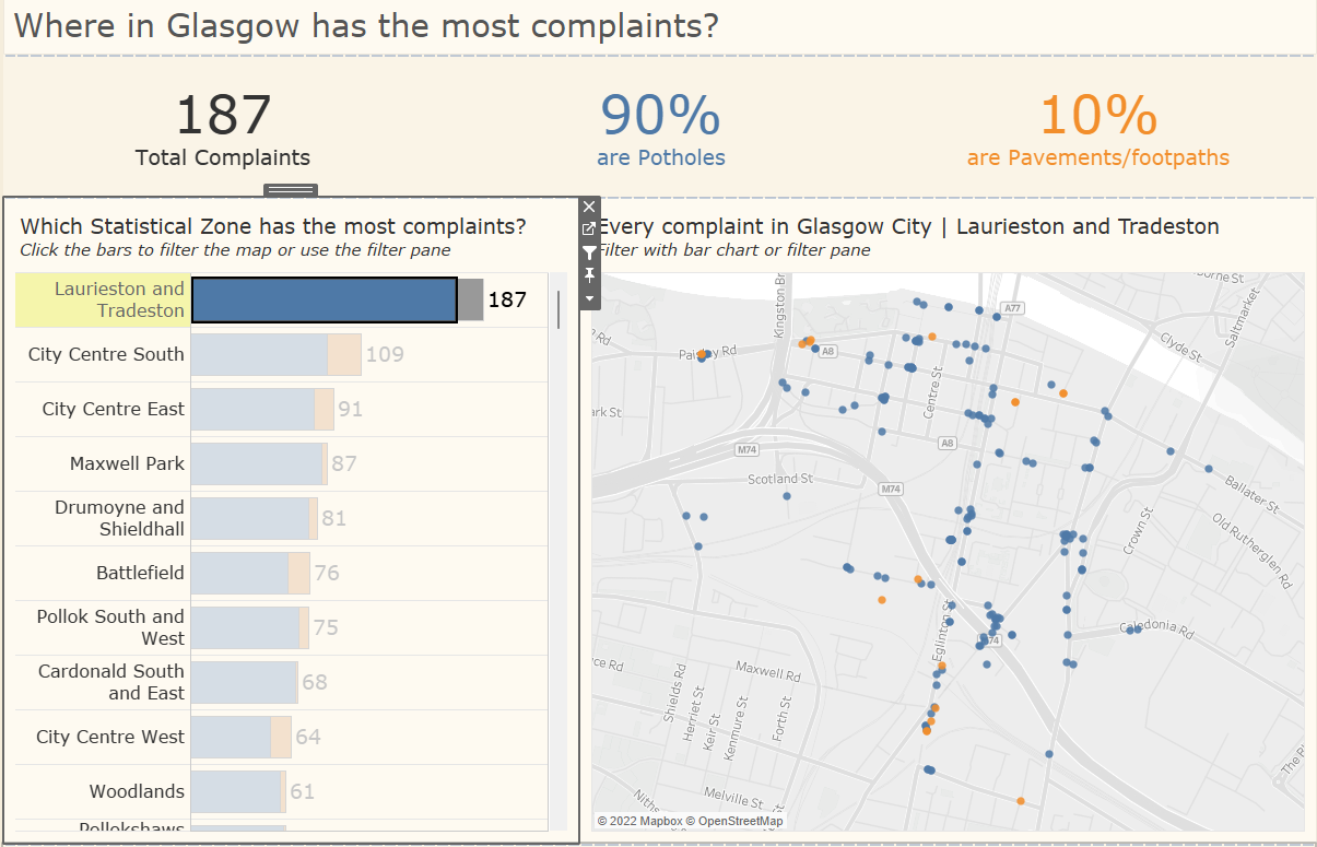
With that in mind, we were tasked with making an accessible dashboard with a Fix My Street data set based on Glasgow City. To begin, I made a plan of a dashboard as I usually would highlighting the things I think needed highlighting. In the case of this dataset, it was which areas in Glasgow have the most complaints and whether they were due to potholes or footpaths.
Once I had made that plan, I started brainstorming different sections that would need to be modified to make it more inclusive to people with different kinds of impairments such as dyslexia, some forms of visual impairment (like colour blindness) and possibly the lack of motor skills.
Here is the dashboard, which I'll go over some things I checked and did to make it more inclusive:
- Firstly, I set a very calm and pastel colour as the background of every section. Those with dyslexia reportedly find it easier to read stuff off of a cream or pastel background; much like a book. I also thought it was a lot less aggressive on the eyes compared to the usual white background with black text. https://www.bdadyslexia.org.uk/advice/employers/creating-a-dyslexia-friendly-workplace/dyslexia-friendly-style-guide
- The font I used was Verdana, another addition to help those with dyslexia. It is a sans serif font with no confusion in the I characters, and is gently spaced to make the reading experience that bit easier.

3. The font Size is much larger than what I usually do to help those who are generally visually impaired, making it bigger means it's easier to see. (14 and 12 size on charts and 36 on KPIs).
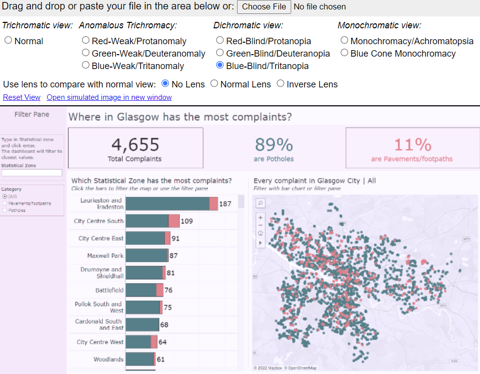
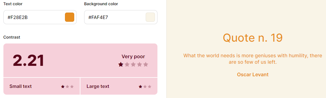
4. The colours I chose were blue and orange which I ran through https://www.color-blindness.com/coblis-color-blindness-simulator/. Blue and orange are very different even when viewed by many kinds of colour blindness.
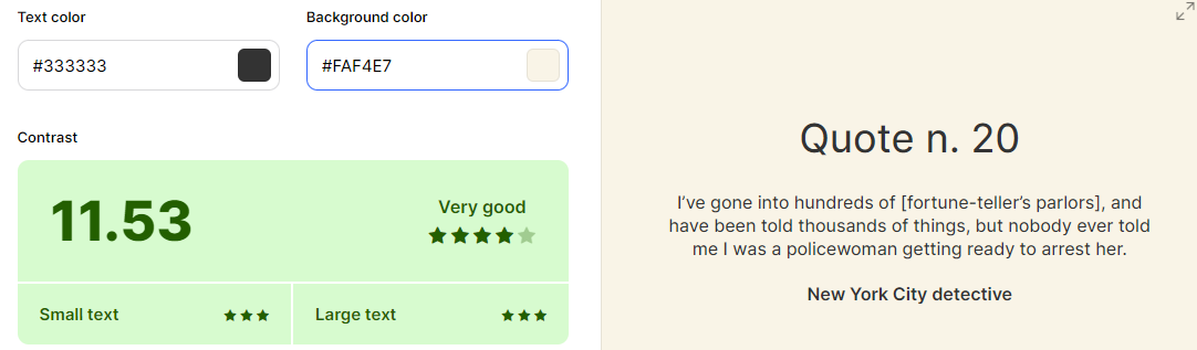
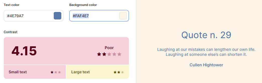
5. I also checked the colour of my text on coolors.co against the colour of my background. The black text had a great score whereas the blue and the orange were quite poor. Maybe in hindsight I should have put a legend instead of colour coding them in the KPIs. However, if someone finds it has contrast sensitivity then they might have troubles reading the KPI section of my dashboard.
6. I ensured to let my shapes and sizes do the talking instead of someone having to look into the bar chart and find the answer for themselves. The bars are wide and have a clear difference in length allowing them to clearly see which area has the most complaints. However, the map was a questionable choice since it can be quite difficult to read.
7. I allowed for a filter click action on my bar chart to affect the rest of my dashboard like so:
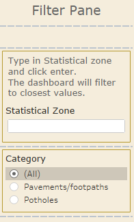
I clearly pointed this out in the subtitles of the charts for easy reading, as well as giving an option to filter through the filter pane for those who cannot use a mouse or trackpad, and must use their keyboard.
8. Finally, I made the choice to use similar shades of the same colour as the background in containers to clearly define where everything was and split up into, giving a layer of thought to how the dashboard was built.
One section is the filter pane, another where the main charts are and one where the BANs sit. This is generally a great use of containers since it breaks things up and makes them more digestible.