


There are certain times where I would like to see a chart in a general overview and then drill down in the same space. I am going to walk you through how to make a dynamic reference line, have reference only appear on a certain condition.
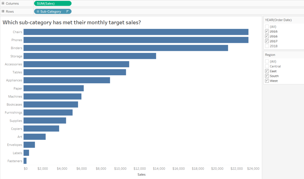
In this exercise we’ll be using the Sample-Superstore dataset and see the Sales performance of Sub-Categories in the Central region. I would like to see which Sub-Categories have met and exceeded a monthly target of $1,000. I would like a reference line to only appear when I filter to one month in view and “disappear” when have multiple (or all) months selected in view.
First, make a sheet that looks at the SUM of Sales for Sub-Category in only the Central region and sort descending. I am only interested in seeing the Sales in 2018, so I’ll be filtering out the other years. See image below.
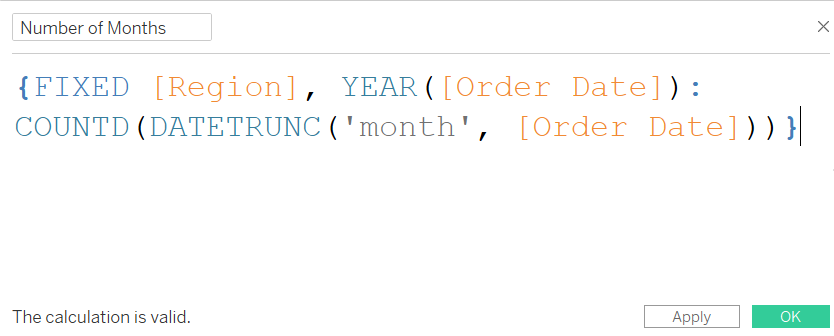
Since we are looking into sales targets being met on a monthly level, for each month, we should count the months.
Do this by creating a calculated field as seen in Image 2.
(If you would like to learn more about Tableau dates in calculations then check out DS7’s Stephanie’s blog about it.)
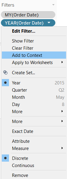
Drag the Order Date field into the filters pane and select Month / Year, and add to Context as seen in Image 3. Do the same for the Year filter field, too. The fields should turn grey in the filters pane.
We would like to make a reference line that would appear when we choose to investigate sales in one particular month as opposed to multiple months. To do this we should make another calculated field that would help us investigate the targets met for each month, as seen in Image 4.
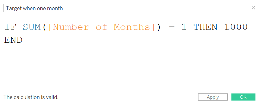
This calculation would tell Tableau that when the number of months in the view is one (i.e., when we filter for one month), it should show our monthly target sales of $1,000.
Drag both the Number of Months calculated field and the Target when one month calculated field into Detail card in the Marks pane. Select one month in the worksheet view, e.g. January 2018. In the Analytics pane, add a Reference Line for a Table.
In the Line section there should be a drop down selection for Value, select AGG(Target when one month) and make it a Total rather than Average and choose None for Label. As demonstrated in the video below, the reference line should only appear when you select one month, and should disappear when multiple months are selected.
To make the distinction between those that are above target and below target, a calculated field should be made, see Image 5.
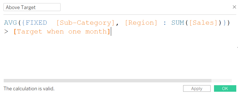
This calculation would return the average sum of sales for each Region, for each Sub-Category that exceeds the monthly target. If we do not fix it on Region then it will calculate the average sum of sales for each Sub-Category for all the regions in the dataset. Then, drag the Above Target calculated field in the Color card in the Marks pane.

Now it is easier to see which Sub-Categories are above or below target on a monthly level.