A few days ago we learnt how to use spatial tools at the Data School: we created polygons from the Alteryx Map Input and from shapefiles, and employed them for answering business questions and building trade areas.
Spatial analytics in Alteryx and Tableau can be both extremely insightful, and useful for Business Intelligence and pattern discovery.
Location Intelligence can drive decision making, offering an understanding of how locations, demographics, and distances influence the business.
But it can also be fun!
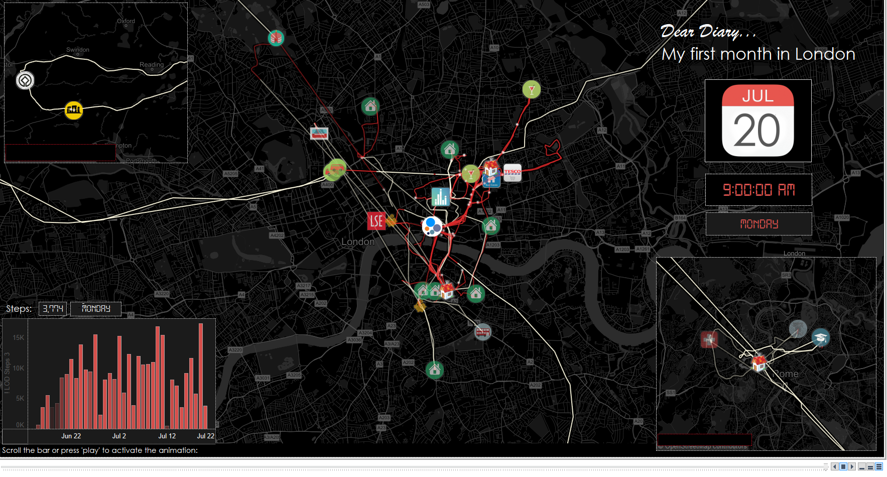
The project for the week was to create a Viz using spatial data, and I decided to use my Moves app for visualizing a diary of my first month in London!
Unfortunately, in the final viz I decided to only show my first two weeks: from the day I landed London and reached my temporary house named ‘Sidney Webb’, to the day I finally went to the agency and signed the contract for my current home!
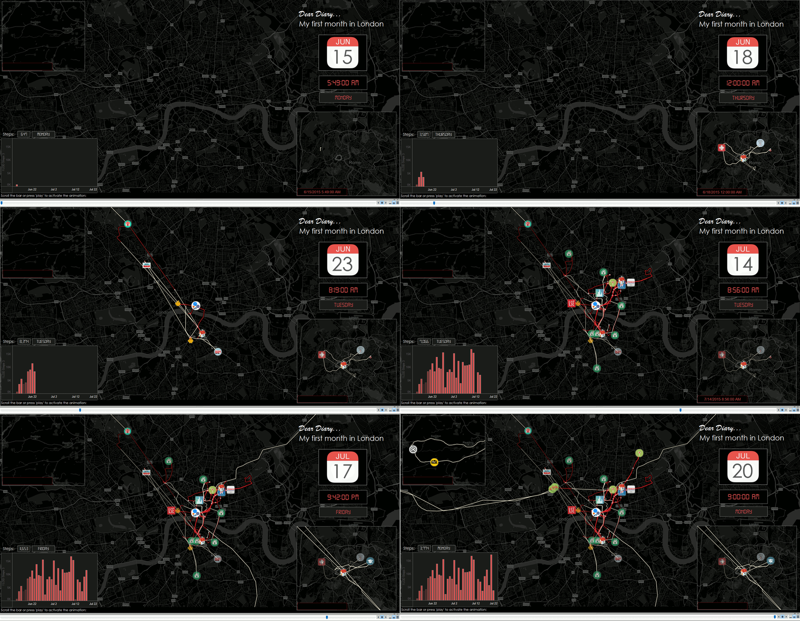
Moreover, Tableau Public does not support animations with the Page Shelf, so I had to convert my animation in a filter (until I figure out how to work it with a JavaScript API…). Nevertheless, I created an animated gif with the full animation for you:
As I am an Italian expat moving abroad, this first month mainly shows a tale of bureaucracy (NiNo and Bank Accounts), flat hunting (seven different amazingly horrible places)… and a wrong bus…!
However, last month I also graduated and – as in Italy we have to defend our Master thesis – I flew from the Data School to Rome, scored 110/110 cum laude, and flew back directly to the School, in less than 48 hours!
Moreover, as I am a curious person, I also made my first trip since I moved: Stonehenge and Bath!
I jumped on a coach and traveled back and forth on the 17th of July: The trip was also my girlfriend’s graduation gift!
In order to build the Viz, I decided to assign different colors for distinguishing my walking movements from the transports, and I allocated some custom shapes and labels to the most important locations.
As my dataset was full of points, my task was to assign a different dimension and a set of shapes only to the points I really wanted to show.
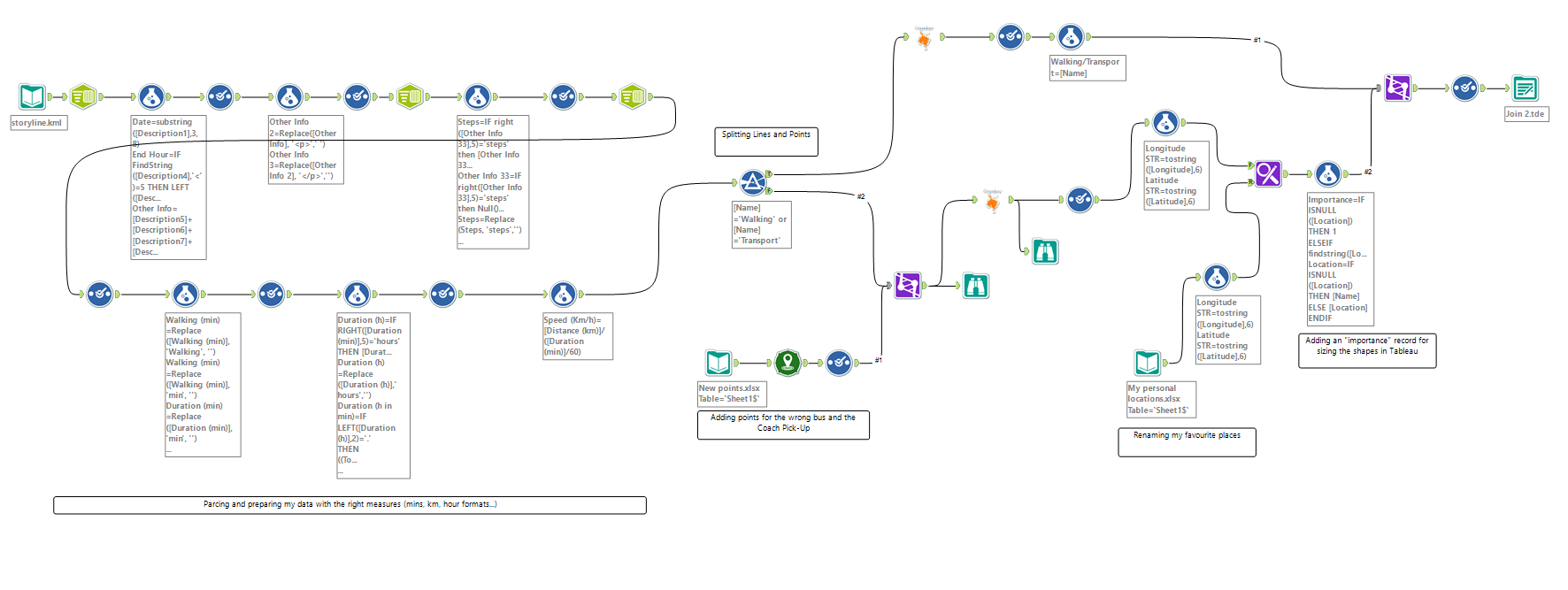
Here below you can find the Alteryx workflow that made it possible:
I parsed my dataset and then I split it into two paths, one for lines and one for points. Afterwards, I joined the points with a table that assigned an ‘importance’ grade and a new custom name to some of them!
This was my first “quantified self” project, and I had so much fun in putting it together: Safe to say it will be the first of a number!


