


As soon as I saw the Music Competition kicking off on Tableau Public, I realized I wanted to chip in.
Maybe it is too ambitious after just a month and a half of Tableau training, but I really believe that undertaking challenges is the engine of learning, hence I rushed into this adventure!
The first issue at hand was choosing an interesting topic for my Viz.
I love listening to music, but I am not a frequent user of services like Spotify or Last.fm, so I haven’t got worthy stats about my music habits.
Therefore, I decided to focus on something else, something fun, something as important for the history of Music that it is almost the first thing coming in my mind when I think about music: Woodstock Festival.
Click on the image below to see the Viz!
Click on the image to see the Viz!
What is Woodstock Festival?
The Woodstock Festival – officially Woodstock Music & Art Fair – took place exactly these days but… 46 years ago.
It is widely recognized as a pivotal moment for a whole generation, as well as one of the milestones of the history of Rock and Roll, and Music in general.
During those three days, Woodstock Festival became the third most populated “city” of New York State, and the dairy farm in which it was organized, hosted a number of people estimated between 400,000 and 500,000. According to the media, it was the largest number of people gathered together so far.
Gathering interesting figures.
Building an interesting Viz focused on an event that happened almost fifty years ago is not that easy. There aren’t so many numbers about it. The only official “breakdown of Woodstock by the numbers” I found is this one, called “breakfast in bed for 400,000” which is actually not really exhaustive.
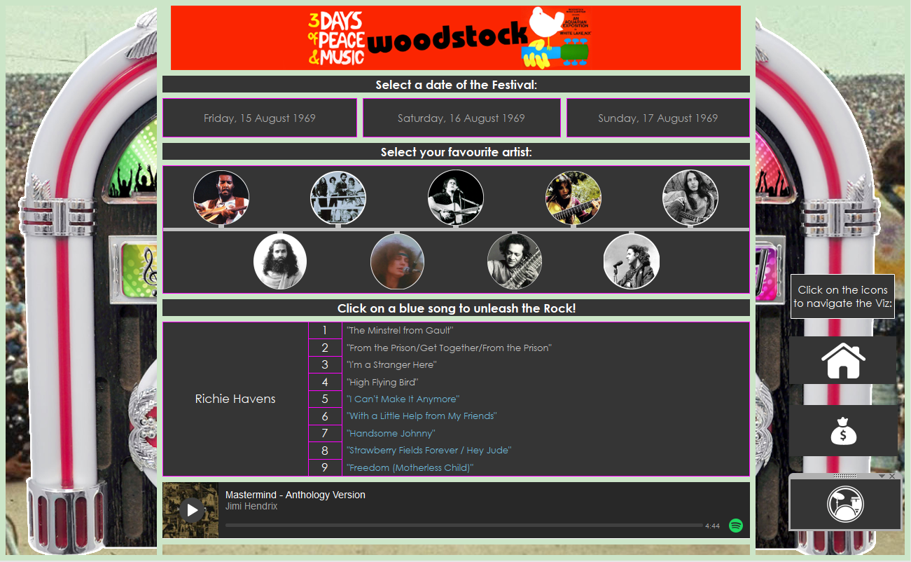
First of all, I decided to visualize the concert’s lineup, including the day, time and songs played for each artist.
Then, I started looking for interesting figures about the event, and I stumbled upon this website, which scraped out from a piece of paper the earnings of all the Artists performing in Woodstock, both in 1969 and 2015 dollars.
Wow! Those figures are outstanding: the whole amount of money spent for all the artists is not even half of how much a contemporary star like Beyonce makes in just one show!
Moreover, some artists earnings are unbelievable: Carlos Santana was paid the equivalent of just $ 5,000!! Can you believe that?!
A third thing I found interesting about those numbers (which I didn’t find on that website, but on Wikipedia) is that, despite there being a cap of $ 15,000 per artist, the producers made a deal with Hendrix for a show including two sets: “an acoustic set and a set with his band” in order to pay more him!
Finally, because – as I told before – there isn’t a single website with all Woodstock’s figures, I found myself with tons of tabs opened in my browser, and I decided to pick the most interesting facts I found on the internet, and to gather them together in a single view.
Building the Viz.
When I finished the data-hunting, I had in my hands:
– The Lineup of one of the most amazing music events in the history;
– An interesting story about artist earnings;
– A bunch of curious facts.
As for the Lineup, I tried different ways to visualize it… then eventually I thought: “Well, if the whole point of the competition is the Music, let’s just let the Music speak!”
After all, I was trying to make something visual, while the power was all in keeping it musical!
And what better way to organize some of the best Music from the 60s than a Jukebox that actually plays that Music?!
I scraped out of Spotify all the links I could find of the songs played at Woodstock, built a database with those links and make my Jukebox play them loud!
Then, I used custom shapes for visualizing the artists and let the user navigate the Lineup day by day.
For visualizing the earnings, I kept things simple, and I just built up a lollipop chart with my custom shapes, adding the earnings and building a parameter to let the user decide if visualizing the values either in 1969 or 2015 dollars.
Finally, I organized the most interesting information I scraped online on a single dashboard.
There I put two lollipop charts, one for the attendance over time, focused on some different milestones, and one for the issues occurred at the Festival.
On the same dashboard, I also put a map showing the quest of the producers for a location for the Festival, started in Woodstock but ended up in a daily farm!
Finally I genuinely have to say that I learnt a lot building this Viz, in terms of Data hunting, Dashboard design and user experience design.
I hope you will find this Viz informative and fun at the same time, any feedback is more than welcome!