


We start the day off by presenting our dashboard made on Day 1, so amongst some very nice looking dashboards I presented the awful and crude Trump Tower plowing dashboard… (https://public.tableau.com/profile/nicholas.bowskill#!/vizhome/TrumpTowersPlowingmildlycrude/TrumpTowerPlows)
For the second day of Dashboard Week, Andy has presented us with a dataset from the New Orleans Police Department about when body cameras were used to record incidents. Today’s dataset was a measly 2.7 million rows of data, compared to yesterdays >250 million, yet it still was enough to cause issues with a very slow Tableau.
The data came in very clean, other than the date and time being in a slightly odd format. This meant that we could get on with exploring the data almost straight away. Andy asked us to draw out our ideas for out dashboards and include those drawings in our blog posts. Mine certainly didn’t end up looking like the drawing but it was here that I came up with the idea of a radial graph:
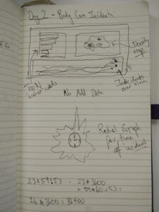
The data we were given was a little dry, the information contained within was mainly just when recordings took place, nothing about the incident itself or what happen with it. This meant we wanted to supplement the data with a new dataset to give some comparison. I wanted to compare the body cam use frequency with the frequency of cameras in the police cars. I also wanted to include a radial bar chart on the hours of the day that incidents were recorded as I had not ever made one of these and they look quite cool! This is what I had to go on so I played around in Tableau for a while to see what I could come up with.
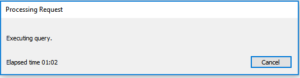
After creating a dashboard at around 2:30pm I added a filter to the dashboard to see if I could make it a little more dynamic. The filter was processing for around 3.5 minutes before I cancelled it, then 30 minutes later the cancel was still processing…. My last save was at 12:16 and my Ctrl+Alt+Delete would be my savoir, so I re-learnt the age old valuable lesson of regularly saving…. However Tableau did have my back with a recovered version of the file before the addition of the silly filter.
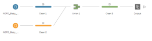
Joining the additional data about the car cameras was fairly easy as the two datasets could be easily blended in Tableau. To make the radial charts each dataset had to be duplicated onto itself so that there were two rows for each original row; this was done in Tableau Prep with a very simple workflow.
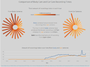
Making the radial bar charts was an interesting one to learn and it is now in my ideas for future blog posts as they make very cool visualisations.

I am not sure how well two radial charts compare against each other but for the time we had I was proud of what I managed to make from the data. The size of the data still caused issued and we did have a fire alarm which are both good excuses if I need them… The finished dashboard looks like:
This concludes day 2 of dashboard week and another hastily written blog post, today 2 minutes before 5pm. See you tomorrow for more dashboard induced fun! Here is the link to today’s dashboard: