


Once again we start our day by presenting our visualisations we made the day before. I was happy to present my radial charts and get a little feedback from Andy about colour and lay out, if you’d like to look over it and give feedback the link is here:
Andy gives us the announcement that we will be learning to use Power BI today. It will be useful for us to know how to use the software so we are able to compare it properly with the software that we are trained to use. The download was fairly simple and connecting it to an Excel datasource was very easy. Power BI also provide short introduction videos similar to the videos I used to train myself in Tableau for the application process for my position in the Data School, so I will be making use of these.
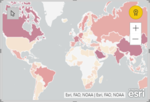
The dataset we are using today is about foreign gifts received by America higher education facilities where the gift is over $250,000 in worth. I would like to compare where gifts are coming from and where they are going to. The first introductory video to Power BI includes the how simple it is to use create a map so I will definitely try to include some of these.
I started off the day really enjoying using Power BI. Creating graphs is simple, it looks very professional and the sheets are incredibly easy to move around to structure a dashboard. My first few hours of using Power BI was actually very enjoyable. It wasn’t until I started to want to start formatting and changing smaller things that I found some real limitations with the software. After using it for a whole day and trying many different things with Power BI I made a personal conclusion; Power BI is great to use you know your data can be displayed in set ways or the people looking at the data don’t need to explore the data too much, but is really lacking if you want to be able to give it a personal touch and user friendly ways to explore the data.
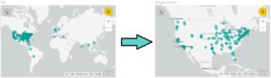
A feature of Power BI that I did continue to enjoy was how easy it was to move sheets around, layer them on top of each other and send sheets to the back. The maps did turn out to be very useful, but not being able to specify where the map should be looking proved a problem when Cambridge in Massachusetts would be mapped to Cambridge in England. The maps couldn’t deal with two pieces of information coming from two fields either, but could deal with two pieces of information from a single field, so merging two fields to create Cambridge, MA worked to create a point from each city in the correct place.
All in all I found Power BI quite simple to use.. up to a point. After being used to Tableau’s versatility in data exploration and visualisation, I found it quite difficult to drill into any specific data and find much of any story, however to create a ‘simple’ dashboard it was very intuitive. So I ended up creating a dashboard of the overall data, seeing where money was coming form (aggregated to a country level) and seeing where the money was going (aggregated to a university level), as well as showing the amounts of monetary gifts exchanged over time. The final dashboard looks like:
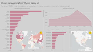
To explore the dashboard click this link here:
We’ll be back again tomorrow for some more dashboarding fun! Maybe tomorrow we will be back to our native Tableau.