


Ever wondered how to effectively visualise survey data? Here are a few tips from my Makeover Monday viz on Gender Equality!
This survey was conducted by Equal Measure 2030, a charity focused on gender equality. They surveyed 613 advocates across the globe asking two questions. One is, on a scale of 1 – 4, how relevant are certain factors in explaining gaps in government data sources related to gender equality. The second question asked respondents to pick their top three priorities in gender equality today out of a specified list.
Question 1 – How to Build a Leaning Lickert scale
____________
Question: To what extent are the following factors relevant in explaining gaps in government data sources to gender equality?
- Collecting data on issues that affect girls and women in policy making isn’t prioritised
- There isn’t enough technical know-how within government-related to gender data
- There isn’t enough funding for the government to collect better gender data
- Gender data is harder to collect than other data
- There is little demand from advocates for data relating to gender equality
Options:
- Very relevant
- Fairly relevant
- Not very relevant
- Not at all relevant
- Don’t know
______________
The first step when dealing with this type of data is to identify the positive and negative responses in order to be able to visualise these in an appealing way. I approached this by taking the responses ‘Very relevant’ and ‘Fairly relevant’ to be positive, with ‘Not very relevant’ and ‘Not at all relevant’ as negative.
I created a calculated field to return the number of responses which were positive and one for those which were negative. The negative calculation is similar to the positive, but it returns the number of responses as a negative number. In this case, I left out the ‘Don’t know’ responses as I was only concerned with either positive or negative responses.
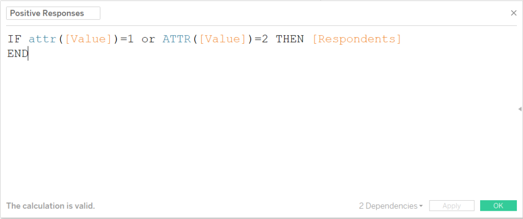
Calculation to categorise responses as positive based on its response value.
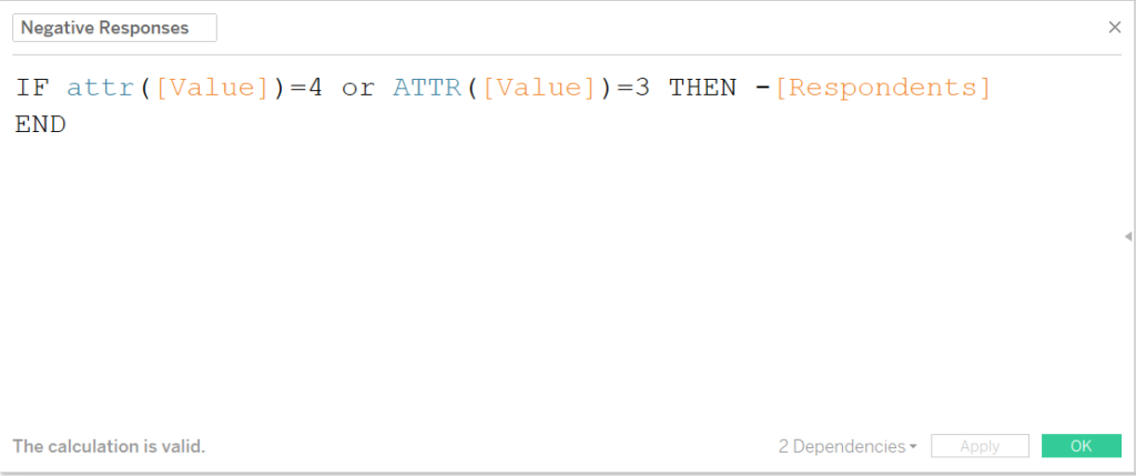
Calculation to categorise responses as negative based on its response value.
If there had been a fifth option between the positives and negatives, this could be made to straddle the zero line by assigning half the respondents as positive and half as negative by just including an extra line in the above calculations to return [Respondents]/2 for positive and -[Respondents]/2 for negative.
These calculations can then be placed on a shared axis against the question wording. This view is particularly useful in that it shows the range of positive vs negative responses around the zero line without the viewer needing to think about how proportions compare if it were a percent of total chart.
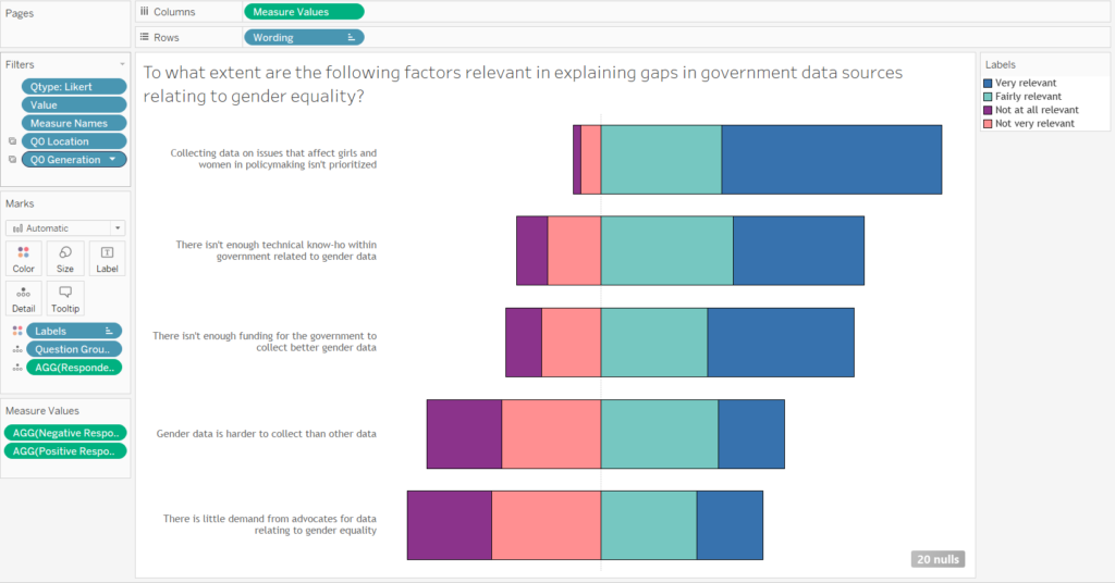
Construction of the slanting lickert chart in Tableau.
Question 2: using level of detail for a percent of total chart
______________
Question: What should be the three biggest priorities today in relation to gender equality?
- Reducing gender-based violence
- Sexual and reproduction health and rights
- Economic empowerment, access to land and financial inclusion
- Equitable and quality education at all levels
- Women’s political and civil society participation
- Women and work, unpaid care, pay gap
- Access to comprehensive health services
- Girls and women in conflict/post-conflict situations
- Women and the effects of climatic and environmental changes
- Access to public infrastructure, including clean energy, water and sanitation
- Public finance, public spending and taxation
- Don’t know
- None of the above
_______
I found this question to be a simpler issue to deal with. From the options listed, the respondents were asked to select their top three choices. The data for this was in an odd format, where each question was given two fields, one for if they selected it and one for if they didn’t.
This made coming up with a good way to visualise it quite tough, but after a bit of thinking (and some words of advice from Carl), I went for a percent of total chart for each question, where the positive responses are shown against the total number of respondents.
In this case, that total number of people who responded was a static 613, though I wanted to be able to set it up dynamically. This required a level-of-detail calculation in order to count up the number of respondents, despite the fields that are in the view.
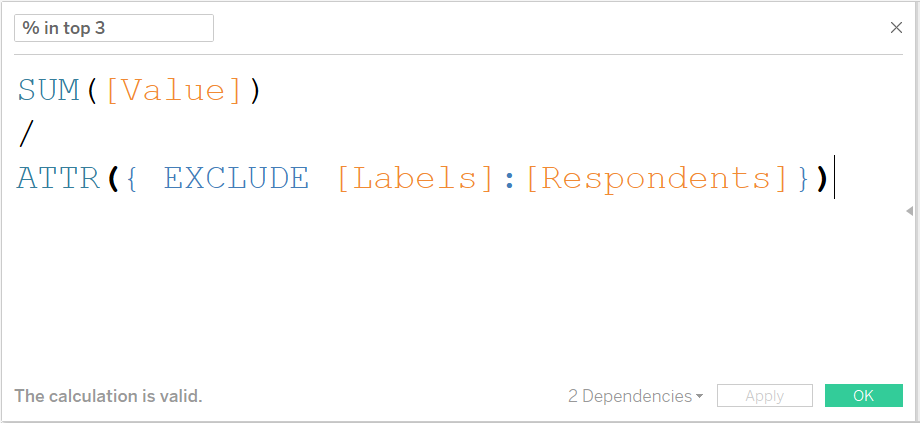
LOD calculation to derive the percent of total who selected the response.
These LOD calculations look a lot more complex than they are. This first calculation is simply taking the sum of the response value (each time someone selected the response, it was given a value of 1) and dividing it by the total number of respondents, regardless of the labels field being in the view.
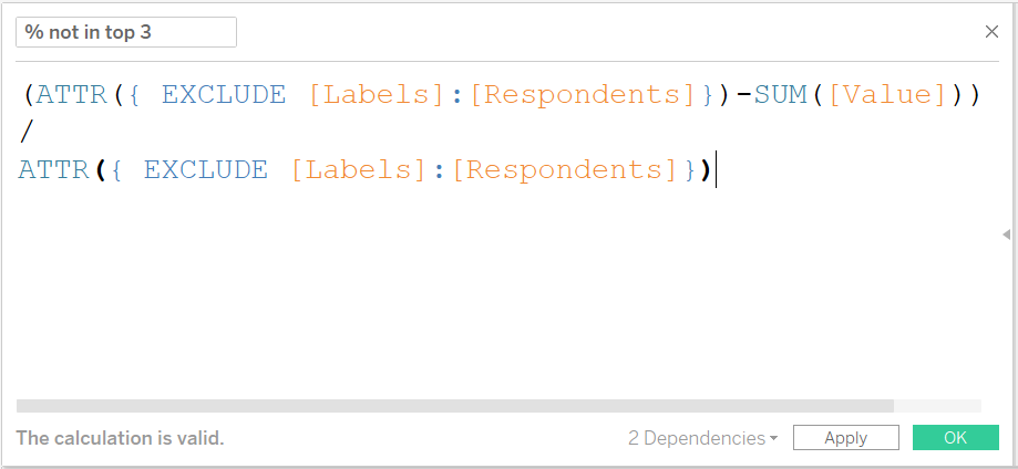
LOD calculation to derive the percent of total who did NOT select the response.
The second calculation, which looks even worse, is just the opposite – taking the total respondents and subtracting the number of times a response was selected then once again dividing by the total number of responses.
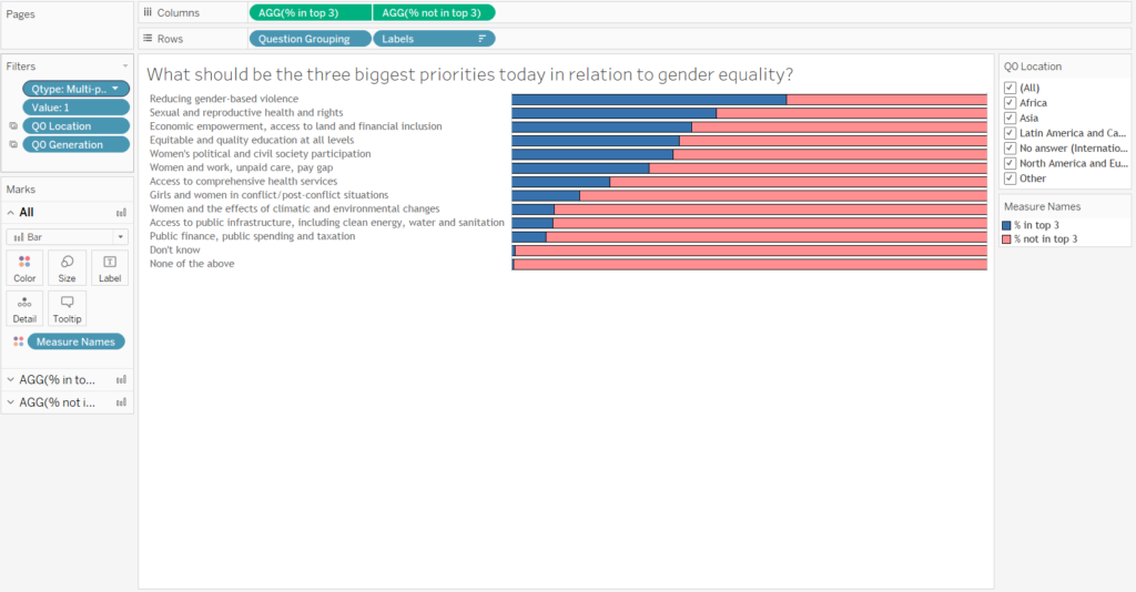
Percent of total chart constructed as a dual axis in Tableau.
By putting these new fields together a dual axis, then sorting the list of responses by the highest response value, the chart above can be generated. This chart is then filterable by any measure and will still maintain the percent of total view.
_______
And there you have it! A few tips of charts to build when working with survey data. I hope this helps if you ever find yourself faced with similar data.