


The other day DS8 were let loose on #WorkoutWednesdays. We each had to pick a different week’s workout and try to get through as many as possible in two days. If you haven’t tried any WorkoutWednesdays I can’t recommend them enough. They can be extremely frustrating at times, but they teach you an enormous amount about Tableau, and we implemented techniques learned from these days immediately into our client projects.
In this blog, I’m going to walkthrough and explain the calculations required to make Week 41’s dashboard. This uses worksheet actions to allow the user to see Sales by Profit for all US States, and then click a State to see the Sales by Profit of all the Cities in that State. If ever you have a two level hierarchy of data, then you can use these Calculated fields (replacing the measures and dimensions for your own) and have the same effect.
Step 1
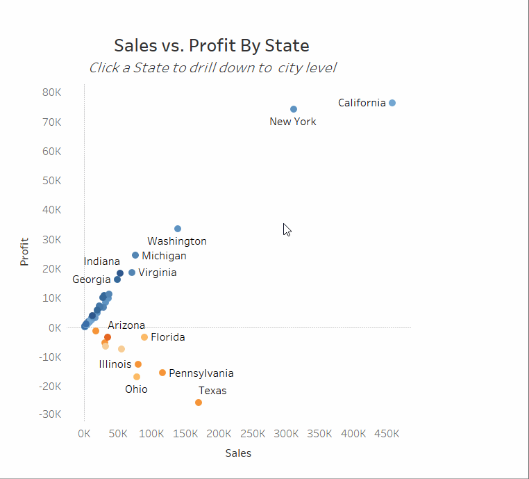
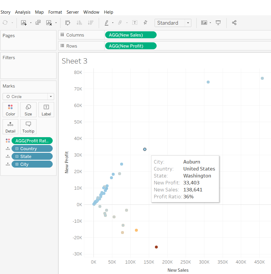
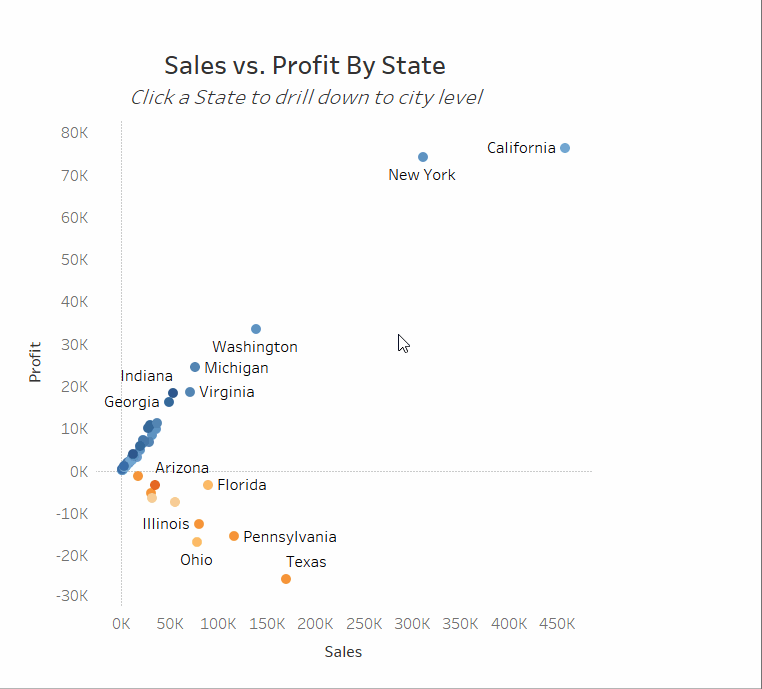
If we start by making the simple scatter plot showing Sales against Profit for all the States, then hopefully it will be easier to think about the calculated fields we need to make.
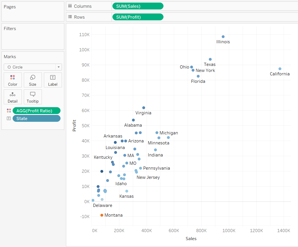
However, we know that we will need both States and Cities on detail in the end. If we add Cities to detail then our chart updates and looks like this (which is not what we want).
To fix this our first step is to replace our measures (SUM([Sales]) and SUM([Profit])) with new ones. As we will eventually need both States and Cities on detail, we need to write a calculation for both Sales and Profit which returns the State level values or the City level values depending on how many States are in the view. So when we filter down to one State with a worksheet action, the view updates and shows the City scatterplot.
Let’s break this down line by line.
IF MAX({COUNTD([State])}) = MAX({EXCLUDE [City],[State]: COUNTD([State])})
The left side of this equation counts the number of States in the dataset. It says, fixed on everything, count the number of distinct States. The right side of the equation counts the number of States in the view. It ignores the fact that City and State are on detail, and counts the number of distinct States. Since EXCLUDE and INCLUDE LODs happen after dimension filters have been applied, then when we click on a State and filter to it, the right hand side of the equation will be 1. If we don’t have a filter on, then the right hand side will be the same as the left.
IF MAX({COUNTD([State])}) = MAX({EXCLUDE [City],[State]: COUNTD([State])})
THEN MAX({FIXED [State]: SUM([Sales])})
The first two lines therefore say If the number of States in the dataset is equal to the number of States in the view then give me the sum of Sales fixed at the State level.
IF MAX({COUNTD([State])}) = MAX({EXCLUDE [City],[State]: COUNTD([State])})
THEN MAX({FIXED [State]: SUM([Sales])})
ELSE SUM([Sales])
END
If the number of States in the dataset is not the same as the number in the view, then give me the sum of Sales at the lowest level of detail – in our case per City.
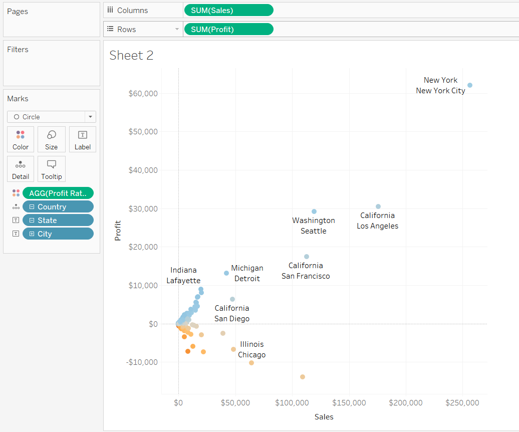
If you replace [Sales] with [Profit] then you have your new Profit measure and our scatterplot is almost ready. If you swap the old measures with the new, you’ll end up with this:
Our dots are in the right place for the State level, but the colours of Profit Ratio are wrong, and if we hover over a dot, then we see that there is City information being shown, as well as State. The final clue that something is wrong is in the bottom left of the screen:
![]()
Since there are 48 States in the dataset, we should only have 48 marks in the view. The fact we have 604 means that Tableau is piling a dot for each City in a State on top of each other at the State level Profit/Sales position. There is still work to be done…
Step 2
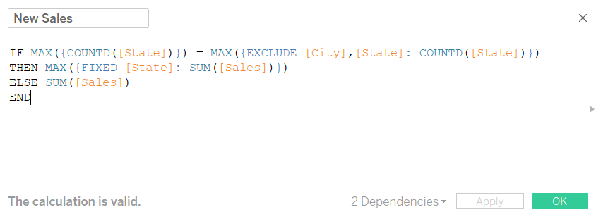
To make sure Tableau only returns one mark per State we need to write another Calculated field. This one is a bit of a monster so thanks to Andy for showing me the way.
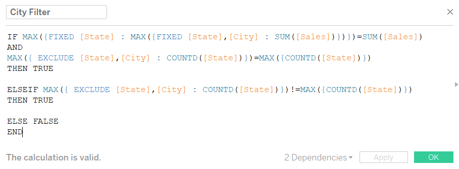
Let’s break this down bit by bit again starting with the nested LOD equation:
MAX({FIXED [State] : MAX({FIXED [State],[City] : SUM([Sales])})})=SUM([Sales])
Always read nested LODs ‘inside out’. So the ‘inside’ LOD takes the Sum of Sales per City per State level. The ‘outside’ LOD takes the largest of these values per State. – So in a hypothetical State with two Cities, the ‘inside’ LOD would give the Sum of Sales per City (let’s say $50,000 and $100,000) while the ‘outside’ LOD takes the largest of these values ($100,000). So for each State we get the value of the most profligate City. We then compare the Sum of Sales with this value. If they’re the same – i.e. we’re looking at the City with the highest Sales in its State – then this returns True.
IF MAX({FIXED [State] : MAX({FIXED [State],[City] : SUM([Sales])})})=SUM([Sales])
AND
MAX({ EXCLUDE [State],[City] : COUNTD([State])})=MAX({COUNTD([State])})
THEN TRUE
We’ve seen the equation after the AND before. It returns True if the number of States in the view is the same as the number of States in the dataset. So this conditional statement says if we’re looking at the City with the highest Sales in its State, AND we are at the State level, then return True.
IF MAX({FIXED [State] : MAX({FIXED [State],[City] : SUM([Sales])})})=SUM([Sales])
AND
MAX({ EXCLUDE [State],[City] : COUNTD([State])})=MAX({COUNTD([State])})
THEN TRUE
ELSEIF MAX({ EXCLUDE [State],[City] : COUNTD([State])})!=MAX({COUNTD([State])})
THEN TRUE
The equation after the ELSEIF says that the number of States in the view does not equal the number of States in the dataset (i.e. we’ve filtered down to one State). If this is the case, the conditional statement returns True.
IF MAX({FIXED [State] : MAX({FIXED [State],[City] : SUM([Sales])})})=SUM([Sales])
AND
MAX({ EXCLUDE [State],[City] : COUNTD([State])})=MAX({COUNTD([State])})
THEN TRUE
ELSEIF MAX({ EXCLUDE [State],[City] : COUNTD([State])})!=MAX({COUNTD([State])})
THEN TRUE
ELSE FALSE
END
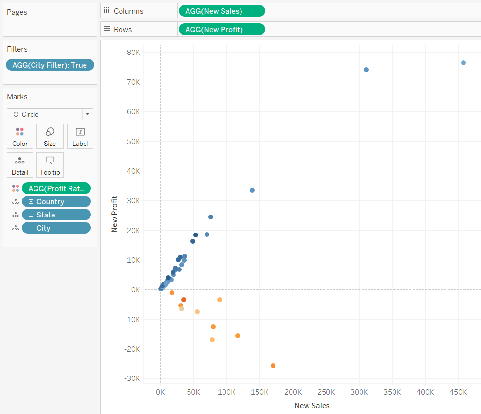
Finally, if neither of the two above conditions are True, then we return False. The only situation which will return False is where we have every State in the view, but we are not looking at the City with the highest Sales. If we drag City Filter onto the Filters shelf and only keep the True results, then when we are at the State level, Tableau will only show us one mark per State.
Step 3
Next up we need to tidy up our presentation. We want to label our marks with their State/City depending on what level we are at and have a Title and subtitle telling our viewer whether we’re at the State or City level, and to drill up/down to go to the City/State level. To do this we need 4 calculated fields, but they are all doing essentially the same thing.
First up, let’s fix our labels:
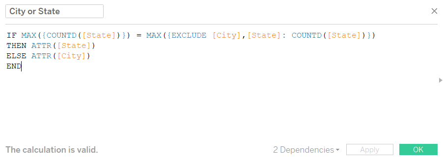
This calculation checks to see whether the number of States in the view is equal to the number of States in the dataset (like before). If this is the case then it returns the State, and if it isn’t the same then it returns the City. If we drag this onto Label, then our labels are done.
Next up it’s our Title:
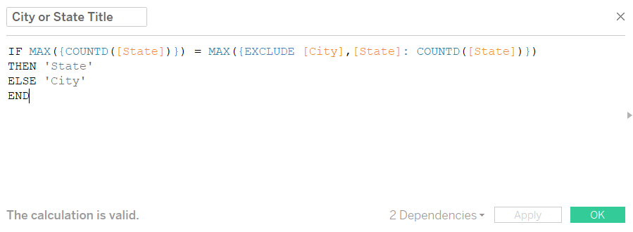
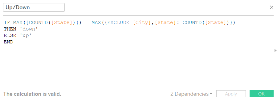
This is exactly the same as the previous calculation except it returns the word ‘State’ and ‘City’ rather than the actual State or City. The next field is again the same, except it returns ‘down’ instead of ‘State’ and ‘up’ instead of ‘City’
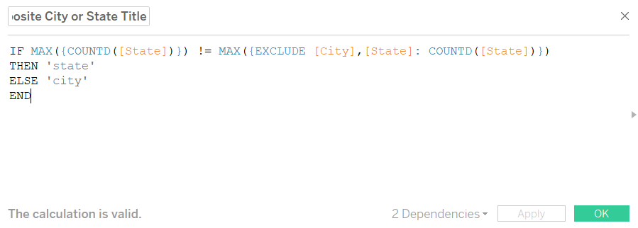
The final calculation is the opposite to the City or State Title calculation – it returns ‘City’ instead of ‘State’ and ‘State’ instead of ‘City’.
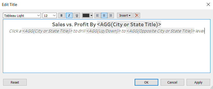
If you put all these fields on detail, and then write your sheet title as follows, then our formatting is finished.
Step 4
We’ve written all the calculations we need at this point. The only thing left to do is set up the worksheet actions. We will need two of these – one to filter to the selected State, and another to prevent Tableau from automatically highlighting the City with the highest Sales.
To add a worksheet action, click on ‘Worksheet’ in the toolbar, and then click on ‘Actions…’. This will bring up a dialogue box from which you can click the ‘Add Action’ button. You will then have to choose what type of action you want: Filter, Highlight or Go to URL. Let’s start with the filter.
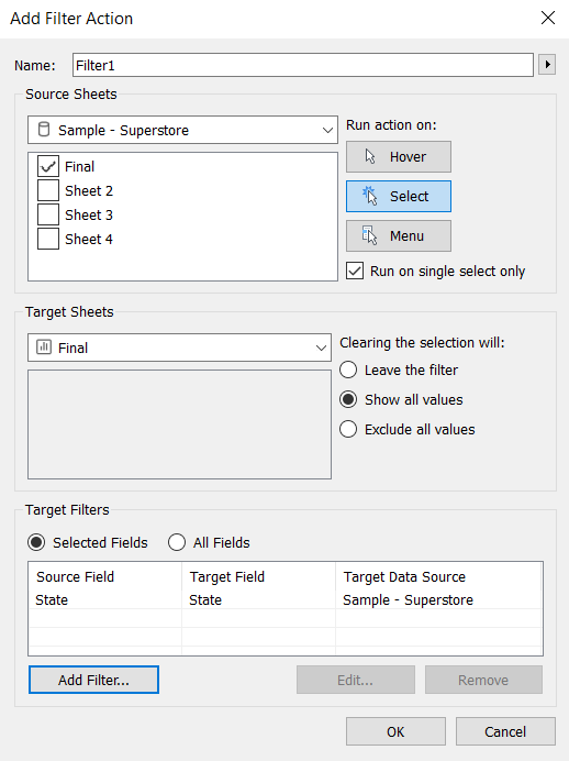
This set up means that our Filter is found on and applying to our one sheet. It is being run when we click something, and when we click one thing only. When we unclick (i.e. click the background) the filter will stop applying and all values will reappear. Finally the bottom shows that we are applying our filter to States.
You could stop now, and the worksheet would be functional. However, every time you drilled down this would happen:
In order to prevent Tableau from highlighting one City, we need to override its default highlighting position with a worksheet action which explicitly tells it what to highlight.
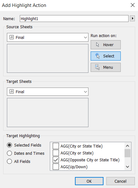
Here we tell Tableau to Highlight the Opposite City or State Title. You don’t have to choose this one, but you want to choose a field which is on detail, but not visible in the view – so when Tableau highlights it, it doesn’t do anything visually.
And there you have it, how to complete WorkoutWednesday Week 41 or set up a worksheet with a drilldown capability.
If you found this useful then let me know on twitter @olliehclarke.