


Last week during our project work I was having issues with cramped labels on line graphs. As per, I turned to Andy for guidance and he gave me this solution which I thought was perfect for Just The Tips!
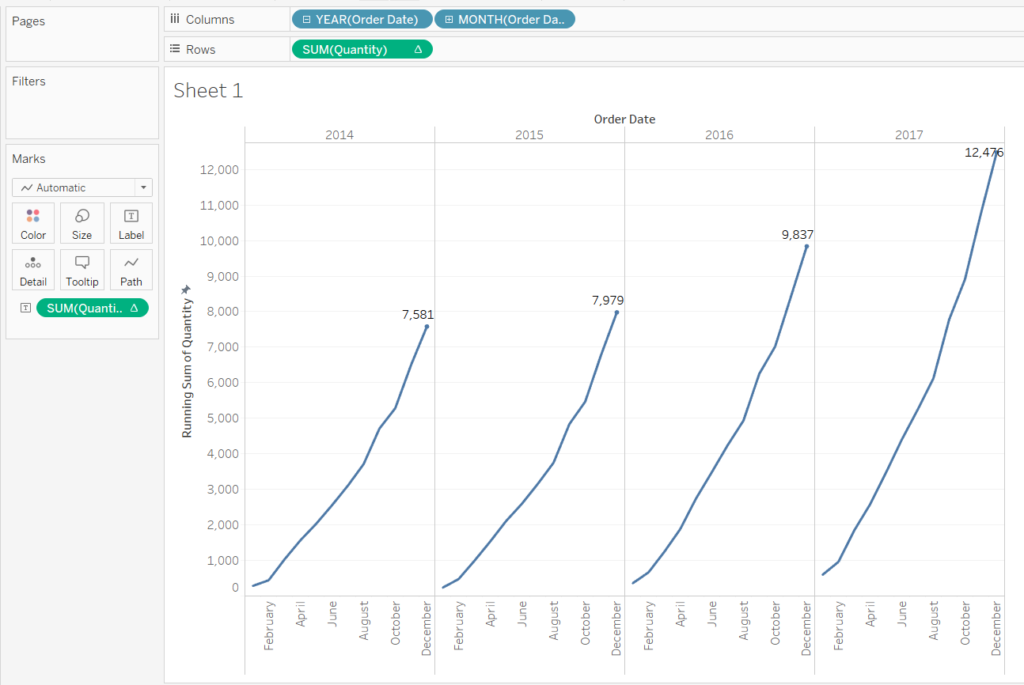
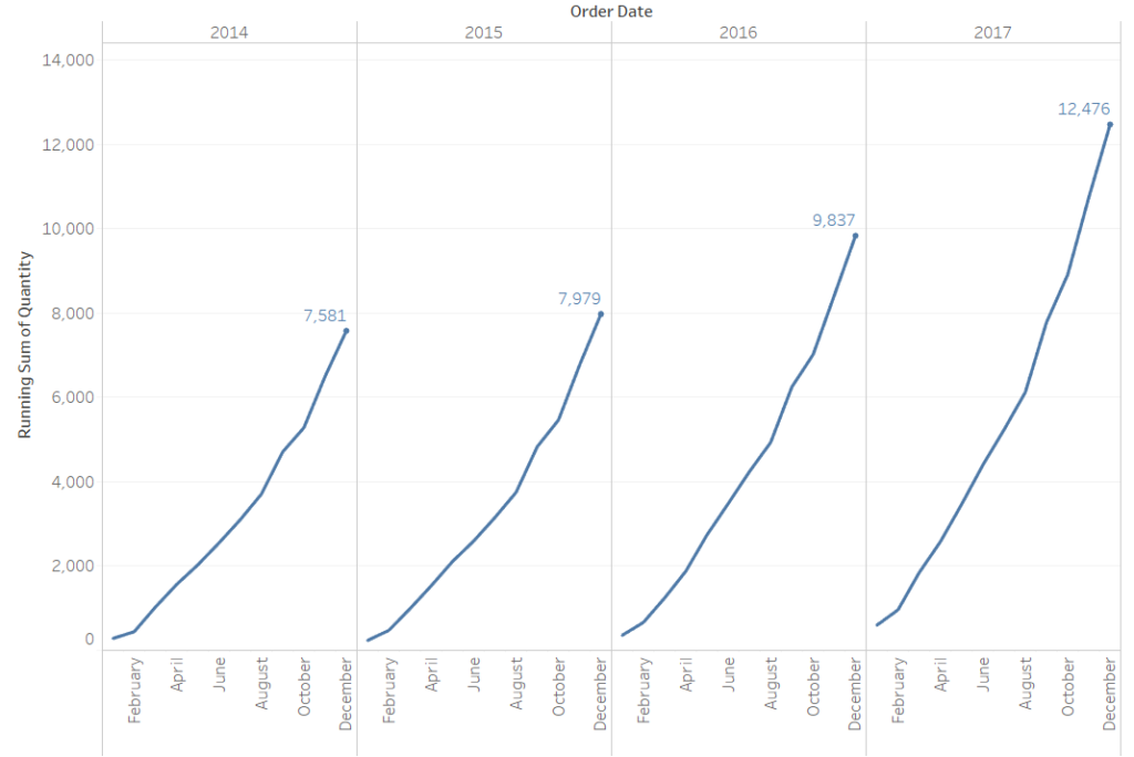
So this was the kind of view with which I was struggling. I was plotting running totals over a number of years and there just wasn’t enough space for the label of the highest value to be easily read. If you’ve had this issue, then you’ll know that you can simply drag the label to somewhere with more space. However, I was using parameters and other things which meant that I didn’t want to manually edit each label’s location. So if you’re lazy like me, then JTT is here to help…
First you’ll want to create a calculated field like this one:
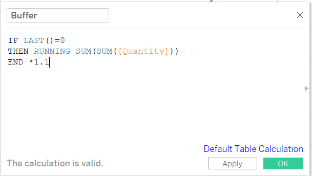
This takes the last value [ LAST()=0 ] gives us the value of the running sum and then multiplies it by 1.1.
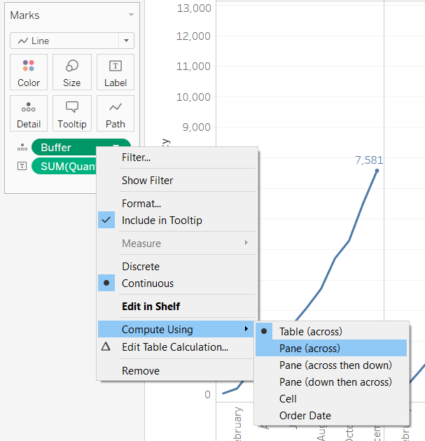
Next, drag this calculated field onto the details shelf.
Now, since our running sum restarts every year, we need to make sure our Buffer does too. So right click it on the detail shelf, and make sure it’s computed using Pane (across).
So now we have a calculated field called Buffer which returns the value of our running sum plus 10%. We’re going to use this to create a reference line.
Go to the analytics pane and drag Reference Line onto your view. Set it up as in the picture below – make sure the value is Buffer, that it has no label and no line.
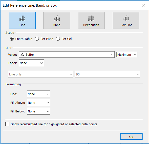
And that’s it! We’ve made an invisible reference line at 110% of the value of our running sum. Tableau will incorporate this into its axes sizing and this will give our labels more room to breathe.
That’s it for this edition of Just The Tips. A pretty rough and ready solution, but hopefully one that will make your dashboards less cramped. If you found this useful, or you’ve got a more elegant solution, then let me know on twitter @olliehclarke.