It’s #Week2 of Data School…
…and despite the lack of R&R found this weekend, I found myself walking into 33 Cannon Street eagerly this morning. Today was all about Tableau as our resident guru Andy was back from holiday in Bruges (replete with chocolates for class!) After covering some basic terminology and topography we got stuck in to the meat of today’s learning – reverse engineering views presented to us. This was not only an excellent way to get used to different facets of Tableau, it was also genuinely fun.
Since my last post got a bit out of hand in terms of length, I thought I’d aim for short and sweet today. That means it’s listicle time! Here are my favourite 5 things I learned today:
1
Let’s start as basic as you can. The Tableau Icon in the top left corner will take you back to the Data Connection screen from your worksheet. I knew this already, what I didn’t know is that if you click it again you’ll be right back in your worksheet. No longer do I have to avoid the top left corner of my screen for fear of losing all my work!
 2
2
Another basic tip, but again new to me – you can add a Data Source Filter from the connections canvas. This means that before you’ve even opened up Sheet 1 you can start to home in on the stuff that really interests you.
3
‘Combined Axis’ and ‘Dual Axis’ charts:
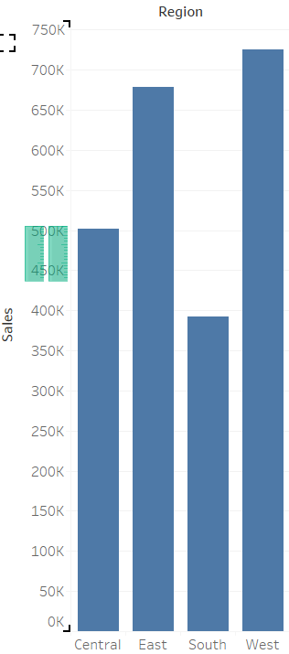
A ‘Combined Axis’ chart is where you have multiple marks sharing the same axis. Super easy to make: having created a chart, simply drag your extra measure onto the same axis that you already have. You’ll know you’ll be making a Combined Axis chart because Tableau will show you two parallel ‘rulers’ as you hover over the axis.

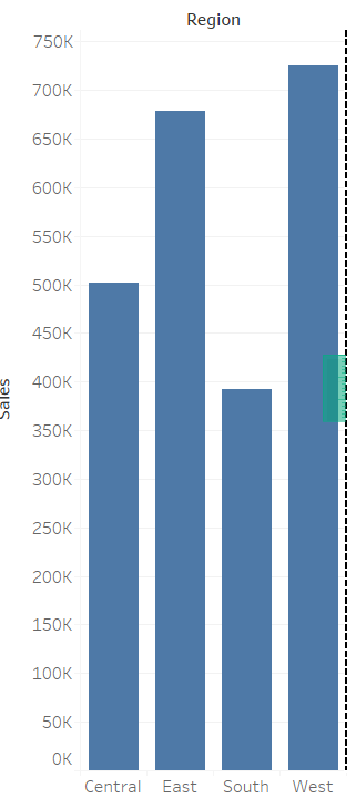
A ‘Dual Axis’ chart, as its name suggests, is a chart with multiple axes. They are as easy to make as a Combined Axis chart. Once again, having made a chart, drag your extra measure onto the opposite side as your original axis. Tableau will this time show you a single ‘ruler’ to let you know that you’re making a dual axis. Once you’ve dropped your measure, you should immediately right click the new axis and click ‘synchronize axis’. This means that both your axes will have the same range of values.

N.B. If the ‘synchronize axis’ option is greyed out, that means that your two measures are different data types.
4
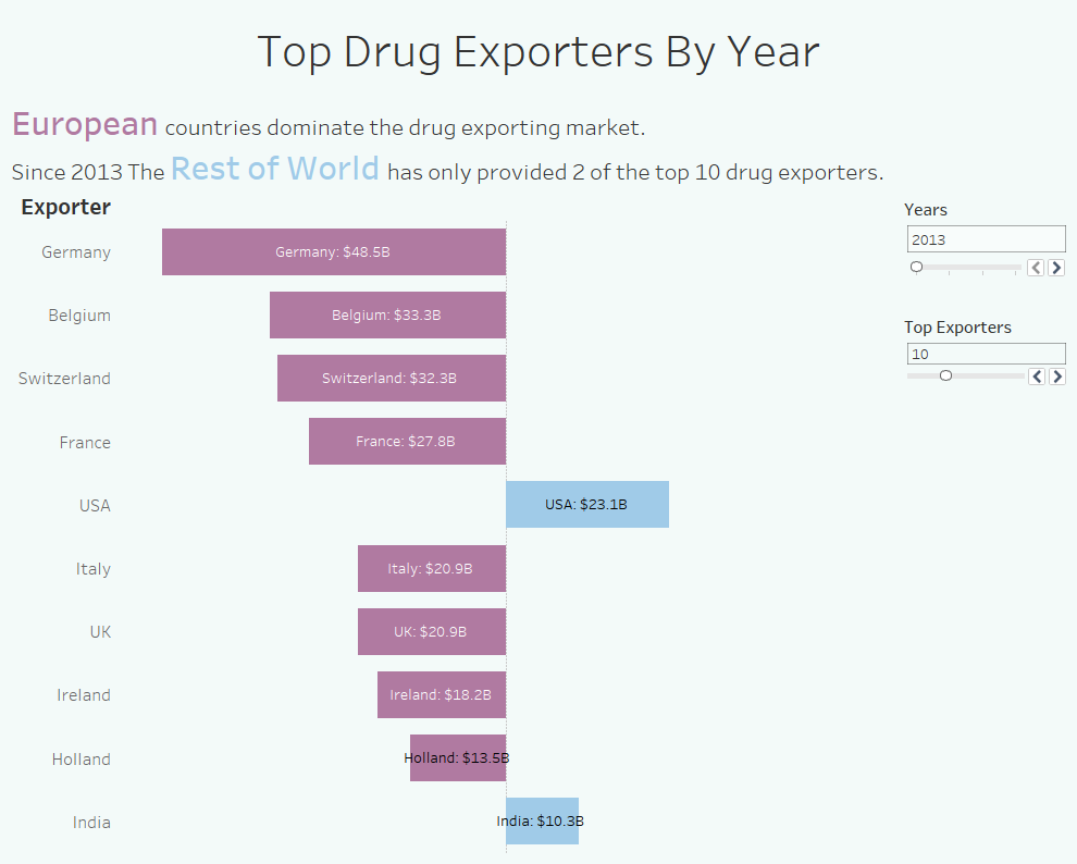
Diverging Bar Charts. This is something I’ve been wanting to do for a #MakeoverMonday for a few weeks now, and I finally got some data that lent itself to it. I had already grouped countries into Europe and the Rest of World and wanted to compare their amount of drugs exported (in $). I made a new calculated field and wrote a simple conditional stating:
“IF [Europe] = TRUE THEN –[Exports (USD)] ELSE [Exports (USD)] END”
This checked to see if a country was in the group Europe, and if it was then it made its Export data negative. If the country wasn’t in Europe and therefore in the Rest of World, its export data remained positive. I put this new measure onto columns, edited the x-axis to make it symmetrical, added some colours and labels, and I was done.

5
This one technically isn’t Tableau related, but it is remarkable to me. Scooby Doo’s full name is Scoobert Doo. I don’t know why I find this so amazing, but I really, really do.
For more Tableau, Alteryx and Scooby Doo insights, follow me on twitter @olliehclarke
