


The Task
The aim of this project was the improve the accessibility of the NYC Open Data Council Constituent Services Portal, ensuring that screen reader and keyboard only users could effectively use the dashboard to get some insights.
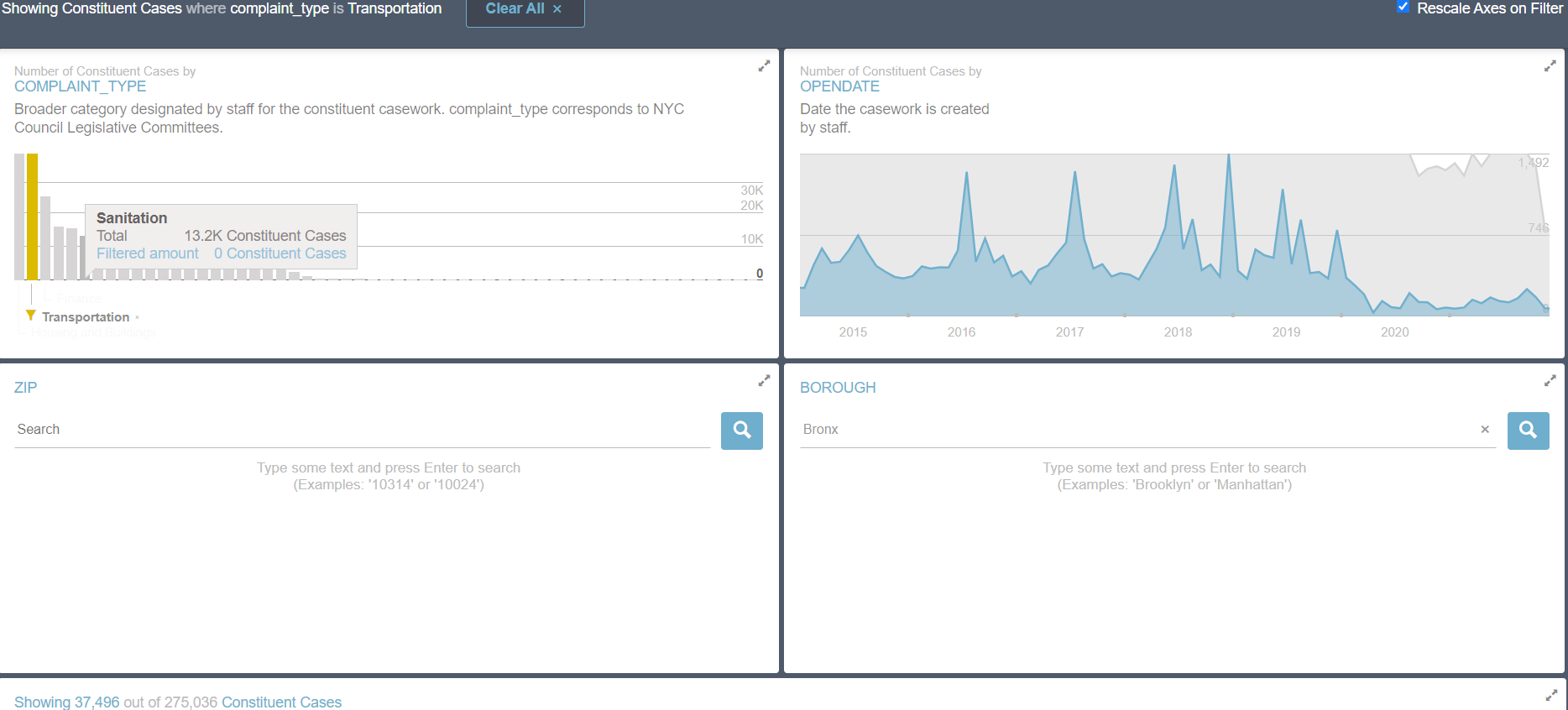
This is what the original dashboard looks like:
One thing I have learned from this project, which I should mention first, is that it is IMPERATIVE that you test your dashboard with a screen reader as you go along. I made a few assumptions which later turned out to be false, causing one or two headaches.
Getting The Data
One of the requirements of this project was to make the dashboard update dynamically. On this basis, using the city of New York Socrata Api was the best opton. All the data could be pulled in using Alteryx. I set an extremely high limit (using ?$limit=) to ensure that the workflow always brought in all the rows of data as the data set expands. Here is the workflow:
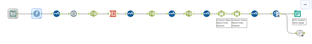
The steps were:
Download the data and parse using the JSON parse tool.
split and clean some columns, and then Crosstab.
Turn the date columns into the proper format using the date/time parse tool.
Output to Tableau Server using the publish to Tableau server tool.
Designing for Accessibility
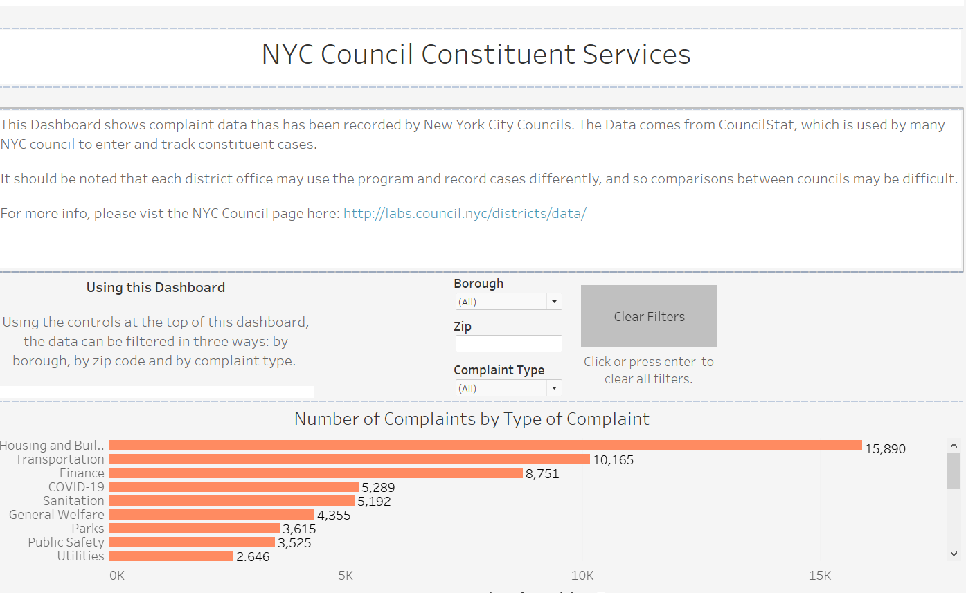
With the dataset ready, the next step was Tableau. Here is what the dashboard looks like so far:
Things to think about:
It is necessary to Include all the text information within sheet titles, as screen readers unfortunately skip over text objects.
Concise and informative text on the aim of the dashboard and how to use it ensure a stress-free experience.
Captions should be utilised to explain each chart, so that screen reader users are able to understand the overall point of the chart.