The Task
We were asked to make this visualisation on US vegetable consumption a bit more interesting:
The Plan
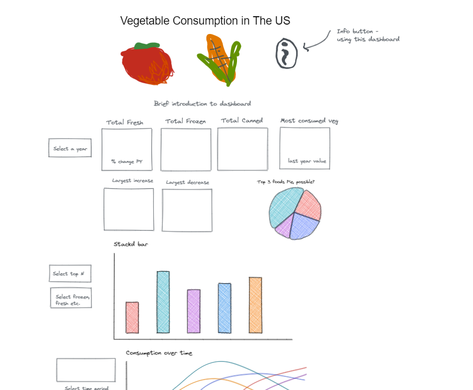
The first step was to plan out what I wanted the final result to look like. This is never time wasted as it helps to focus your thoughts and allows you to understand better how your data needs to be manipulated. Here's what mine looked like using Excalidraw:
Preparing the Data
For this task we opted to use Tableau Prep. The first issue was that the data was not in a nice columnar format necessary for Tableau. Fortunately, this issue was remedied through the use of a wildcard union (unioning all the different sheets in the single excel file) and the data interpreter. The data interpreter is really a life saver when dealing with awkward excel files.
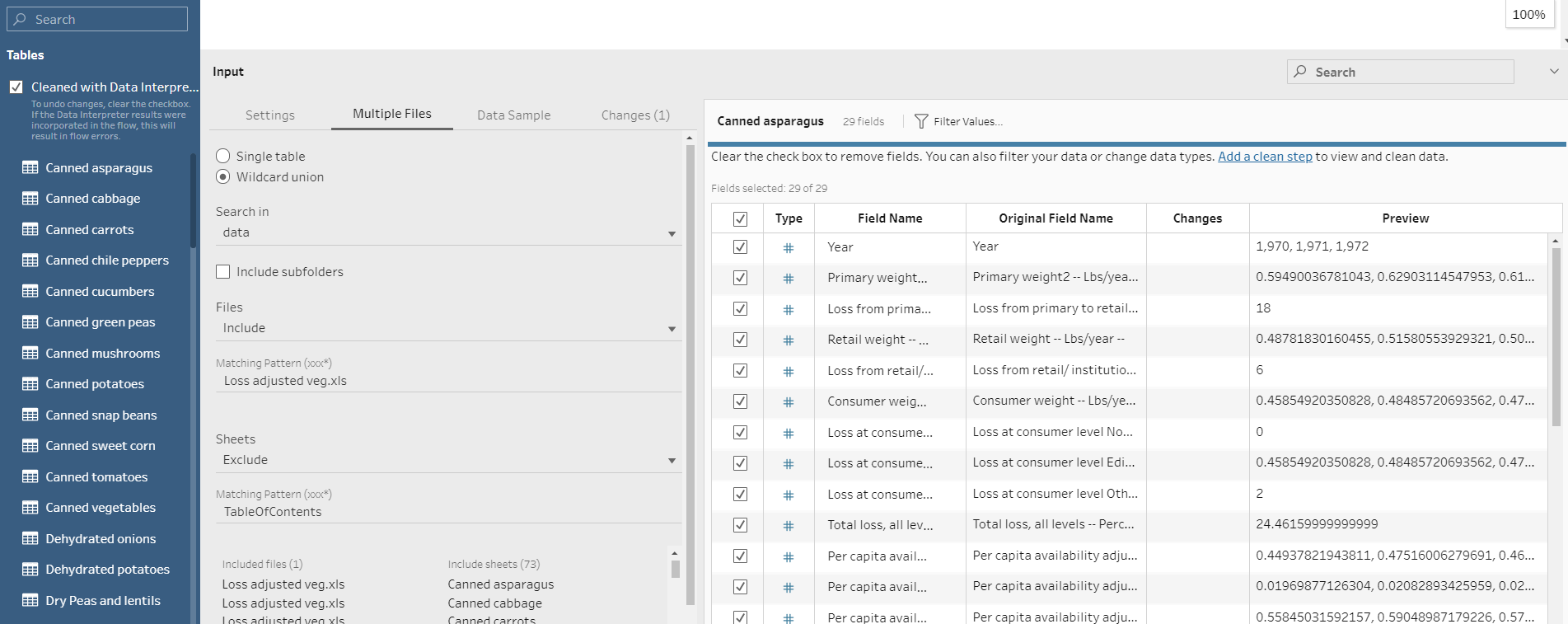
There were also columns that contained the same data but had the tiny difference of an extra '-'. Luckily this is also dealt with using a merge.
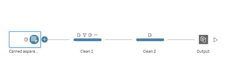
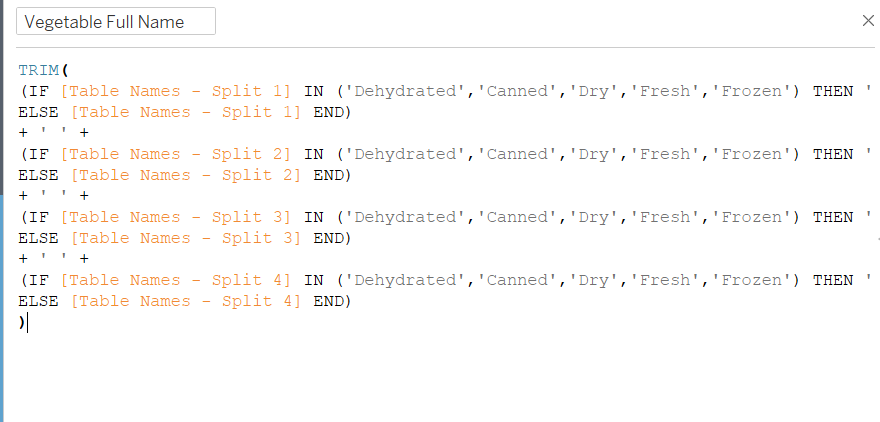
I Also needed to split the sheet name column in order to get one column for the vegetable type (frozen, fresh, canned etc.) and one for the vegetable name. I achieved this by splitting the columns in Tableau Prep and the exported everything to Tableau to do one further step. In Tableau we have more options when it comes to functions.
This is how I was able to extract the vegetable name from the single string field:
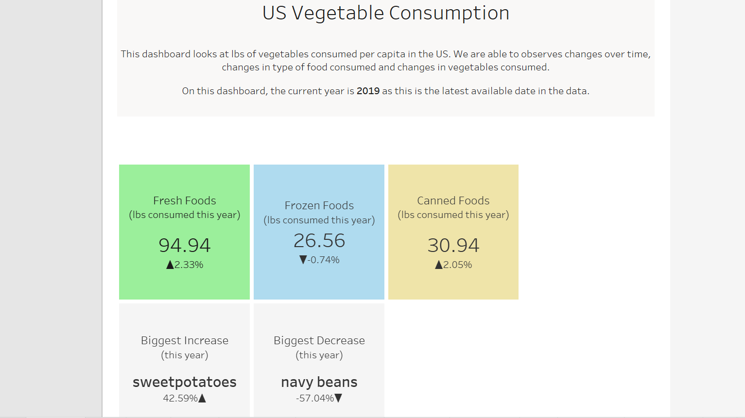
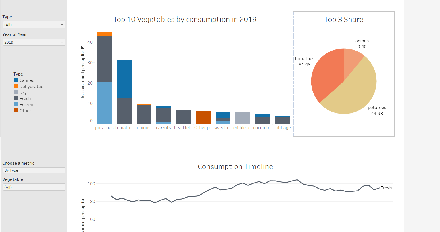
The Dashboard
The single biggest challenge of this final step was the time constraint of the task. Due to these constraints, I had to limit the scope of what I wanted to achieve. After failing at some more complex things for a time, I had to put them to the side to focus on what was going to be achievable. As such, I decided to build a working dashboard best I could first, and then try to refine and add some complexity later if time.
This was the result at the end of the day: