


Here at the Data School, we learn how to work with both Tableau and Power BI as business intelligence/data visualization tool. During our 5th week at the Data School, we had to create a dashboard in Power BI as part of our Friday project.
As part of my project, over half the charts I needed to make were 'Dot Strip Plots' which allow for the reader to see how different data points directly compare to one another, and possibly across multiple dimensions. This can be a useful way to compare data, saving space rather than using another chart like a clustered bar chart.
In the rest of this blog post, I'll be going through how you can make a 'Dot Strip Plot' in Power BI in two different use cases: when you have multiple measures you want to compare to each other, and when you have a single measure split by a legend. For these examples, I'll be using the sample data available within the Power BI app.
Multiple Measures
When you have multiple measures, you can use the dot strip plot to compare them to one another, especially with the ability to compare them across a dimension.
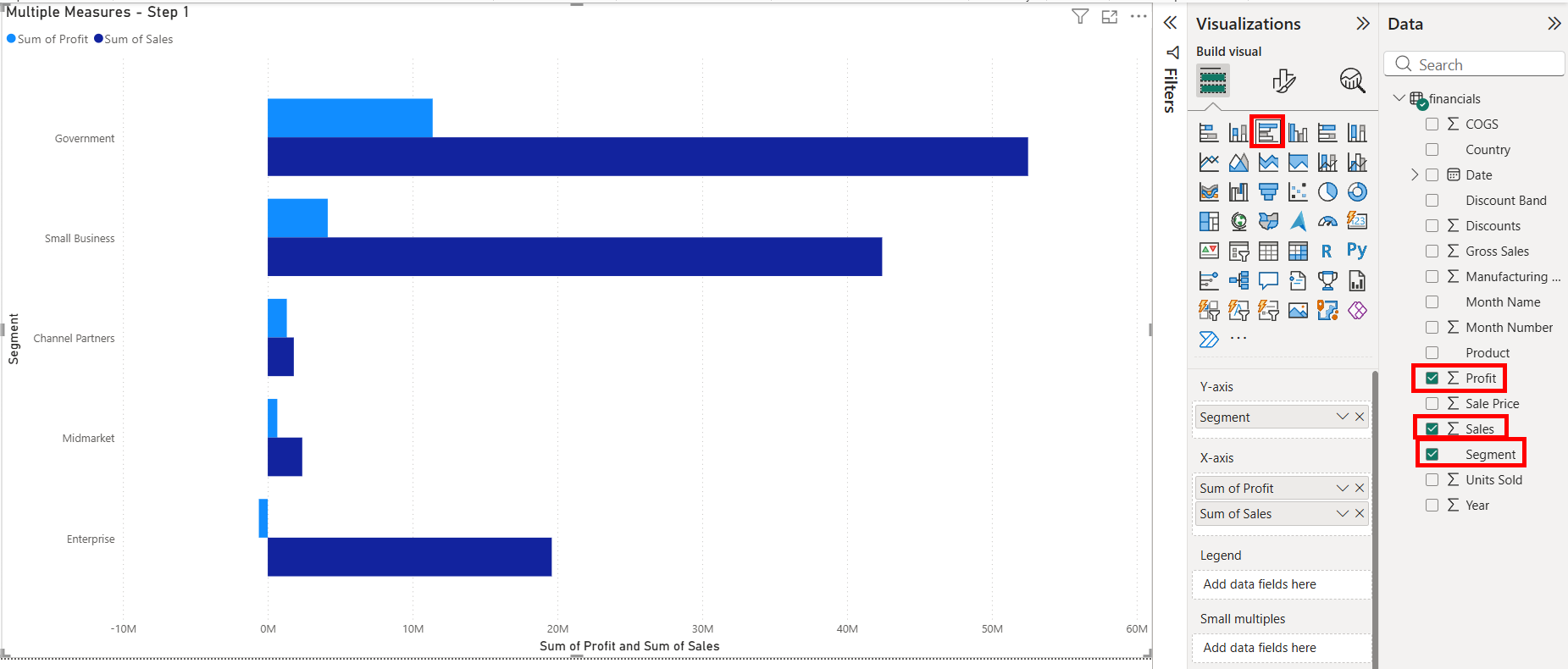
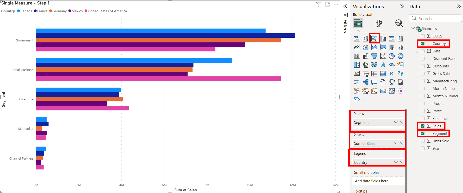
Step 1:
To start, we'll put together the basic chart. For a dot strip plot, we'll be using a clustered bar chart in order to put it together. We can find it on the Visualizations pane on the right hand side under the Build visual tab. Once that's been placed, we'll add the Segment onto the Y-axis and Sales and Profit onto the X-axis.
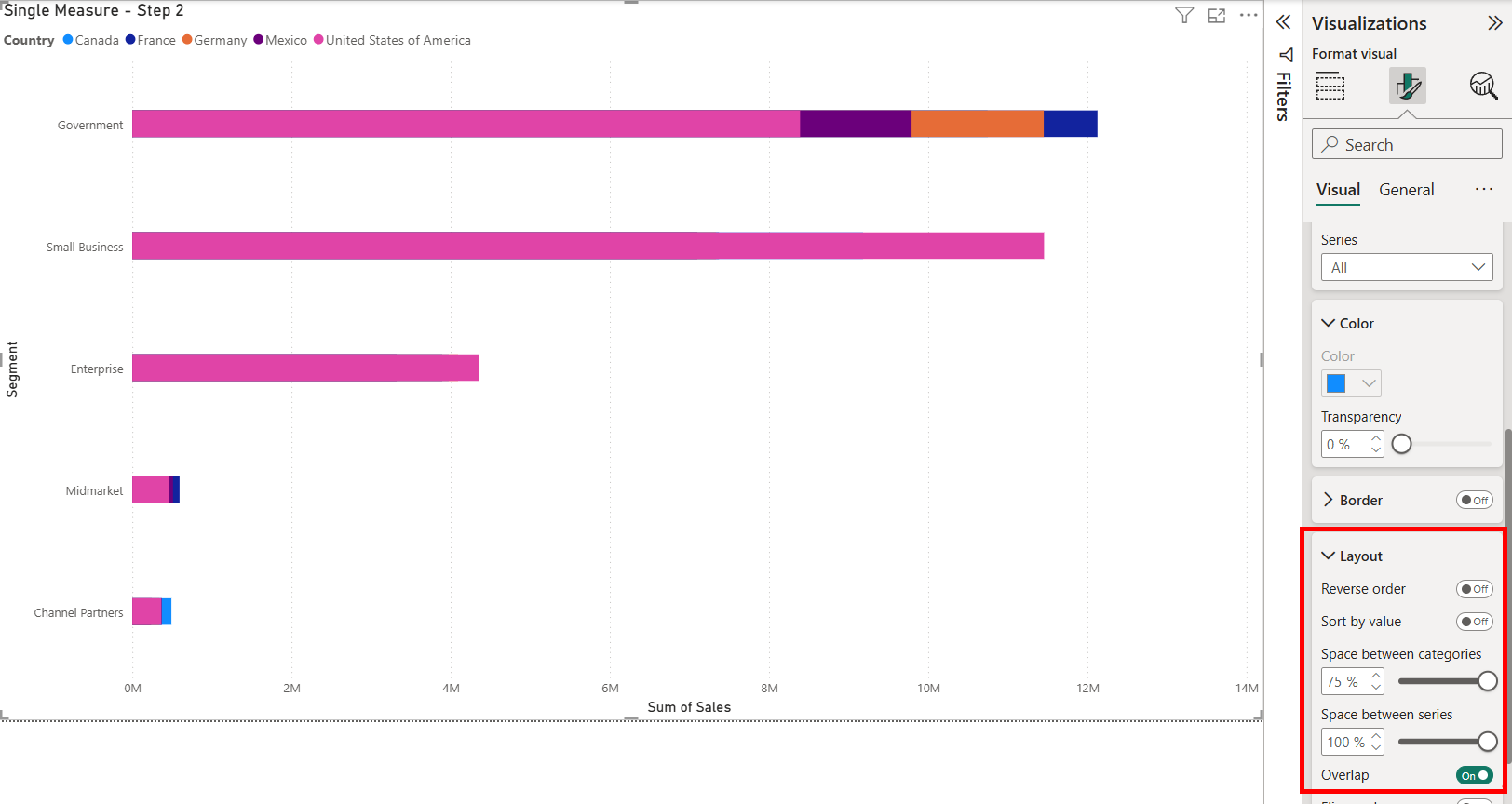
Step 2:
Here we will group the bars together. To do this, we'll navigate to the format tab on the Visualization pane. This is next option next to the Build Visual tab where we can see all of the visualization options. From there, we'll scroll down to the Bar option and open it. There we can see the color, border and layout options. Going under the layout, we'll turn on the option for the overlap, then move Space between series and Space between categories to their maximum values. This will have the clustered bars overlap each other.
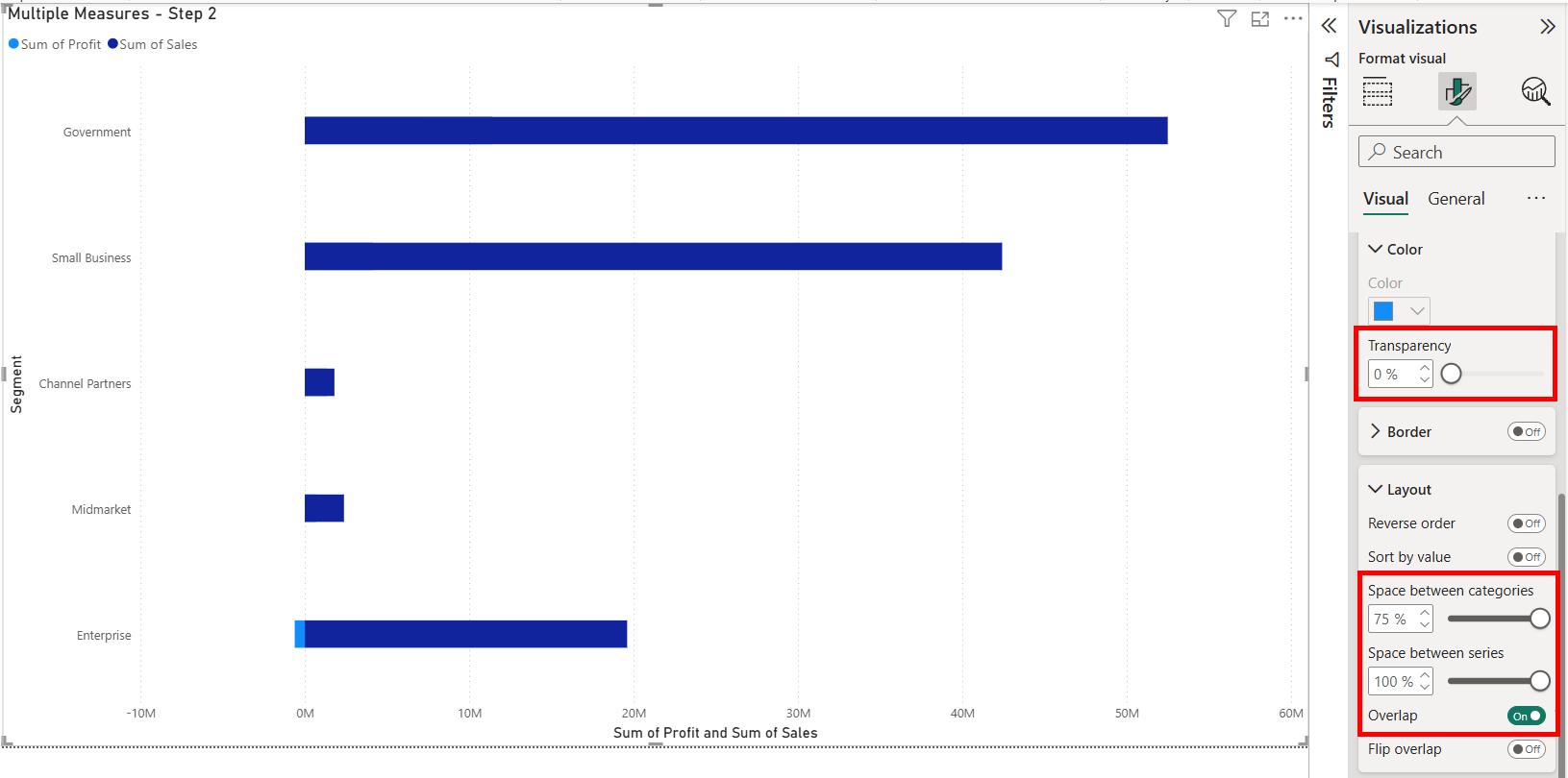
NOTE THAT YOU WILL NEED TO PUT THE TRANSPARENCY UP TO 100%.
You can find the transparency option under the color section of the bar option. This ensures that the bars are hidden when we add the dots onto the chart. This will be done for the next step, but I haven't done it yet to allow you to see the overlapping bars.
Step 3:
Now's the time for us to add the dots onto the chart. Within Power BI, we can do this through the Error Bars option on the Analytics pane. Here we choose the measure that we want to add the dot for as the series we want to apply the error bar to. We'll first enable it then put the same measure onto the Upper and Lower bound. This will put the dot onto the chart, representing where the end of the now-transparent bar is.
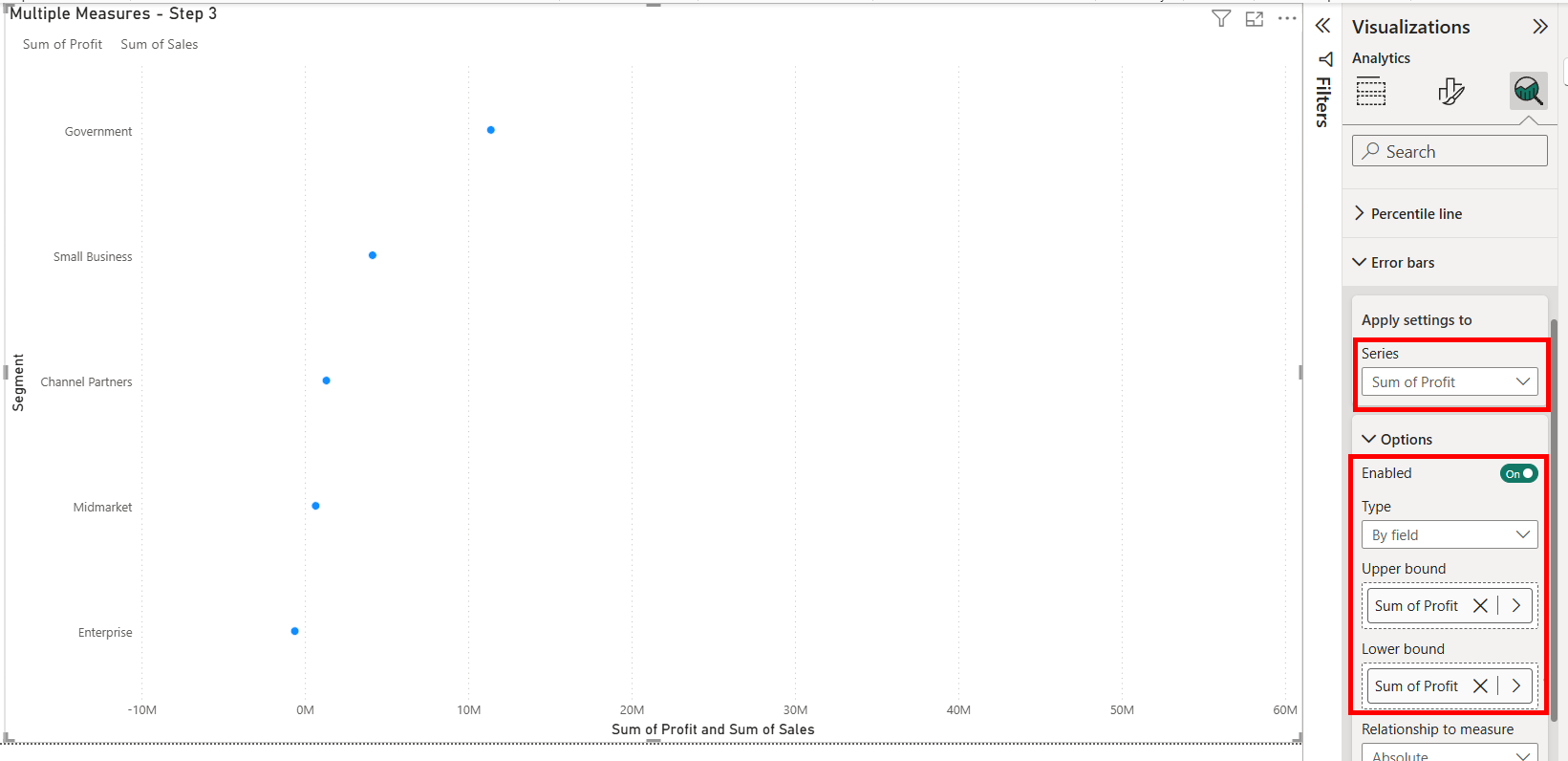
You can look under the Bar and Marker options under Error Bars to change the color, shape and size of the bar. Under the Bar option, you can change the color and border of the marker, which here I have ticked the option to use the 'Match series color' option to have it match the original color of the bar. Under the Marker option, I've also change it to be a circle.
Step 4:
For the final step, we'll just repeat what we did for the first error bar but with the other measures that we want to add dots for. We can select the other measures under the series dropdown under the Error Bars option.
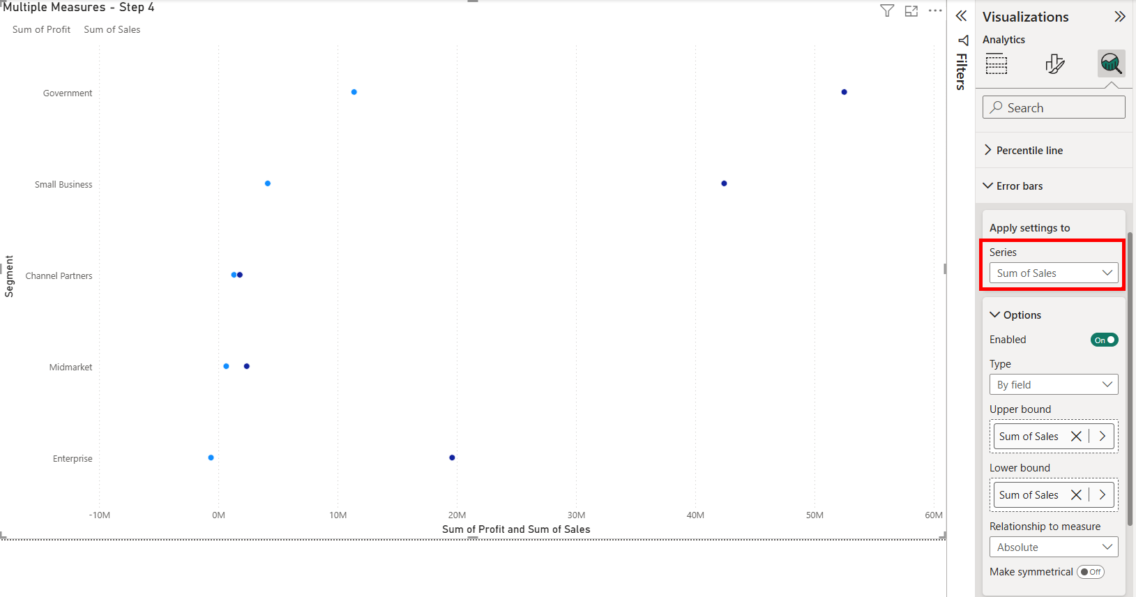
I did the same options for the 'Sum of Sales' as I did for the profit with the color and shape. This now allows for me to see how the Sum of Sales and Sum of Profit compare across the different segments of the dataset.
Unfortunately, since we have set the bars themselves to be transparent, it has now made the legend colors transparent as well, even if we have the colors on our dots. So a different method needs to be used to let the reader understand what the colors mean. This could be through a similar legend found on a different chart or using a textbox to recreate the legend.
Single Measure
Another time that we could create a dot strip plot is when we have a single measure that has been split apart through a legend. The process is similar to when you have multiple measures that you want to make dots of, but has a small difference in its creation.
Step 1:
We'll start by putting together the basic chart together. We'll create another clustered bar chart, then add Segment onto the Y-Axis, Sum of Sales onto the X-Axis, and for what is different from the other version, add Country onto our legend.
Step 2:
We'll be doing the same as before again, going under the Format tab and navigating to the Bar option to turn on the Overlap, and move the Space between categories and Space between series to their max values.
AGAIN NOTE THAT YOU WILL NEED TO PUT THE TRANSPARENCY UP TO 100%.
You can find the transparency option under the color section of the bar option. This ensures that the bars are hidden when we add the dots onto the chart. This will be done for the next step, but I haven't done it yet to allow you to see the overlapping bars.
Step 3:
Now that we have our invisible bars, we can go to the Analytics pane and the Error Bars option. Here we can select our metric, being the Sum of Sales, and enable the error bar and put our same measure as the Upper and Lower bounds. This will create the individual dots for each of the different bars created by the country field we put on the legend.
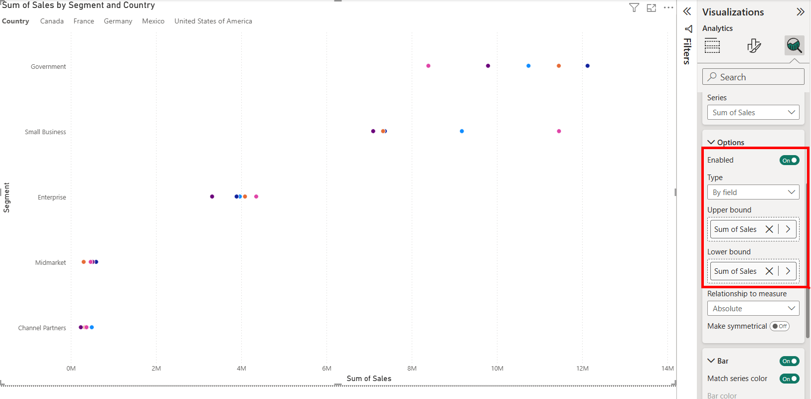
Once the bounds have been set, you can edit the way the error bar looks like under the Bar and Marker option to change the color, shape and size options for the error bars. Here I've again set the color to match the original bar chart and changed the shape to a circle.
So you can now be free to format the the error bars as you see fit! If you want the dots to not overlap with one another, you can change the how much you've squished the clustered bars together under the Bar Layout option, but will cause all the marks to separate. When you have more complicated relations with other datasets, you'll need to start using calculated measures to filter correctly, using the Calculated function.