


Today we were asked by Andy to revamp one of his old vizzes using what we have learned so far during our Data Viz 101 sessions. Here is the viz that I was allocated:
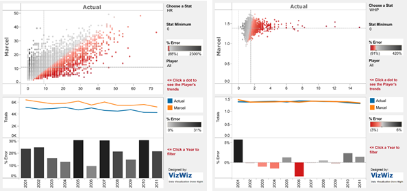
We were also given criteria to evaluate the visualisation on, such as the use of colour and filters. Here are my findings from viewing the viz using the criteria:
- Use of colour
I like how the colours used for each graph are contrasting, so you can easily differentiate between them. On the batting predictions sheet, the “% Error” bar chart maybe doesn’t have to have different colours and might look better as one colour as the bars themselves show the values without needing to have a colour. I do like how in the pitching predictions sheet, the “% Error” bar chart turns red for negative values, as it stands out instantly. There are also quite a lot of colours used, so it would be good to minimise this.
- Formatting – fonts, lines, dividers
Everything is quite tightly packed, so it might be good to spread each element out so that there’s more space. The grey background around the graphs themselves could be removed to make the viz look cleaner. The fonts do not stand out very much, and they could be made bigger and bolder (for example, if there was a title and for subheadings). I would also get rid of any border or divider lines, as well as axis ticks, to make it look neater.
- Title – Which type was used? Did it work? What would be a better option?
There is no title for this viz, so I struggled to figure out what the viz was actually about because I am unfamiliar with baseball. Adding a title, (either a question, declarative or descriptive), would help to “set the scene” and tell the viewer exactly what the visualisation is about.
- Text usage (or lack of it perhaps)
There isn’t really any text apart from the axis labels and text in the filters. Perhaps adding some analysis throughout the visualisation for key parts, or a few words to show what the insights are would be useful.
- Key message
In terms of key messages, this wasn’t any description explaining what the viz entails. It would be good to have a sentence or two explaining the visualisation at the top to help the viewer to understand what they are looking at. I didn’t know what Marcel was, so I had to Google to find out what the viz was comparing the actual values to. Having a definition of Marcel (Monkey Forecasting System) would help immensely.
- Call to action
There is a call to action to Andy’s blog on the viz; but as the logo has a white background and it is on a grey background, it sticks out a bit. It might be cleaner to keep this call to action but change the entire background of the viz to white so it blends together better. However, as I will be recreating this viz, I will not include the call to action.
- Instructions/Explanations
There were some instructions, such as “Click a dot to see the Player’s trends” which I thought was helpful.
- Filters
Filters are included in this visualisation, which I think is great because it means you can filter by different baseball stats and see how the Marcel system compares to the players’ actual values. I also really like how there’s an option to filter a player; however, instead of having this as a filter option, I would make it a highlight so that the rest of the players do not disappear and you can compare. It’s also great that there are prompts for when you can click on a graph to use it as a filter for the other charts.
- Interactivity
This viz is quite interactive, as there are filters to play around with and view different stats and players.
- Legends
The legends could be removed and instead the description at the beginning of the viz can have the words highlighted in the corresponding colour.
- Annotations
As mentioned previously, adding key insights would help the viewer to pinpoint the important aspects of the viz and what to take note of as they view it.
- Labels
In terms of labels, it may help to make the viz look cleaner if the percentage values of the bar chart were placed on top of them rather than on the y-axis. It also means the value can be seen straight away. This could also be done to the line charts, so that the beginning and end points of the lines are labelled.
- Tooltips
The tooltips include quick information about that particular point but could be better if they were formatted differently. For example, in the line chart the headings could match the same colours as used in the chart itself.
- Context
I do like how there are reference lines on the Marcel/Actual chart, as this helps to add context compared to the average. It may be useful to also add these lines to the other charts to add further context. It also means you can clearly compare the players to the average across all players. Perhaps also adding more descriptive axis labels to help explain what the axes represent, or a colour legend within the key message or description of the viz.
- Chart type(s)
I think the chart types used are good overall, but maybe the “% Error” bar chart isn’t needed as it displays similar information to the line chart above it. I do like scatter plot graphs in general, and I think this works well for comparing the Actual vs Marcel values.
My Version
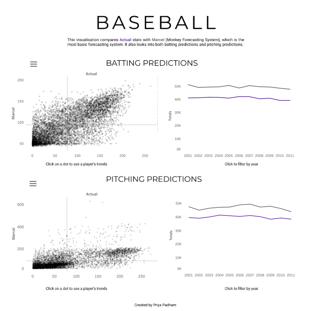
For my attempt at redesigning the viz, I decided to simplify things a bit and got rid of the bar charts. As mentioned previously, I felt that the bar charts were almost repeating what the line charts were showing, and the information can still be found in the line chart (i.e. when you hover to view the tooltips you can still see the Variance %). I completely changed the design and tried to have everything on one dashboard. I got rid of all divider lines and borders so that it would look cleaner overall.
Originally, the scatter plots also showed the “% Error”, but I thought this may be confusing and I wanted the focus to be on comparing the Marcel and Actual values. I got rid of this and made the scatter plot one colour. I also decided to change the colour of the line charts and add the Actual and Marcel colours to my description at the top of the page. Adding both a title and a description helps to tell the viewer what the viz is about and what to expect, which could help someone like myself who is unfamiliar with the topic. To make things neater, I also included show/hide buttons which contain the filters for the graphs so they are easily accessible. I kept the instructions as I thought that was useful to guide the user.
Although I ran out of time, I would have loved to add some labels to the line graphs so you could see straight away the values at the end of the line. I think annotations would also have been useful to pick out key points or trends. Perhaps some descriptions of what terms mean or some further background would also be helpful. Overall, this was a fun activity and allowed me to see what can be achieved in just a few hours and what aspects to focus on more next time!