


The Task: To makeover/edit the viz that we sent in for our Data School applications.
My original take on Makeover Monday data from the infamous US elections of 2016:
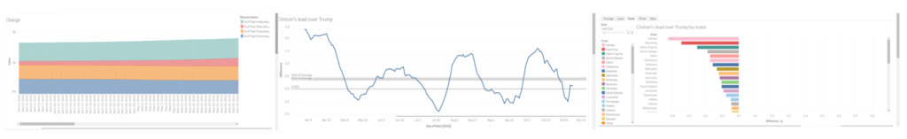
Votamatic Take 1
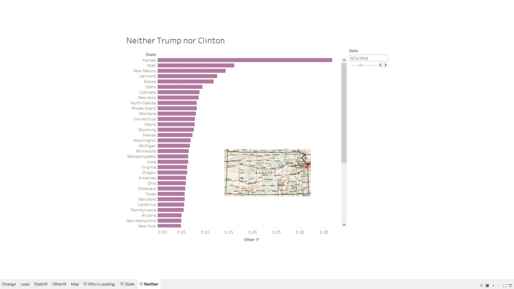
The story here is basically that in the last few months of campaigning leading up to the election, neither Trump nor Clinton saw their overall support increase (at least in this sample data). Instead, a large number of undecideds were won over by other candidates, seeing neither Clinton nor Trump as a palatable choice. The third chart in the story shows Kansas as the state where Trump has the largest lead over Clinton. However, a final reveal (in the last dashboard of the story) shows that actually Kansas largely supported Other candidates.
Intent: Precise and interactive.
What worked: Using a variety of charts types.
What didn’t work: I didn’t like the scroll function on the first sheet, and this was remedied in the new version.
What I changed for the second version:
- Combined graphs that worked well together into separate dashboards.
- Remove colour that wasn’t adding anything to the story.
- Added a few graphics to make the presentation a bit more engaging.
- Fixed some of my filter issues.
votamatic redux
Things to continue to work on: I would like to make my vizes a bit more visually appealing and accessible rather than exploratory and use fewer of the Tableau default settings.
Takeaways/Feedback:
- Tooltips – don’t forget to clean them up.
- If the tooltip includes a sentence, the sentence should go at the top (before the rest).
- If the story was about Trump’s lead, I could just show the states where Trump was leading (that would have gotten rid of the scroll bar.)
- Make sure labels and axes are clear.