


There have been far too many gun deaths in the United States.
Today’s dashboard took a sombre turn as we looked at “Mapping the Dead: Gun Deaths Since Sandy Hook” by the Huffington Post and took the data to create something for ourselves. If you haven’t seen it, I recommend you have a look at it before continuing on with this post. It’s really, really emotive and excellent – It also tells a powerful story.
Since this came out, there have been other iterations of the visualisation, such as this one by Periscopic and this one by Slate. I found these when I was hunting for some inspiration to what and how to map my data in a way which was effective and powerful. I also didn’t have much knowledge on the narrative on the amount of gun deaths in the US – apart from the fact that there were too many and the NRA existed and stopped a lot of gun control laws or something. But once I started delving in, the narratives I found were odd perspectives, and showed the dirty side of data – Using a different metric of comparison to tell *your* story. Which I guess isn’t wrong per sé and is a way of looking at it. But I’m not going to wade too far into this murky river.
So let’s talk about the data.
I think I’ll continue my theme from earlier, and show my properties pane on the left, before and after the processes I ran/added, and talk through them before showing and navigating through my dashboard.
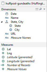
Original Dimensions & Measures
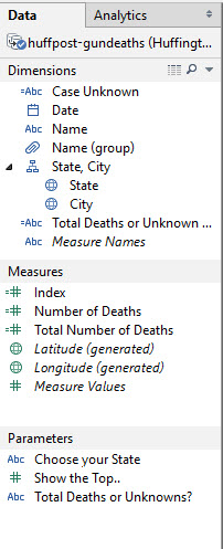
My Dimensions & Measures
You might be able to see, there was some amendments to make; the ‘Lng’ field had to be changed – A caveat here; I just had to go back into my data and change my latitude-longitude from the Tableau generated ones, to the ones that the Huffington Post provided. The beauty of this? It actually didn’t take long. Beauty of Tableau!
Anyway, the Lng field had to be changed to a geographical field ‘Longitude’. I also created a group which split off the ‘Unknown’ names and the named victims in the data set in order to create a view.
The Case Unknown calculated field is a dynamic text field which changes depending on whether unknown names or total deaths is selected, giving a different paragraph using a CASE statement. Total Deaths or Unknowns is what enables me to swap between two different views using a parameter – Which is a pretty cool tip I learnt from Hashu during Tableau Tip Week (using his post here)
The Index again I used to create a shape for my ‘Hover for instructions’ part. Number of Deaths did a Count(Name) as this counted each name of the victims, whilst Total Number of Deaths was a single number to show the total number of deaths.
You can see my parameters – I’ve gone a bit ‘Show the Top N’ values crazy the last few days; I was going to add in a ‘Choose your State’ part but decided against it.
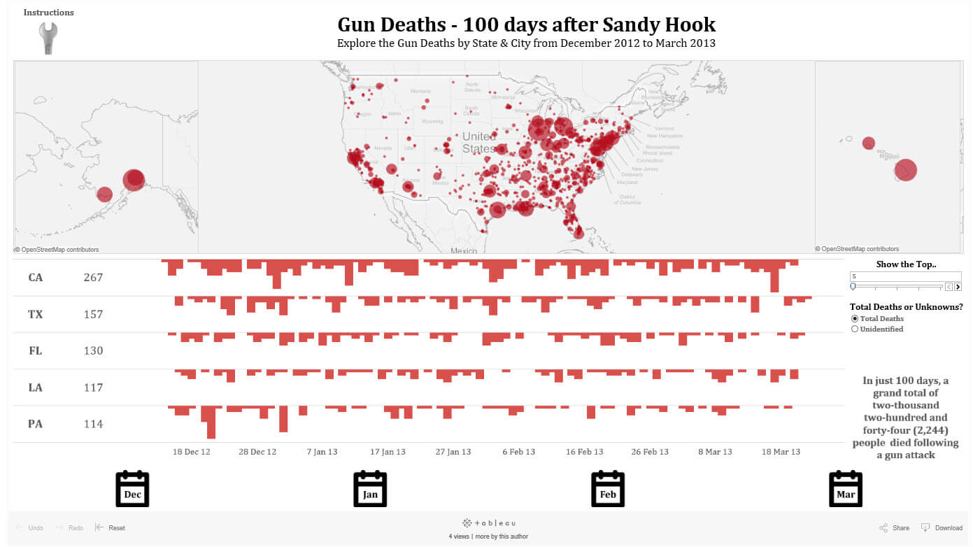
My final viz can be found on Tableau Public through this link or by clicking on the picture. You’re able to filter by month, you can hover to find out more about the deaths in a city or show the top 5, top 10, top 20 or top 25 states with the highest deaths – And switch the views to see the number of unidentified victims within the totals.
I hope you find this visualisation informative; It sends a strong message, and I was shocked to find out more about the level and spread of gun deaths in America.