


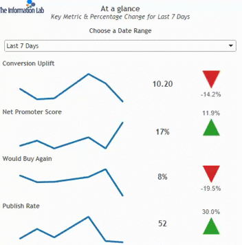
Last week, we had our fourth client project and within that, myself and Hashu found ourselves doing a dashboard makeover for the client and within this, one of our ideas for the dashboard included having a switch between two views, as shown on his blog during Tableau Tip Week.
Our objective was to use a parameter to switch between two shapes – One to appear when there was a positive change (so the shape would have the text above the shape) and one to appear when there was a negative change (so the shape would have text below the arrow)
This was a little hack to ensure that the text field appeared as we wanted it to (as shown below)
 So in order to do this we hard to;
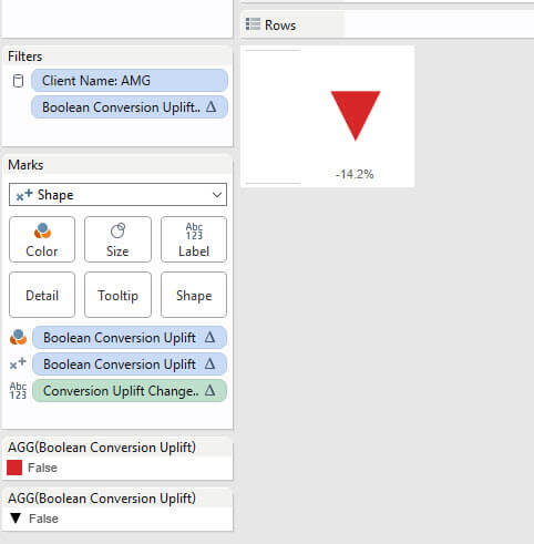
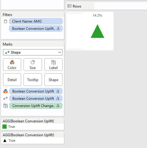
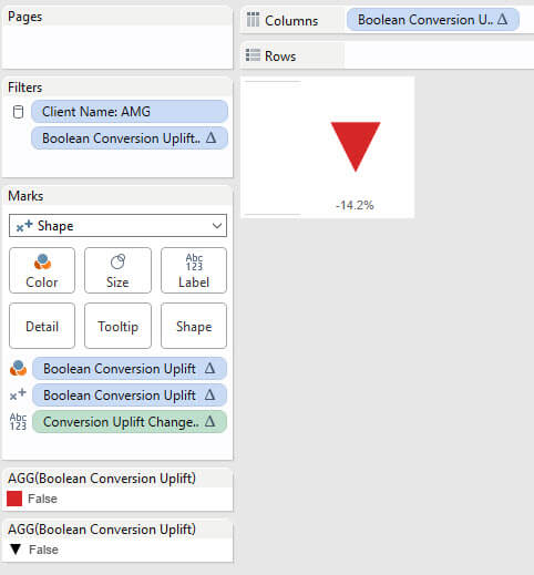
- – Create negative/positive Boolean – Very straightforward, just adding the ‘measure’ to a calculated field and having [Profit]>=0 so if this added to the filters card
- – Second, we had to change the mark type ro ‘Shape’, add our Boolean to the colour shelf on the marks card, and also onto the shape. Our measure would go on text.
- Then change the colour to Red if negative or Green if positive depending on what your value change is, and similarly change the shape to an arrow. We used a red filled down arrow as our change was negative. The text can be edited by clicking ‘Label’, and moving it to be centre-below the shape.
- This gave us something which looks like this.
 Once you have both of your arrows, REMEBER TO REVERT YOUR CALCULATION BACK TO ITS ORIGINAL FORMAT! So for me, the green arrow should disappear once I do this…
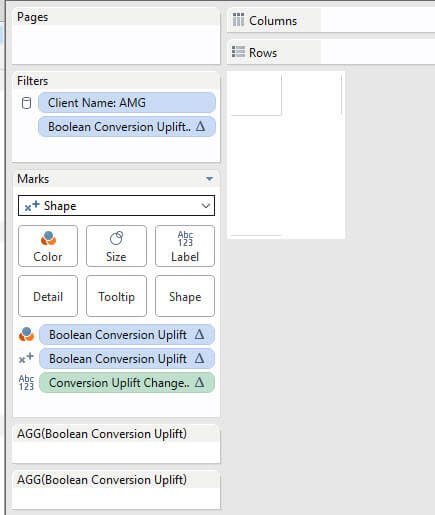 Awesome.
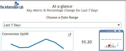
Putting something on either rows or columns, and then hiding it (right click the pill, show header)
And finally, order was restored, and we had this beautifully dynamic up/down arrow where the labels also moved. A very subtle change, but one which aids the understanding of the dashboard.