


Dashboard Week Day 2: the challenge, predictive workflow and result centred around El Niño and La Niña.
Day two of dashboard week kicked off, this time centred around the natural phenomena referred to as El Niño and La Niña.
The task was set to get historical Southern Oscillation Index (SOI) from the NOAA website and work from there. The SOI is a measure of fluctuations in air pressure between the West and East of the tropical pacific and is meant to correlate with El Niño and El Niña episodes.
In short, prolonged periods of negative SOI should coincide with abnormally warm ocean waters in the East (El Niño) and positive SOI with La Niña.
Below you can find a quick overview of how I approached this day and ended up with my viz below.
1. The Challenge
I set out looking for some extra data to test how well we can use the SOI data to either predict, test or find correlations to El Niño episodes.
NOAA likewise has data available referred to as the Oceanic Niño Index (ONI), which can be described as a measure of El Niño and La Niña episodes ( ONI > 0.5 = warm episodes, < -0.5 = cold episodes). Thus I set out testing this data.
2. The Workflow
First things first, clean up the data. The SOI data came in XML format and a nice ‘long’ shape to use in Tableau. Just a two tools to format the field type and create a date field. The ONI data required a bit more steps (nine) to transpose the date fields and create additional columns to extract the Month field from the running average data and add a date field.
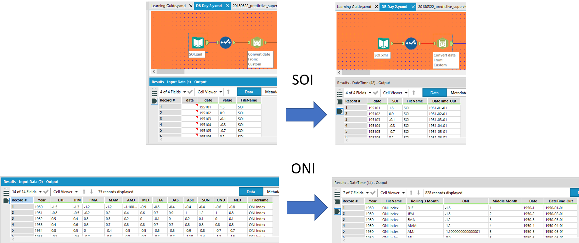
From this point both data sets could be union-ed on the date field and explored in Alteryx and Tableau.
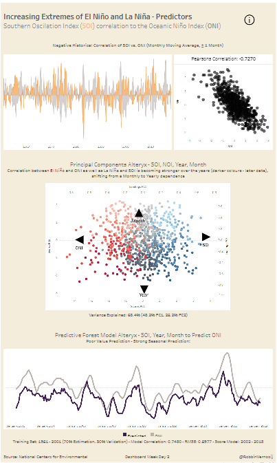
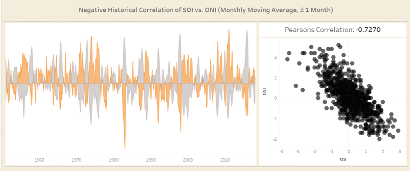
First visually inspection (left side) revealed the a possible negative correlation between SOI and ONI. both peaking on opposite sides over time. This was then confirmed by quickly running a correlation matrix in Alteryx, giving a negative correlation of -0.73 using the Pearson correlation coefficient (-1 = strong negative, 1 = strong positive correlation).

Next came several predictive tools available in Alteryx to further explore this correlation and to see whether we can predict ONI values (possible El Niño or La Niña episodes).
This by far took most of my day as models had to be optimised, validated and scored accordingly. Seasonality plays a strong role in this data set and changing climate is giving rise to more and more Niño or El Niña over time, making it difficult to work with.
However, I did manage to extract some further useful information, quantifying the observed seasonality as well as increased episodes.
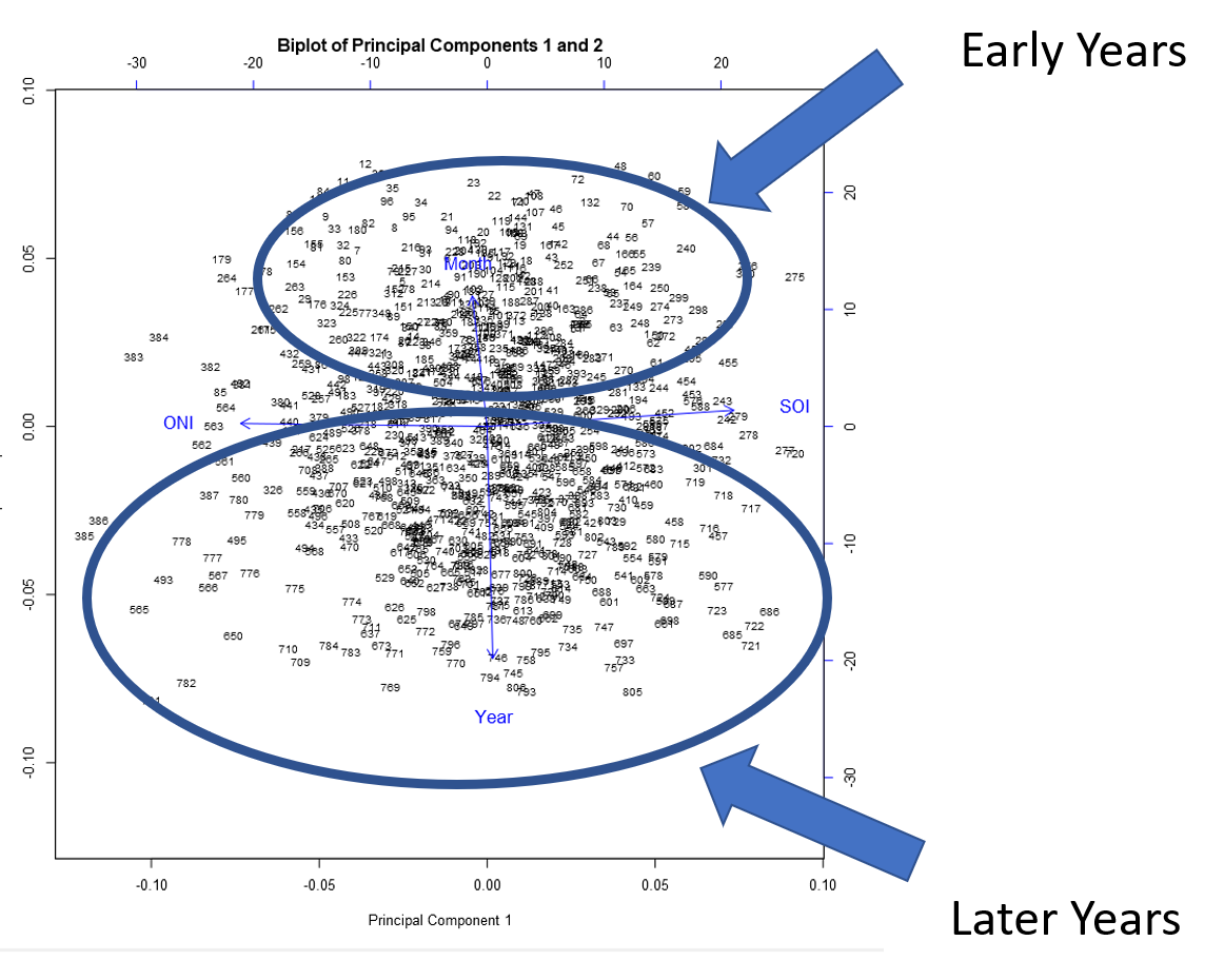
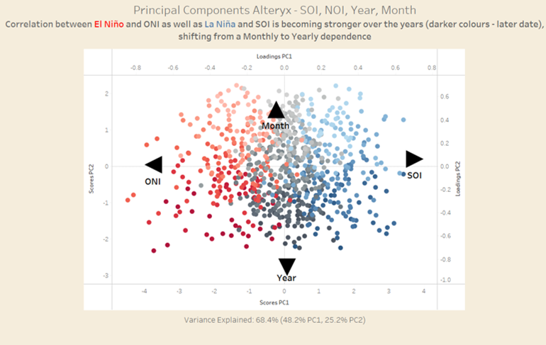
Principal Component Analysis (an unsupervised data reduction method, check out my earlier blog post for more detail) emphasise clustering and higher scores of the later years and months closer to the SOI and ONI Values on the PC1, whilst PC2 captured a shift from Monthly to Yearly dependence.
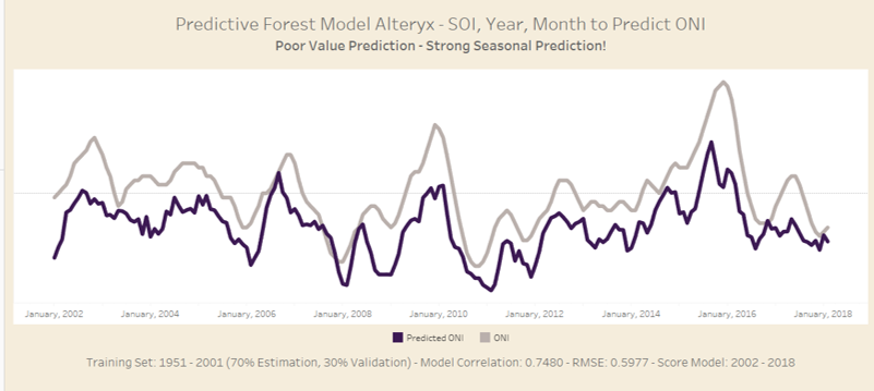
The last part consisted of predictive models and time-series, tested against the data set, trying to predict ONI values based on SOI, years and months. Whilst most models performed poor, a final setup using the Forest model returned a result with 75% correlation in the test set (but a fairly poor RME of 0.597).
I setup the data as follows, given that the time-series predictions could not account for the seasonality properly:
Data ranged from 1951 – 2018 (monthly).
- split up data into 1951 to 2001
- Use 1951 to 2001 to build the model (70% Estimation, 30% Validation)
- Use the known SOI, month and year values from 2002 to 2018 to predict the ONI values
- Compare Predicted vs. Actual
I will leave you in suspense for now, check out the results below!
3. Results
In order to create a coherent dashboard, all data was exported from Alteryx and put in Tableau.
The first line chart and Pearson correlation coefficient was slight touched up and changed into an area chart to enhance the opposites of ONI and SO. The scatter plot was left black but allowed for transparency to better show the overlapping data points and density in the centre.
The Principal Component Analysis was enhanced by dual colours to the data points. Red in case those dates were reported to be El Niño (red) or La Niña (blue) episodes, with darker shades representing the later dates, making it easier to see the change in trends (further towards ONI, SOI and Year the later the date).
Now the prediction… As you can tell below the actual values were poorly predicted, however, the seasonality was impressively well picked up by the model. This means we successfully quantified the seasonal changes from 2002 to 2018, which the time-series failed on. Not optimal, but quite a decent result for just a few hours work.
Last things, were touching up the tool tips (make this a habit if you aren’t doing this routinely already), and adding a light background colour to emphasise the charts and place the necessary (lengthy) text a bit more on the background.
That’s it for now, feel free to contact me about any of the content on Linkedin or Twitter @RobbinVernooij