


In an earlier blog post I started to talk about some of the first steps to take when approaching an iterative design process, and in case you missed it you can find it here: /ryan-lowers/dont-be-a-hater-be-an-iterator-part-1/.
In this post I’ll be picking up from where I left off in the previous post and wrapping up what I’ve learned about using iterative design to create dashboards using Tableau, hopefully by the end you’ll have some pretty useful tips to find a method that works for you.
Take breaks!
This may seem like an obvious point to suggest but I can’t stress enough how important this is. Plugging away at something endlessly may seem like a good idea but it’s very easy to completely lose sight of what you’re trying to achieve in the first place. Taking a break and coming back with a fresh set of eyes makes it easier to spot things that you missed initially, and especially if you’re stuck for inspiration, taking a step back and doing something completely different can help with coming up with new ideas. Maybe just keep a pen and paper handy as inspiration can come at the unlikeliest of times.
Feedback
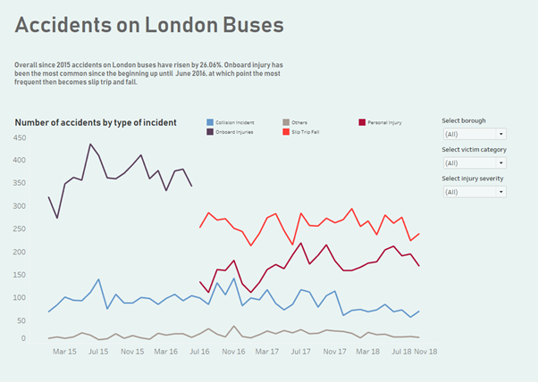
At this point, a while after my initial attempt at the TFL dashboard I worked with another Data Schooler to produce the version shown above. I was pleased with how simple and clean it looked in comparison to the original version, and it made use of set actions with allowed each line to be clicked to drill down further into detail. The feedback when presenting this though highlighted that the choice of colour didn’t reflect the subject matter and the choice of functionality used to drive the visualization wasn’t well suited to what the dashboard was trying to show. On the face of it there is nothing on the dashboard that gives the viewer a quick sense of the story within the data.
Speaking more generally, feedback is a very useful part of the process because:
- A person giving feedback can act as your audience and will be best placed to comment on whether or it is clear in what it is presenting. They won’t have the benefit of any context that came from building the work so can state whether it is easy to interpret.
- Receiving feedback can bring to your attention improvements you didn’t initially think of or provide ideas for a future iteration.
- It can highlight more subtle areas for improvement such as colour and composition.
- Asking a range of people means it’s possible to get a wide range of opinions.
- It’s possible to give feedback to yourself and draw up the questions from step one, “Who are my audience and how do I expect them to interact with the dashboard?” and “What question does this dashboard propose to answer and does it actually do so”
An important note on feedback though, it must be constructive! Comments that don’t allow you to learn or improve are no use to anybody.
Know when to walk away
Iteration is a cyclical process and therefore by nature and can go on indefinitely; it’s easy to get sucked into a cycle of constantly making changes and then noticing other things that can be improved. This is a good skill to have but it makes completing work quite challenging, and therefore the final tip is knowing when to walk away. This isn’t to say that you should eventually just give up and stop caring, but rather knowing when to make a judgement call and realise that any additional changes that are made will have diminishing returns.
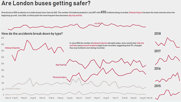
Below is my final iteration of the bus dashboard which I created using some very useful feedback I received. Even at this stage there are tweaks that could be made to it, but I’m choosing to hold off because continually changing it would prevent me moving onto any new pieces of work. A better approach at this stage would be to take note of the lessons learned and try to apply them to the next piece of work.
The point at which you should call time will vary from person to person, but below are a couple of tips that will help determine whether it’s time to call it quits.
- Does the dashboard answer the question you set out to answer? If not, what is preventing it from doing so? If you present it to someone without any prior context, can they see the message you are trying to convey?
- Is there anything unnecessary that can be removed while still maintaining the clarity of the message or analysis? This could be unnecessary charts, text, colours or graphics. Once at a stage where anything that is removed detracts from the clarity then it’s probably a suitable time to walk away.
That pretty much wraps up all I’ve got to say about iterative design for now but it really is a learning process. I’m far from an expert at, and I’m still trying to tie down a way of working that suits me, but I’ve learned a lot writing this post and experimenting with the process so hopefully it’s useful to others as well.