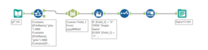
For today’s dashboard week we received data about major league baseball containing 147 years worth of baseball data from the retrosheet. This was also parsed using the XML tool and we had to use the data dictionary to match the header to the corresponding values. Data preparation was fairly simple as we just needed to obtain headers for every column containing our data. We started with a wildcard input to read in all files from 1871 – 2017. The Date Time tool converted the data columns from a string format to a date format. Lastly, the multi-row formula tool separates the data into different columns.
Next step was visualising the data, for me that was the biggest challenge because I have no knowledge on baseball and at a first glance of the data I had no idea what the data meant especially when using terms like “intentional walks” and “errors”. So I solved that problem by researching baseball, reading up on it, and asking Andy many, many questions about baseball rules and how people play. I then looked at previous visualisations of baseball and got inspired Jacob Olsufka he created a lot visualisation about baseball so it was interesting exploring his take on it.
A problem I encountered with the data is that I need to figure out total winning scores because the data was separating winnings by visiting team and home team so I had to create a calculated field to get a list of winning so I had to fix on the day because every row represented an exact day where a game was played:
(if ({ FIXED DATETRUNC(‘day’, [Date]), [Home Team] : SUM([Home Score]–[Visiting Score])}) > 0
then [Home Team] else [Visiting Team] end)
I then had to calculate the winning score:
{ FIXED [Date], [winning team ] : SUM(1) }
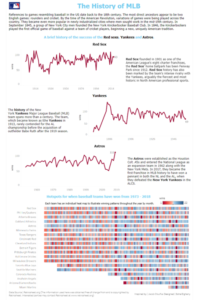
This is what my end result data visualisation looks like: here