The donut chart is one of the popular means of visualization. I was looking for different types of donut charts when I stumbled upon this Blog which explains about the expanding donut chart. I found this really interesting and wanted to try it out myself. An expanding donut chart helps one to analyse on level deeper. In my customer project, I had a use case where I could implement this. The client was quite impressed with this representation which motivated me to write a blog explaining how to create an expanding donut chart.
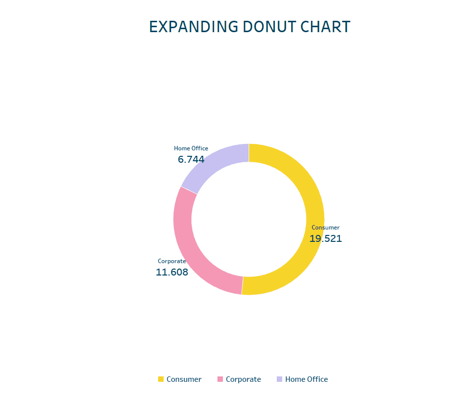
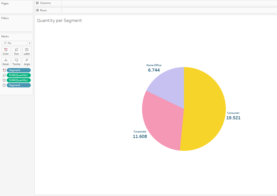
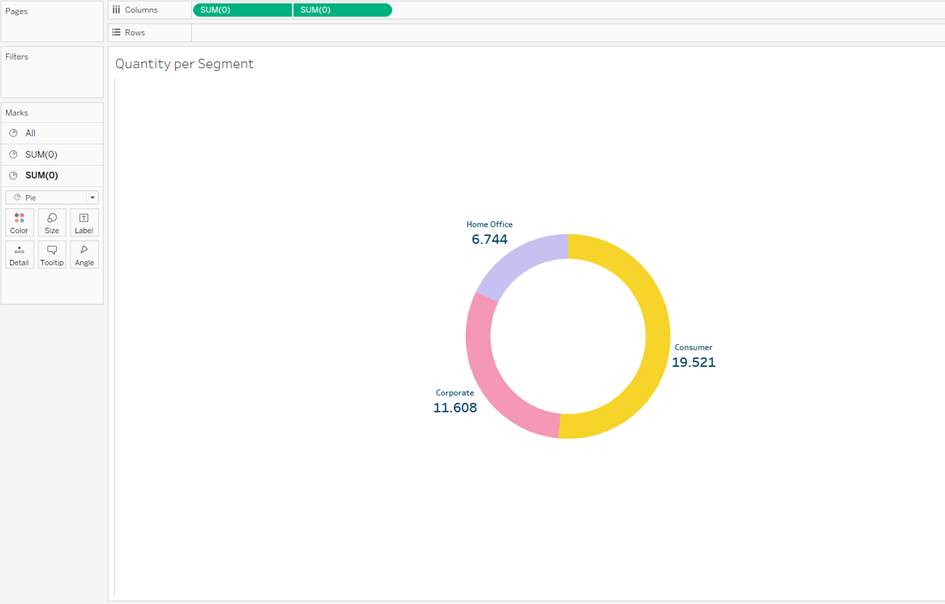
Using the Sample Superstore dataset, I created a simple Pi-Chart that represents the segment-wise quantities.
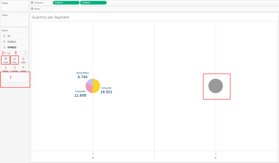
The next step is to convert it into a donut chart. In order to create a donut chart, we need two Measures that act as Placeholders. I simply added two “0”s on the Columns which was then converted automatically to SUM(0) by Tableau. It is irrelevant what aggregation is used as these act only as Placeholders.

For the second Pi-Chart, the one on the right side of the screen, all the values from the Marks area were removed, the color was changed to White and the size was adjusted such that it would be smaller than the other Pi-Chart.
Then it was made dual axis and the Headers were hidden. After a couple of formatting, the donut chart should look like the one below.
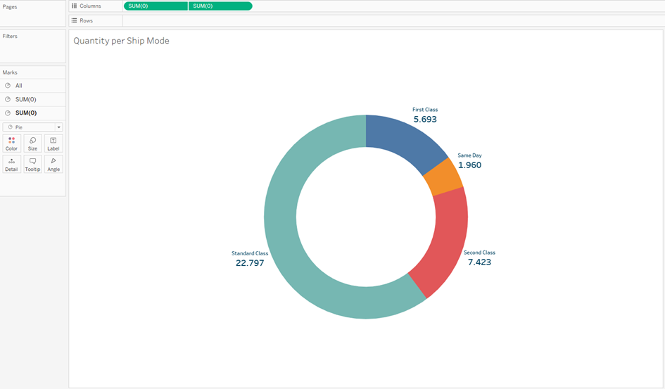
Through the expanding donut chart, I want to find out the quantities that were delivered through different “Ship Mode” for each segment. Using the above-mentioned process, the second donut chart was created which shows the quantities per Ship mode and it should look like the below one.
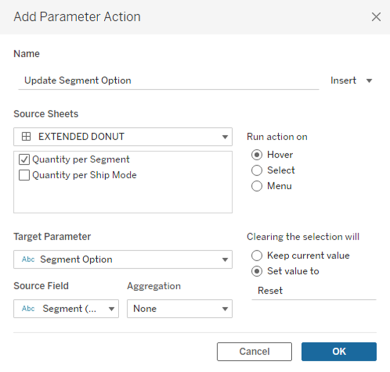
In the next step, a parameter is created that enables the interactivity between the donut charts on the dashboard. The logic is that, when a slice on the main donut chart is selected, the corresponding slice should be shown on the expanding donut chart. Since the selection happens on the main donut chart, the values of the Segment should be used to create the parameter. Additionally, an option “Reset” is added so that nothing will be selected on the expanding donut chart when nothing is selected on the main donut chart.

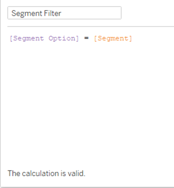
The next step is to create two calculated fields. The first one checks whether the value selected on the parameter matches the value from the field Segment.
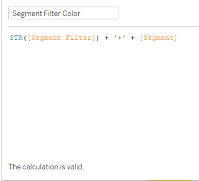
Using the second calculated field Tableau is informed on which segment we want to focus on. For this purpose, the result from the first calculated field, that is “Segment Filter” is concatenated with the column “Segment”. Since the result from the first calculated field is a boolean, it needs to be converted into a string. The formula will look like the one shown below.
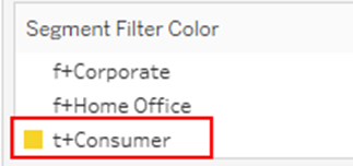
The newly created field “Segment Filter Color” is now added to the color on the expanding donut chart. The color on the “Segment Filter Color“ should be selected in such a way that, the segment containing “t+” should match the color of the corresponding segment from the main donut chart. The segment containing „f+“ is changed to white so that they are not visible on the chart.
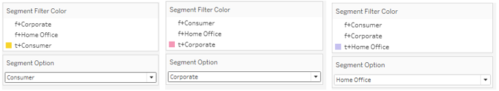
Now show the Parameter and make the above changes for all the Segments selected on the parameter. It should look as shown below.
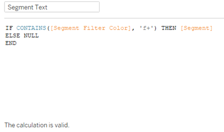
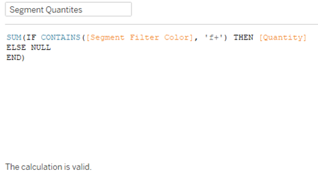
A few more calculated fields need to be created with which the texts and the values on the label and tooltip can be made dynamic.
The following formulas are used to create the fields for the texts and the values on the main donut chart.
For Text
For Values
The following formulas are used to create the fields for the texts and the values on the expanding donut chart.
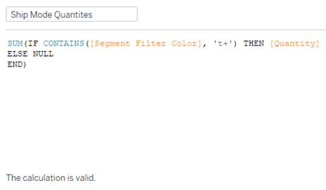
For Text
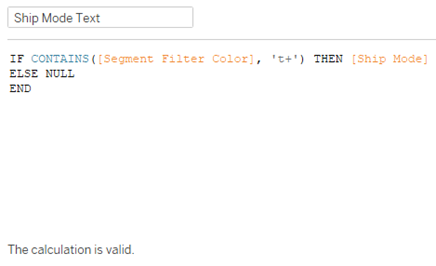
For Values
The fields on the text area on each of the donut charts should be replaced with the corresponding newly created calculated fields.
In order to make the slices on the donut charts look cleaner, a white border is added by clicking on the Color property of the Marks card, clicking on the Border dropdown, and choosing White. This step is performed on both the donut charts.
Now we are ready to create the dashboard. First, the expanding donut chart is added to the dashboard followed by the main donut chart. The main donut chart is added in floating mode and it needs to be positioned in such a way that there is even spacing between each chart. This might take a few tries to get just right. The main donut is made transparent by clicking on Format > Shading and under Worksheet choosing “None”.
The parameter action is now created so that when we hover on the main donut chart, the expanding donut chart is displayed.