First day of Dashboard Week started with survey data, because why not. (If you would like to know more about Dashboard Week, have a read at Andy’s blog.)
Since we haven’t had yet our training on how to handle survey data, I was incredibly grateful to have attended the previous Viz for Social Good hackathon, which involved working with survey data from Justice & Peace NL. This made the task ahead less daunting, but not so much less hard.
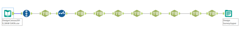
First, the data. It looked pretty straight forward to start with, but then I quickly realised that in order to analyse it properly in Tableau, it needed some work as some fields included multi responses in one row. Cue lots of Text to Column:
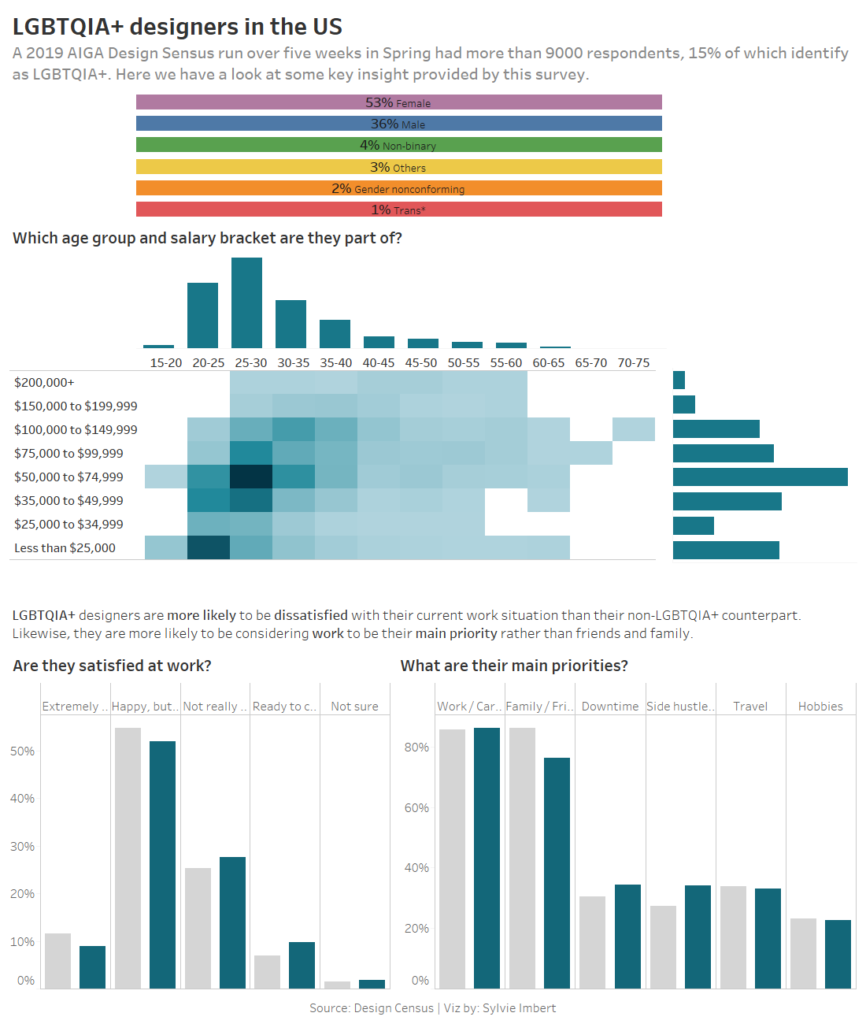
Then, the angle. The survey gave the respondents the option to say whether or not they identified as LGBTQIA+, which I thought would be quite interesting to focus on. The only issue was, it didn’t narrow down what to focus on ultimately in terms of the questions answered. I had the idea of having a chart for each letter of the acronym (L for “life priorities”, G for “gender” etc.) but that proved too overwhelming. So instead, I focused on some key demographic elements plus some insight that I had found.
I had set myself the goal of not creating yet another line chart or bar chart and failed miserably, however I did try! I went through an iteration process which included: a map, some packed bubble charts, an attempt at a waffle chart before giving up. The final result isn’t quite what I have in mind, but I’m still pretty happy with it.