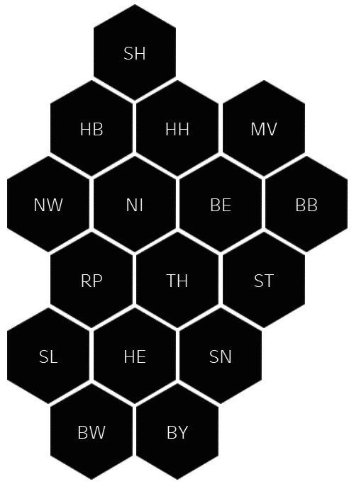
As Heinrich pointed out in his previous blogpost, there isn’t really a good, at least half representative hex map of Germany. Yesterday I made it my task to change that.
I did some research which resulted in the classic “there are many ways to Rome” situation but I decided on the path that seemed quite doable to me. The approach is described in detail here and is based on the approach of Matt Chambers.
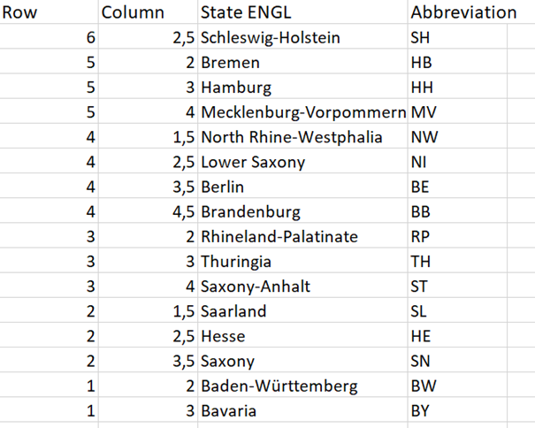
I actually used pen and paper first to work out the coordinates for each state – not latitude and longitude, just plain numbers. Luckily there are not too many states in Germany, but some of them have umlauts which one has to be careful with when joining data. I then put them into a simple excel file where each row contains the state name, the coordinates and an abbreviation for each state:
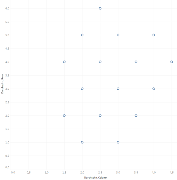
Next I opened the Excel file in Tableau and drag the Column pill to the Columns shelf and the Row Pill to the Rows shelf, both as averages - this was recommended in a blogpost I read but adding the SUM of Row and Colum to their shelves doesn’t change anything for me. Putting the State pill onto Detail will assign a circle to each state right where you set the coordinates:
Next up the shape need to be changed to a hexagon which needs to be downloaded first as Tableau does not offer one by default. The size of the shapes will need some adjusting and if you want to you can create a dual axis to add the labels to each hexagon (don’t forget to synchronise the axis). Also, as Germany is a bit longer than wide, it makes sense to adjust the whole chart accordingly to make sure the spaces between the shapes are somewhat equal. The rest is just a bit of formatting – removing unnecessary lines and headers, cleaning up the tool tip, etc..