Dashboard week kicked off today with a dataset from the Environmental Protection Agency. The data contained information on US state facilities, their associated environmental permits, industry types and much more. This was all provided to us in Andy’s morning blog, with the ominous final line: ‘There are lots of rabbit holes and traps to fall into that WILL significantly hinder their progress and the quality of their work. Let’s see who can avoid those. ‘
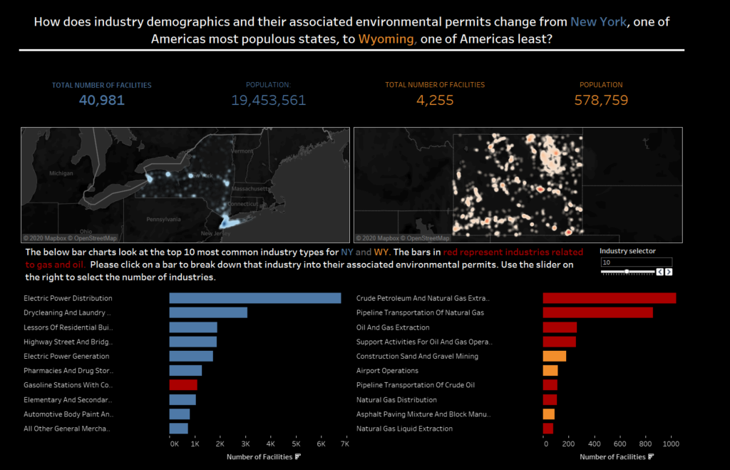
When i first took a look at the data, I thought doing a nation wide analysis of facilities would be the way to go. However I (and the rest of the cohort) soon realised how big a file the collective states was, and decided to focus my analysis on individual states. I thought it would be interesting to see how industry demographics change across one of the most popular US states, New York, and one of its least, Wyoming.
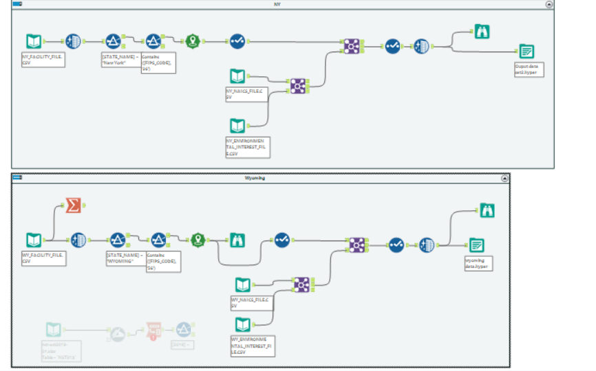
In Alteryx i connected to the data and used the spatial tool create points to visualise my data on a map. I realised that some of the data was mis-classified into incorrect states and so tried to filter these out beforehand. My biggest hurdle was connecting the permit level data from NAICS and the environmental data to my facility level data. Whenever i joined, whether it be on just the unique facility ID or a series of fields, i was loosing about two thirds of the data in the join. I tried multiple ways of joining but in the end had to take the output of my join into Tableau to start creating a dashboard. I repeated the NY process for Wyoming. The below image shows my Alteryx flow.
With the data in Tableau, i began to visualise my data. I used density maps to show the distribution of facilities across the states, and could see that while NY had significantly more facilities (as expected) they were almost entirely located to the island of Manhattan. I used the distinct count of facilities to compare industry type and environmental permits to see if there was any trends in either state. Interestingly, the majority of the top industries within Wyoming were gas and oil related – whereas NY had a wide range of industries.
My final dashboard is below: