


Day One to Forget About
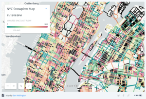
Today’s challenge was to create a dashboard inspired by this article using data from NYC Open Data about snow plough coverage in New York City. Reading through the article got us all very excited for the day ahead – playing around with maps and spatial data, what more could anyone wish for?
O my sweet summer child.
Little did we know that we were about to be faced with a load of information the likes of which we had never had to deal with before. New York CIty is very meticulous about its snow ploughs, let me tell you. For every single road section (defined as a piece of road between two intersections, e.g. 5th Avenue from 42nd to 43rd Street), there is an entry every 15 minutes with the exact time this section was last visited by a snow plough. All in all, we were looking at over 250 million rows. Too much data for Excel or Alteryx to handle. Hence how we got our first crash course in SQL.
Heaps of Data to Clear
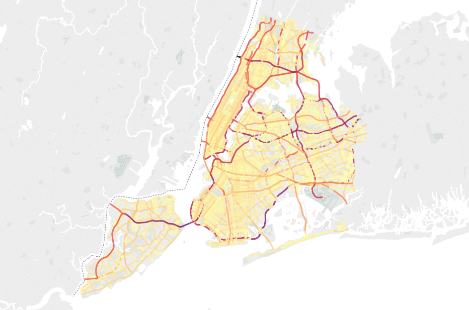
In a team effort we managed to upload the data to an EXASOL database to which we could then connect in Tableau Desktop. That alone took up half the day – time which I spent downloading more data to supplement my visualisation. My plan was to underlay the data on snow plough coverage with data on Annual Average Daily Traffic from the New York Department of Transport to see whether New York’s busiest roads did get some extra love from the city’s ploughs. Connecting to the data was simple enough, and I quickly got an idea of what are NYC’s main traffic lifelines. Unsuprisingly, they are the expressways connecting the different boroughs with one another.
Lookin’ pretty, NYC.
Once the snow plough data was uploaded to the EXASOL database, we were faced with the next problem, since Tableau was less than happy with the amount of data we were feeding it. We all came up with different ways to reduce the load for tableau. I decided to aggregate the number of snow plough visits to the day level which reduced the row count dramatically. I did this in Alteryx, using its In-Database tools. Connecting to the EXASOL database in Alteryx was another time consuming process. I also went to Mapbox to get a more custom, wintery-looking map for my viz. I was convinced it was all worth it since I would end up with a cool side-by-side comparison of traffic density and snow plough coverage.
Except I didn’t.
Slippery Slopes
The result left me deflated. Pretty much all roads had an average of between 30 and 40 snow plough visits on snowy days, and there were no patterns I could make out compared to traffic density. Also, since the two data sets came from different sources, I had no way of consistently joining them together. Streets names are relative, it seems. Again, a problem I could have foreseen but had decided to ignore.
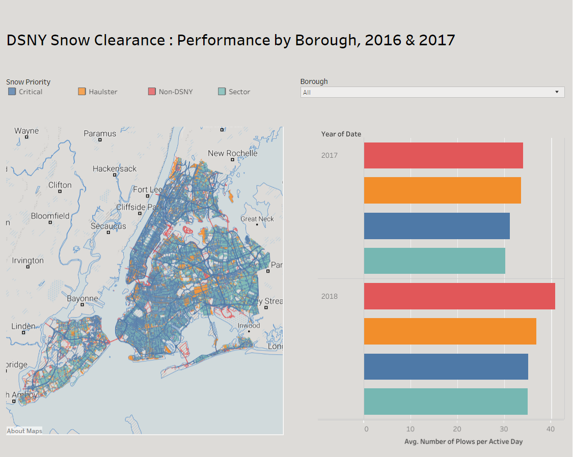
By now, I was more than a little pressed for time. I decided to whack out some bar charts showing how many times on average roads with different ploughing priorities were visited by snow ploughs in 2017 and 2018, respectively. I added a map that shows what roads are part of which priority group. The dashboard shows that roads which are not under jurisdiction of the New York CIty Department of Sanitation (presumably the state of New York looks after those) get the best snow plough treatment while making up for the smallest part of roads in NYC.
Meh.
The result of a long day left me a little deflated. Luckily, there are four more days of dashboard week to come.