Like many other users, I learned Tableau by watching tutorials and by trying out things within the view while observing what happened as a result. This approach was definitely useful to familiarise myself with the software but it was also very time consuming and frustrating when I didn’t know how to do things that in my opinion should have been very simple. (And they did turn out to be very simple, I just didn’t know where to look or what to google to find it).
When I was preparing my application I spent hours clicking and dragging things all over the canvas until I obtained an acceptable result, but couldn’t replicate it, as I didn’t understand what was going on in the background, or why it actually worked. I also over complicated things not knowing that there are simpler and quicker ways to get the job done.
Therefore the goal of this blogpost is to share a couple of tips and tricks I wish I had known when going through the DS application process, and that would have definitely saved me a lot of time and frustration
1. Dragging items onto Rows and Columns and getting it right
Ok, this sounds like a no-brainer, I mean click on the field you want on the shelves and drag and drop. Or double-clicking and let Tableau decide. Simple. Well…yes…but that doesn’t really put you in control and Tableau might not always know what you want to do.
When building a simple bar chart it is quite straight-forward but when building tables with multiple elements on the shelves it can get a bit tricky.
So how to decide what to drag onto columns and what to put on rows based on the outcome you want to achieve?
Let’s assume we want to build the below table: Sales by Region, Segment and Category

This is how to do it
Notice those little lines on the column and row shelves?

For columns the lines are right next to each other while for the rows they are under each other. This can give you an indication of how Tableau will list the content of the field that was placed onto the shelf.
In our example, Region is a discreet field that contains ‘Central’, ‘East’, ‘South’ and ‘West’ which are placed under each other. The same way as the little lines next to Rows. So let’s place Region onto Rows.

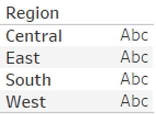
And voila, the members of the Region field are listed as rows, under each other.
Next field is Segment that contains: ‘Consumer’, ‘Corporate’ and ‘Home Office’ which in our example are next to each other. The same way as the little lines for Columns. Then let’s drag Segment onto columns.
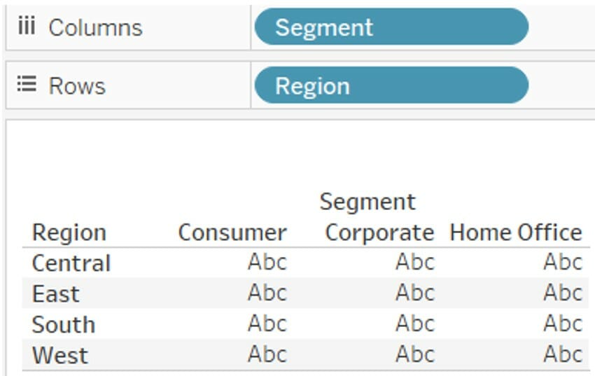
One more field to go: ‘Category’, which comprises ‘Furniture’, ‘Office Supplies’ and ‘Technology’. All these are next to each other within the view so,…. you guessed….they go on Columns, right after Segment.

And final step is to add the sales (as we are trying to build Sales by Region, Segment and Category remember?). Just double-click or drag Sales onto the table, and it’s all done!

This logic works for continuous fields as well. The only difference is that instead of individual values, Tableau will create an axis with the labels being next to each other when placed on Columns…

…..and they will be listed under each other when placed on rows.
2. Assigning different formats to the same numeric field
This is something I struggled with quite a lot.
I quickly discovered that numbers can be formatted by right clicking on the pill, going into ‘default properties’ and then ‘Number format’. In the number format window I could easily change the values into a percentage, move decimal places, pick the symbol for currencies etc…
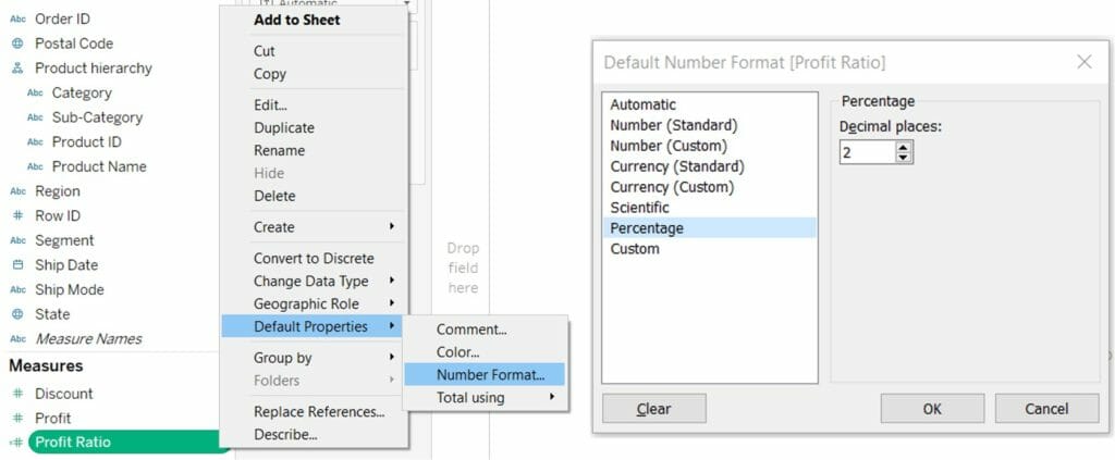
The format chosen here for the specific numeric field would apply to all worksheets and dashboards within that workbook so wouldn’t have to worry about it again…until…..I would want a different format in different places within the view.
For example, I might want to show the Profit Ratio (which is sum(Profit)/sum(Sales)) as a percentage with two decimal points when listed in the table but with three decimals on the line chart and no decimals on the axis. (This is not an example of visual best practices, it’s just to illustrate the different ways of formatting)
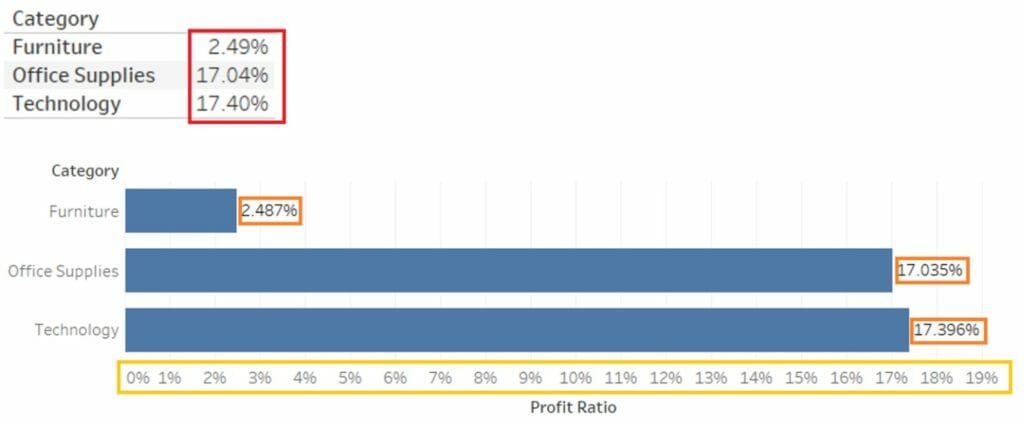
This is how to do it
The numbers in the table have already been formatted within the data pane (described above) as percentages with two decimals. But if we drag this onto the chart…

Everything will have two decimals, same as the table.
To change the format of the numbers on the labels, right-click on the pill within the shelf then Format…
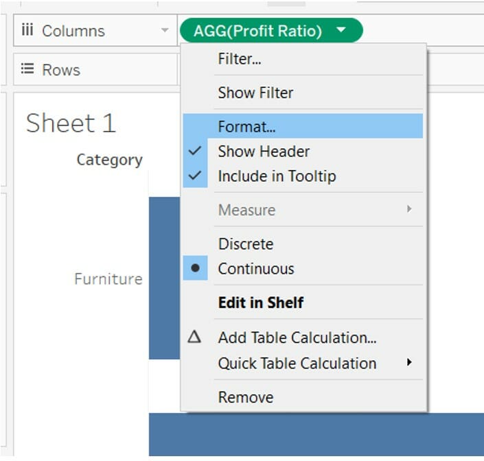
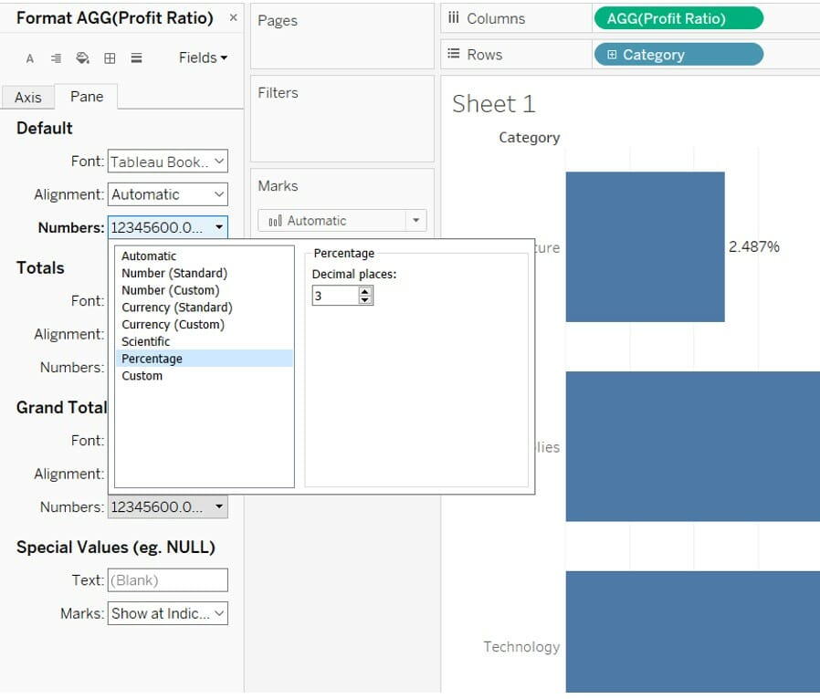
This will open the formatting area on the left side of the view, where under the ‘Pane’ tab, click the numbers dropdown. Then choose percentage and 3 decimals.
Now that the labels are done, to format the Axis, just click on the Axis tab and follow the same steps as before.
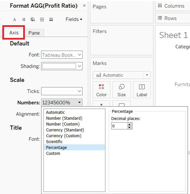
And you successfully assigned different formats to the same numeric field!
3. Clearing the sheet with one click
This a really simple one, and I am sure most of you are aware of it, but it was such a revelation for me that I thought to include it in this list in case there is still someone out there dragging measures and dimensions off the view, just because they want a clean sheet without creating a new one.
To be honest, I have done this countless times and it was a real pain, especially when I had dual axis charts with multiple elements in the marks card. So imagine my surprise when I found out that Tableau has a button for this called “Clear Sheet” (no mystery there about what it does), and it sits in the toolbar together with the other buttons I used so many times, but somehow never noticed this one.

4. Exploring the data that goes into a calculation
Working with inconsistent and incomplete data, thought me to always double check my results and make sure that the filters and calculations worked as expected.
When using Excel, I would just double click on a cell containing a value in the pivot table and it would open up all the rows that were taken into account when calculating that specific value. So this is the Tableau equivalent of that.
Let’s go back to our initial table: Sales by Region, Segment and Category, and assume that we want to have a look at all the rows that, when added up, will equal the total office supplies sold to the customer segment in the central region.

This is how to do it
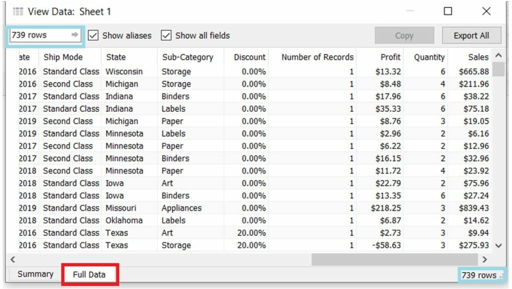
Right click on the cell and choose view data
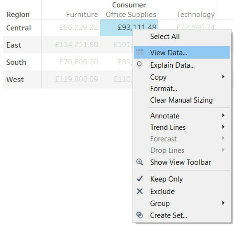
This will open the View Data window on the Summary tab. The Full Data tab will display the total number of rows that went into the calculation allowing the user to view them one by one.
5. Update the filter options based on previously selected filter
No intro here, let’s dive straight into the example.
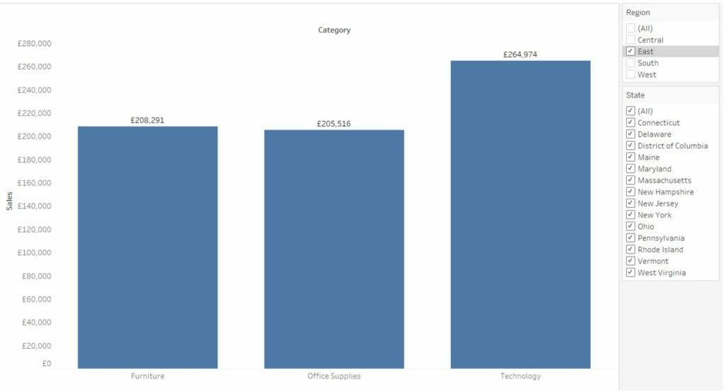
The below chart can be filtered by Region and State. We know that each state is part of only one region as we can’t have a state that can correspond to multiple regions.
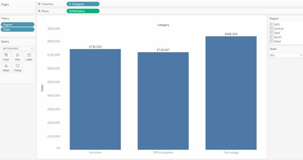
So if we filter by a region and pick East for example and then choose Colorado we will obtain….
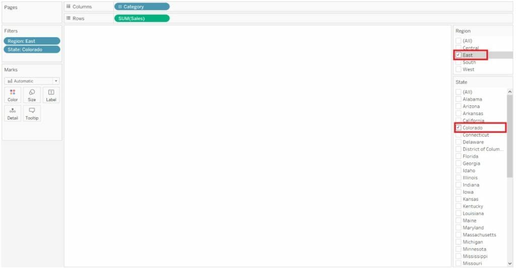
A big blank page. As Tableau can’t find any records that would match to both the East Region and Colorado, just because Colorado is in the West.
So how do we make sure that this doesn’t happen without having to rely on the user’s geography knowledge? Ideally, once we select the value(s) in the first filter (in this case East) the second filter should not allow the user to select any of the options that are not within the selected (Eastern) region.
This is how to do it
Hover over the filter until the down arrow appears in the right upper corner. Click on the arrow and select “Only Relevant Values”
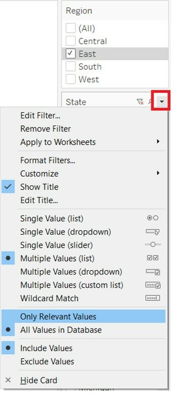
This will update the filter to list only the values that match the filter that has already been applied. In this case it will only list the states that are in the East. Notice that the list got shorter and Colorado is no longer there?
Hope you found these tips useful. I would love to hear in the comments about any other tips that you believe made your life easier when using Tableau
