


Today’s data-set was about facilities or sites subject to environmental regulation in the US.
After receiving the link to the EPA website, we quickly released that the file would take over half an hour to download. So I decided to focus on one area only. Not knowing anything about the data or how it may look in different regions, I picked Hawaii just because it reminded me of holidays, and thought it would be interesting to check out the environmental info for it.
Once downloaded the data for Hawaii, I found the documentation that was mentioned by Andy in his blog. As much as I love a good documentation, 27 pages seemed incredibly long. So I started skimming trough and trying to figure out what data is included in which file.
My idea was to explore the data in Alteryx, and go back to the documentation when something is unclear.
After mapping the long an lat, realized that it’s everywhere except Hawaii.
In my attempt to get rid of the “miss-mapped” registries I searched for a shape file for Hawaii thinking that I could exclude the regions that aren’t in Hawaii. After playing around with this for over half an hour (don’t know where the time went really because it felt like I wasn’t doing anything) I realized that it’s a lot easier to leave these in and just exclude them by select and exclude once I load it up into Tableau.
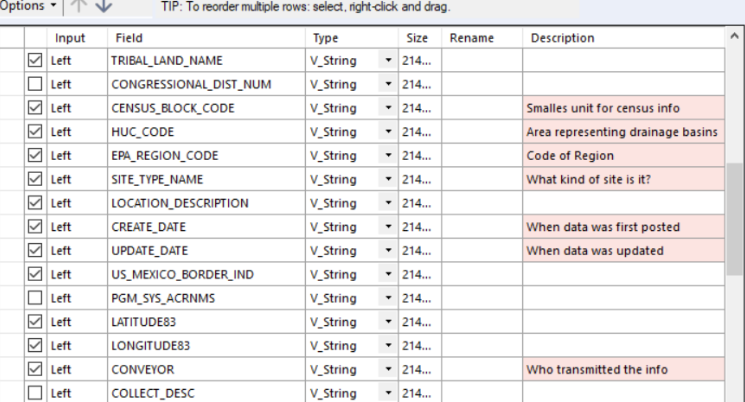
Reread the description of files, and decided to drop contact and email files.
Two and a half hours in, I still felt that I can’t wrap my head around which file joins with which and why are things falling out. I couldn’t really understand why should I join these…so I decided to go back to the documentation and find fields that I consider of interest that I could use in a visualization.
After reading through the documentation again, I joined the facility file with interest and removed fields I didn’t consider necessary. My goal was to identify which environmental issues were registries from Hawaii most interested in.
To make sure that I find it easier to understand the fields, I added in the explanations in the comment section of the join tool.
With the facilities and interest joint I decided to move away from Alteryx as it was already past lunch time, and still needed to do a dashboard and write this blog post.
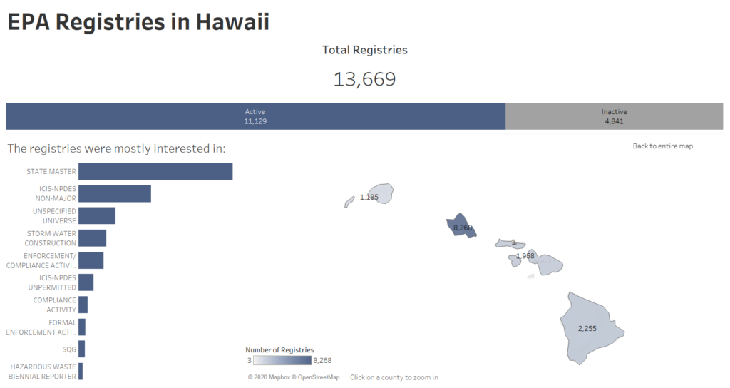
Still had no idea what exactly I will visualize, so I started exploring the data and decided to make a drill-down map, group the multitude of ways in which the data expressed whether a registry was active or not, and look for a shape file that would allow me to map the counties, as they weren’t recognized by Tableau.
At the end of the day I feel that I haven’t really achieved a good analysis, and that my dashboard could do with at least another hour. Didn’t have time to set up my set actions to filter the by Active and Inactive Registries but at least the map drill-down works 😉
I definitely learned that I should ALWAYS start with the documentation, and that when there is so little time it’s essential to pick as soon as possible the fields that I wan’t to focus on. Trying to encompass everything will just create confusion.
That’s it for today…wonder what tomorrow holds…