


Today, two and a half weeks since we joined the Data School for our pre-training, we were given our first ‘project’ to complete. Each of us was assigned with one of Andy’s old vizes and were asked to critically assess it, provide a short commentary on what does and doesn’t work, and finally, create an alternative with suggested edits. Oh, and all that in three and a half hours.
The viz I was given looked at the performance of Arsenal FC between 2001-2012.
FIRST GLANCE and KEY MESSAGE
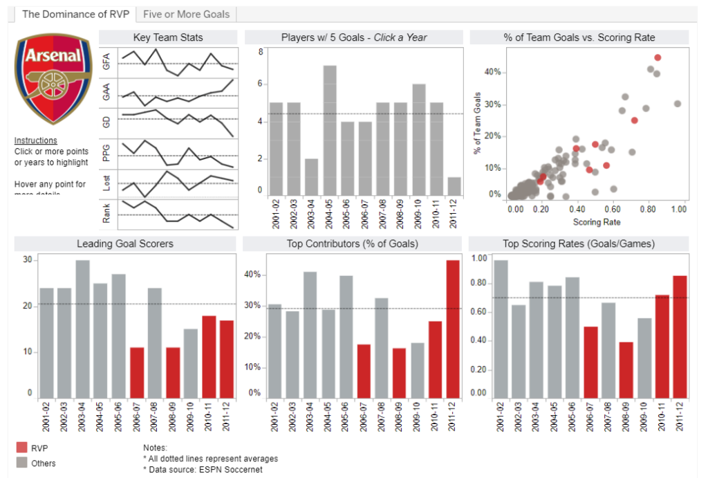
The first thing I noticed, was that the viz had no title. Initially, I intuitively assumed it focused on the team’s overall performance, since the club logo and the Key Team Stats in the top left corner were the first thing that got my attention. However, while exploring the viz I realised that the red bars and circles were intended to draw viewers’ attention to one specific dimension: RVP. I know very little about football, so I actually had to google what that referred to – turns out RVP stands for Robin van Persie, a player who joined Arsenal in 2004. Only then did I notice the name of the dashboard tab on the top, which said ‘The Dominance of RVP’.
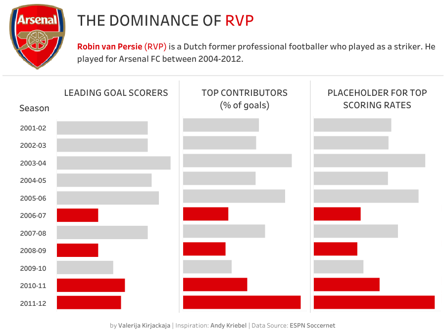
This made me wonder what the key message of the dashboard was – was the focus on RVP’s contribution or the team’s overall performance? The first two charts clearly relate to the overall picture, whereas the remaining four aim to highlight van Persie’s role. In my version of this viz, I tried to focus solely on highlighting RVP’s performance and did not include any of the general overview charts.
FORMATTING
What works well:
- Colours. I like that the original visualisation does not use too many colours; the red is matched to the shade used in the club’s logo and contrasts nicely and clearly with the grey. The white background works well and does not distract from the data in the view.
- Chart types. I though column charts were a good choice for the metrics shown. Sparklines used to indicate overall team performance were also clear and clean, but, as mentioned earlier, I am not convinced they add much to the key message.
- Tooltips. Tooltips are informative and clear. I would probably format them slightly differently (not a huge fan of using asterisks as bullet points) – but that’s just personal preference.
What could be improved:
- Title. This viz definitely needs a title. A subtitle, or a short sentence outlining the key insight would also be helpful.
- Space and borders. Overall, the viz feels a little too cramped together. I would add some more breathing space between the charts (e.g. it’s hard to tell whether chart titles in the second row relate to the chart below or above them). I am also not sure borders around each graph are necessary.
- Labels. The season labels are repeated four times in the current view, which makes the whole viz feel even busier. Swapping rows and columns on the bar charts to flip them could be a neat solution to only use the season labels once on the first chart.
- Legend. I would have preferred a slightly more explicit legend (or have it incorporated into the title/subtitle) – ‘RVP’ meant nothing to me on its own.
- Instructions. The instructions on how to use the viz under the logo are understanable but not worded in the best way. ‘Click a Year’ above the second chart is the only phrase in the whole viz written in italics – I am not sure this is necessary.
- Interactivity. The original viz allows the users to highlight a specific season across the charts but it does not seem to help reveal any additional insights.
MY VERSION
As expected, three and half hours felt like 20 minutes and I did not manage to get to where I would have liked to with my alternative version of the viz. I struggled trying to recreate some of the charts I liked in the original viz as I could not figure out what most of the measure names meant (Note to future self: Always make sure the names extra clear, even if you don’t think anyone will ever care).
I tried my best to use football glossaries but that didn’t seem to help and my calculations were not returning the same numbers as the original viz. In the end, I still did not manage to build the third graph the way I wanted to and replicated the second graph as a temporary placeholder.
I will be honest, I am not used to this sort of time pressure. But, despite all the stress and frustration this morning, I thought this was a great exercise and I already know what I would do differently next time. Here’s what I got today:
Link to the updated version is here.