Last Monday we did a #MakeoverMonday session at Data School, thanks to which I have finally submitted my viz. It is usually quite challenging for me to come up with an original idea for a makeover with all those amazing vizes popping up in the Twitter feed at the same time. You just can’t unsee them.
Fortunately, the dataset for the last #MakeoverMonday was extra simple so there was a common, unspoken agreement that it is OK for everyone to go for a waffle chart. I wanted to try this type of chart anyway so I eagerly googled a tutorial. The search result I used was Andy’s video. It’s pretty easy to follow and I have managed to finish on time, even though I lost my workbook half way through the session. To my surprise, everyone seems to like the outcome a lot! That’s actually unfortunate as it puts a bar for my future submissions even higher that I originally put it myself! I guess when in doubt ..right click AND/OR go for the simplest solution.
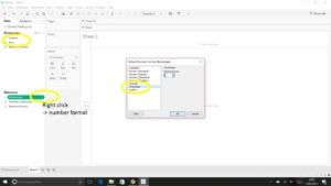
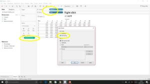
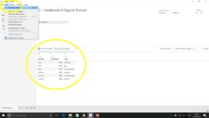
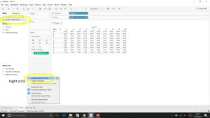
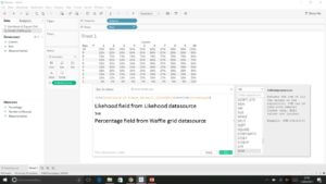
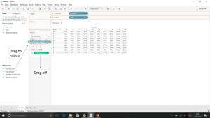
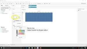
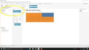
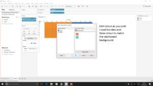
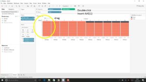
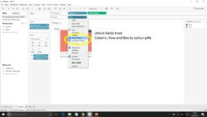
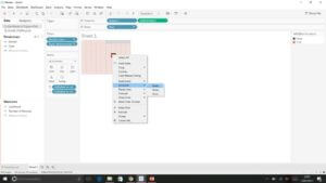
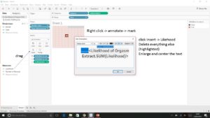
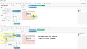
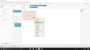
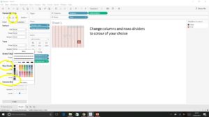
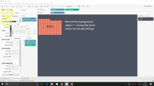
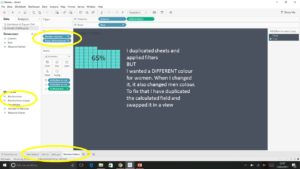
If you similarly to me prefer images over videos follow the steps in the pictures below to create this viz:
My first #MakeoverMonday (finally!) and first #wafflechart 🙂 https://t.co/a4IHDY87qu pic.twitter.com/QXCvGKjkja
— Wiktoria Gryniec (@WikiDataDrops) March 13, 2017
Images come from flaticon.com
First, download this waffle chart template. The whole idea of the waffle chart is to colour the right amount of squares which reflect the range 1 – 100 % from this sheet.
https://docs.google.com/spreadsheets/d/1WI_0PkNaUDJm6GTrurIpxiVgfXKf1S5j6PYcs1VpKZs/edit?usp=sharing
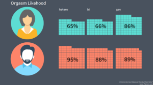
https://public.tableau.com/views/Orgasmlikehood/Olikehood?:embed=y&:display_count=yes
Wiktoria
