


So for this week we were challenged to do #MakeoverMonday with the rest of the attendees at the Tableau Conference. We were given just an hour to analysis the data, form our ideas and complete the viz. I failed.
I couldn’t think of any coherent ideas within the time constraints. What I did come up with did not show the data at all, and didn’t provide any insights. I left the Data School thinking of how this could be solved and I realised that I had to combine two different types of charts to really get across the message I wanted to show.
The two key points I needed to get across were the rise in female representation at each level and then also showing the split between the two genders at each year. I decided to represent these with a slope graph for each level and then a “2 Slice Pie” at each end. The shading on the line shows the percentage increase from 2012 and 2015 so you can instantly see that VP and Senior VP were the highest rises in terms of percentage gained.
The pies at each end then show a quick indication on how large that percentage is in comparison to the male share:
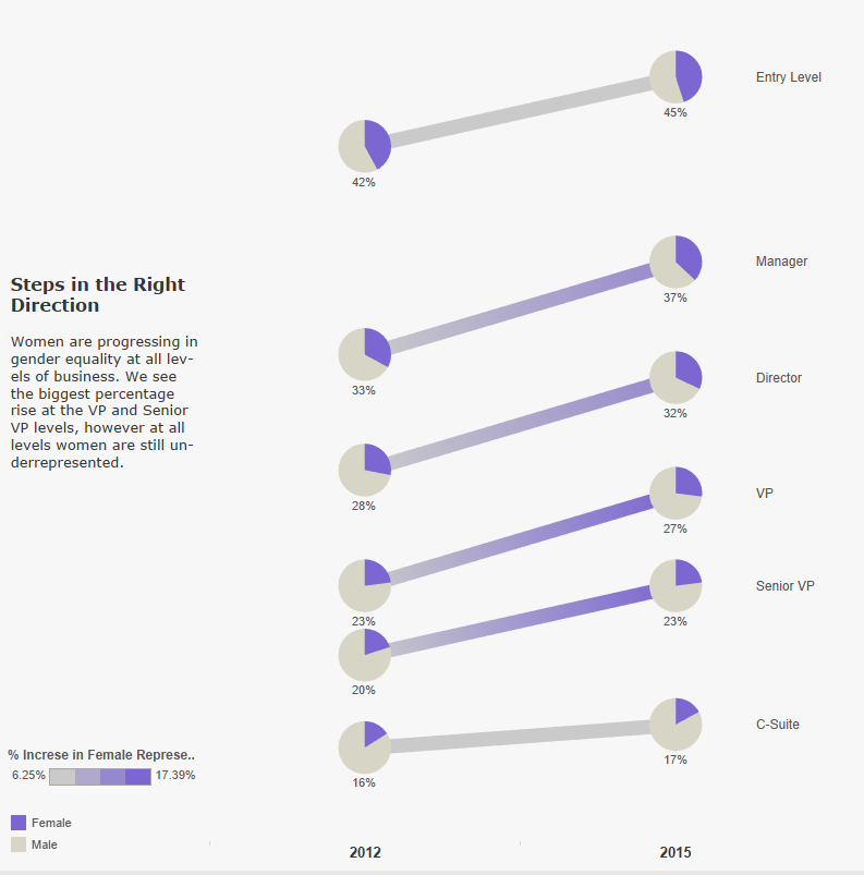
The final chart, a slopie!