


For my quick Tableau Tip this Tuesday I will be showing you how to colour your custom shapes based on another category/variable.
First of all build your chart that will contain your custom shapes. For this example I am going to be using my previously mentioned data from Netflix. I have just created a simple scatter plot using film release date and rating as the axis, and using the film name as the detail, I have then set the chart to be a shape chart and then the shape to be a custom picture of Bruce Willis’ head as this is a chart showing all of Bruce Willis’ films. You can the result below:
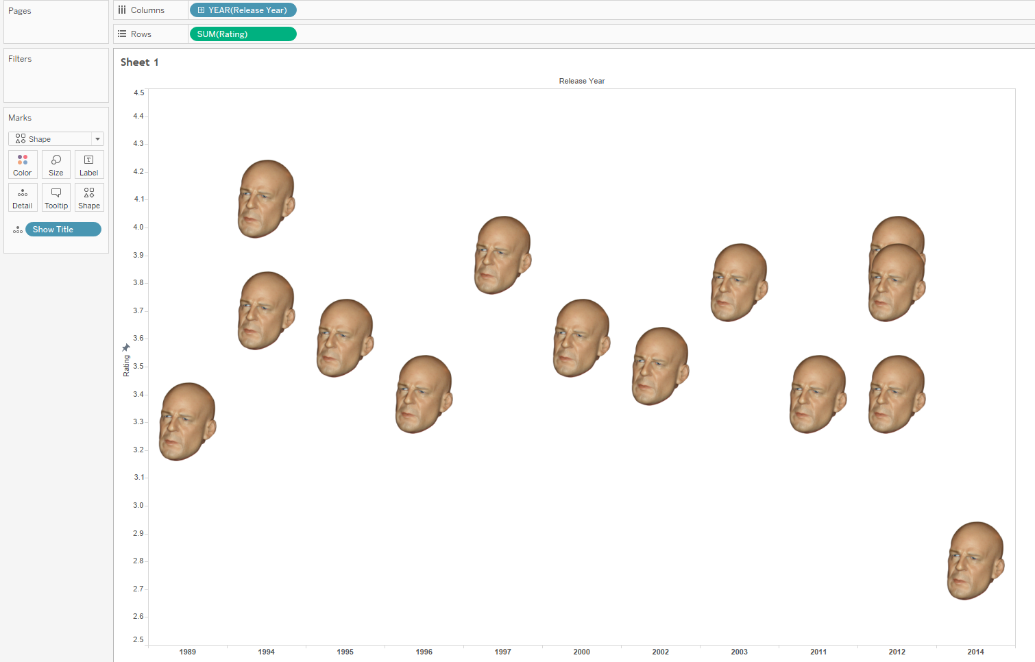
Simple Scatter
To create our colouring without losing the detail of the custom shape we must create a dual axis for our rows. After synchronising the axis the chart will look no different, but we will have 2 shapes overlapping each other. The key is to set the variable you want to use as your colour on one of the two marks cards and then add a transparency.
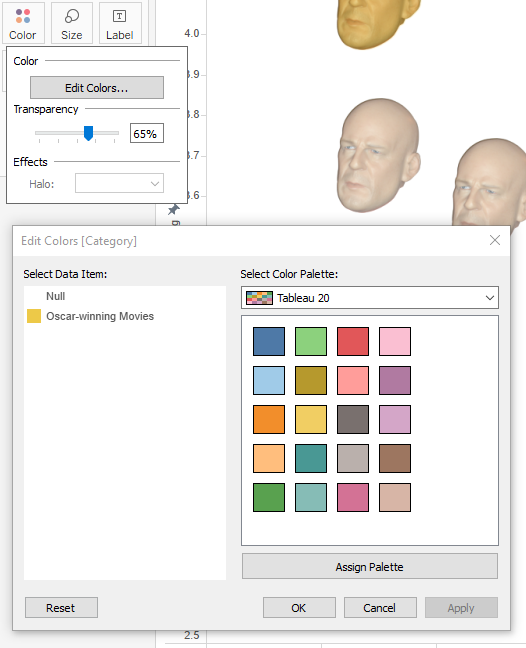
Setting a Colour
You should now have a scatter plot that is coloured by your variable, yet you can still see the detail of the custom shape. In this example I have coloured the Oscar winning movies yellow, and left the other films white.
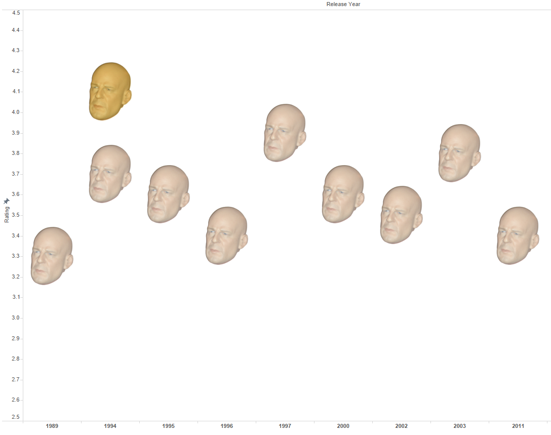
Finished Scatter Plot