


Hello, everyone!
As we the third week of our training begins and we’ve started tinkering around with Alteryx – an impressive piece of software I will be exploring in more detail in my next blog posts – I wanted to take the time to share one of the first projects we were tasked with completing after joining the Data School. In order to test the knowledge and experience we’d gained in our first week as Data Schoolers, Andy asked us to revisit the original viz we had sent it with our application and create a brand new viz from the same data. Even though I polished off and published this visualization two weeks ago, I feel that the journey from the original idea I had when first seeing the data to the final dashboard I presented in front of my teammates is full of insights that may be useful to many of you.
Let’s get cracking!
The Original Idea
Before joining the Information Lab, I was completing a degree in Development Management. The purpose of this discipline – a mixture of international development and economics – is to arm its pupils with the tools to analyze and understand why all nations evolve in different ways. We combine the lenses of sociology, economics, political science, anthropology, and others, to dissect the social forces at play within a nation and identify the deep causes of their opulence, or alternatively their poverty. In order to do this, scholars of international development are regularly tasked with sifting through giant databases filled with numbers in order to try and build ridiculously complicated regressions in an effort to quantify the effects that certain policies or global shocks have on the functioning of countries. Needless to say, as any social scientist, I feel a deep sense of discomfort when asked to open up R, write a hundred lines of code, and hope that somehow the statistical program will not speak gibberish back to me. And that’s where Tableau comes in. One day, while working on yet another paper centered around a data set I obtained from the World Bank, I decided to open up Tableau, drop some dimensions in columns and measures in rows, and was immediately taken aback by how simply, quickly, and efficiently I had gone from a .csv file to actual actionable information.
The reason this dataset interested me is that it contained a decent number of African nations – countries for which data is not always easy to find – and was centered around a few key development indicators – you can think of them as the KPIs of development countries – around which I could build an interesting story. Unlike the traditional statistical packages that I used, Tableau made it infinitely easier to allow any person to visually understand the insights I was trying to get across, and so I set out with two simple objectives:
- Compare the overall performance of African nations in key development indicators with the rest of the world,
- Reveal the overall pattern of convergence that can be observed across nations in terms of their development
- Create a visualization that would have enough depth to be useful to a scholar of international development, but be approachable and interesting to a layperson.
The Original Submission
With these ideas in mind and the deadline for our first applications approaching soon, I decided to give it all I could and build this dashboard. The overall layout is quite simple: A title and small paragraph to introduce the viz at the top, three scatterplots showing the relationship between child mortality and different key development indicators in the center, and some supporting text and a legend at the bottom.
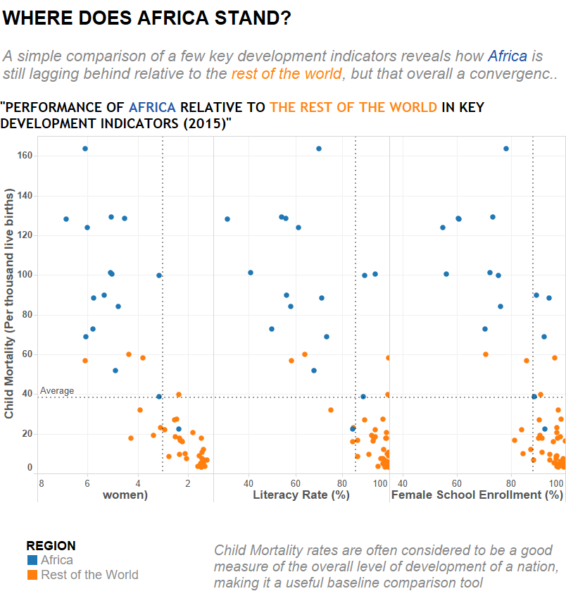
What works?
- The strongest aspect of this viz lies in its use of color: before even having the time to think about what he is seeing, the viewer knows he will be comparing orange and blue. It might seem obvious, but taking advantage of patterns that are not cognitively heavy but effective is a great way to ensure your story will get across, and the blue/orange comparison gets that done very well.
- The subtexts are short enough to be discrete, but long enough to provide the supporting information the viewer needs to understand the dashboard.
- The scatterplots, albeit cluttered and incomplete, reveal that African nations are struggling compared to the rest of the world mainly because of the addition of the average lines: they create a grid that simplifies the task of identifying which groups of countries are in the “underperforming” portion of the plot. This helps get the Africa vs. the rest of the world story across as well.
What doesn’t
- The title feels incomplete and isn’t actually clear without additional context. A clear case of the author being biased towards understanding his own work.
- Clutter. Clutter. Clutter. The three scatterplots side-by-side are just a giant cognitive load and make it difficult to process the information they are trying to get across. A simple case of too-much-information. The fact that the legend on the x-axis of the leftmost scatterplot is broken clearly does not help.
- The convergence story is difficult to make out: the fact that the nations tend to all be slowly evolving towards the top left of the graph does not transpire at all. A consequence of my design of the scatterplots.
- The color legend at the bottom left is simply useless and is taking up space. If you’re going to use a clear color code that transpires throughout the dashboard, you don’t need to bother with a legend at the end!
- The source and the author’s name are nowhere to be found!
The Remake
After presenting my initial viz to Andy and the rest of the class, I realized that I had a lot of work to get done if I wanted my original idea to truly take form: I had to simplify my color scheme, take advantage of Tableau’s functionalities, and remove the clutter from the viz. After one day’s work, here’s what I came up with.
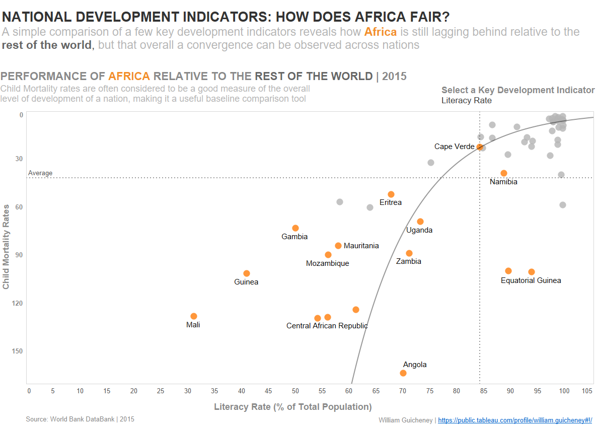
What works?
- The color scheme has been changed from orange vs. blue to orange vs. gray. The simple explanation for this is that my story is about Africa, and therefore that group of countries should be the only one that stands out. I also chose to add text labels to my scatterplot to give the viewer more information straight away.
- Removing the three scatterplots and replacing them by one with a parameter control allows the viewer to dynamically change between each key development indicator. This frees up the dashboard, making it both more clear and aesthetically pleasing, and also makes the entire experience more fun. Furthermore, the extra space gives more depth to the data, allowing the viewer to clearly see that African nations are underperforming relative to the rest of the world.
- The addition of the trend line was key in ensuring that the convergence story would stand out clearly. It is a mental guide for the viewer who can now clearly understand that the top right quadrant of the scatterplot is showing high-performance nations and that all nations seem to be slowly progressing towards that quadrant.
- The title, legends, axes, source, and author name have all been fixed and formatted correctly. They are simple elements that are easy to overlook, but they make sure your dashboard looks professional!
What doesn’t?
- The child mortality axis was inverted in order to make the top-right quadrant the higher performance one, but some of my peers indicated that this made the overall scatterplot more confusing.
The process of going from a dataset to an idea, to a visualization, is incredibly challenging but rewarding. Being able to take a step back, accept criticism, and put in the extra hours to get every little element to fit just right is the central formula towards ensuring you will build dashboards that get your story across!