


Hello, everyone!
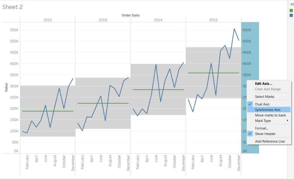
Afer yet another jam-packed day at the Data School, rushing to put the final touches on dashboards for our client presentation tomorrow and delving deeper into Tableau’s magic tools, I’ve got yet another guide for you guys. Today we’re going to be looking at control charts. What is that, might you ask? Well, just check the screenshot below.
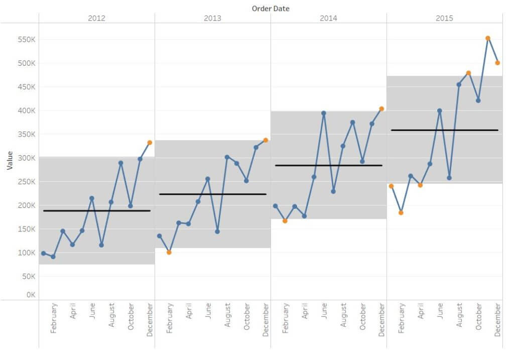
In the chart above, the black horizontal lines represent the average for each year (separated into panes), and the band represents where our “normal” values are (the upper and lower bounds of the band are one standard deviation away from the mean). Blue circles indicate values that are within our normal, controlled range, while all the orange circles indicate values outside of our control range.
Control charts are immensely powerful charts for allowing an analyst to easily identify outliers within a dataset, allowing them to quickly inform their peers and devise a plan to address what could potentially be a catastrophic business issue. From tracking stock prices to car sale figures, the applications of this type of chart are endless. That being said, let’s figure out how to make this! This chart is relatively complex to build so I’ve added a lot of screenshots to make this guide as simple as possible.
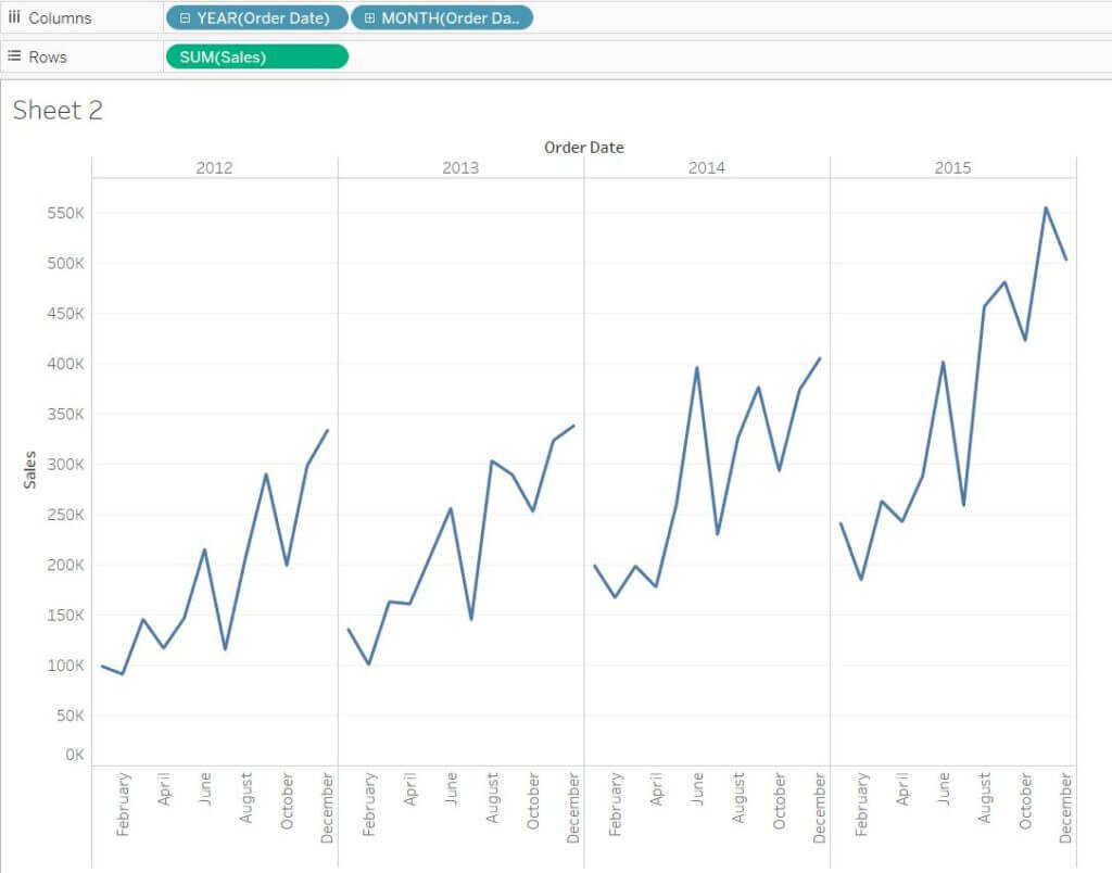
Step 1: Building our base chart
The base chart of this control chart is pretty standard: all you’re going to want to do is drag Sales into rows, and Years into columns. Hit the little + sign on the Year pill to drill down to Quarter level, and then to Month level. Drag the Quarter pill off from columns and voila! You’re ready to start.
Step 2: Adding our average lines
Now that we have our base chart, we’re going to want to add our average lines:
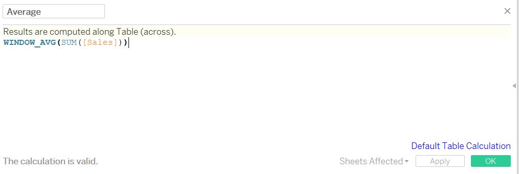
- First, we’re going to calculate the window average – the average of the values that are currently in view in your chart. To do so, hit Create a Calculated Field, and type the command in the screenshot below. Don’t forget to give it a name – mine is called Average.
- Secondly, you’re going to want to adjust the way Tableau is computing this average so that you get a different line for each pane (or year). To do so, hit the caret on the Average pill located in your Measure Values card, scroll down to Compute Using, and hit Pane (Across). This is going to tell Tableau to calculate the average in each pane individually.

Step 3: Building the reference band
Now that we have our average, we are going to build the reference band within which our normal, controlled values will live.
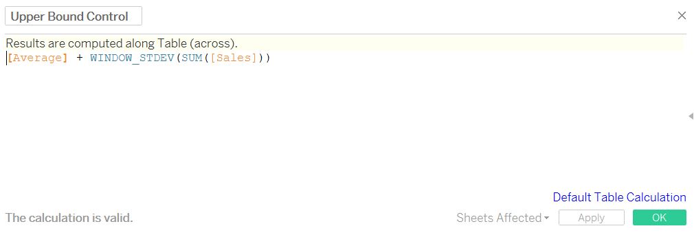
- First, we are going to build the upper and lower bounds of the band. The bounds are calculated by simply adding or subtracting one standard deviation from the average in each pane (for any statistics nerds, this means that 66% of our data points will lie within the reference band). To build the upper bound, hit Create a Calculated field and type in the command below. Don’t forget to name things – by naming my window average calculation earlier Average, I can directly drag it in this time around rather than typing in it again!
- Repeat this step to build your lower bound and type in the following formula:

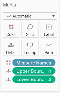
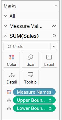
- Whatever you do, don’t drag these calculations into the chart just yet! Instead, you’re just going to drag them into your Marks card into Detail, as shown below. Nothing happened? Don’t worry, this is simply for our next step to work!
- Now that we have calculated our bounds and added them to the marks card, let’s build our band. To do so, hit Analytics located on the top of your Data Pane on the left, scroll down to Reference Band, and drag it into Pane.
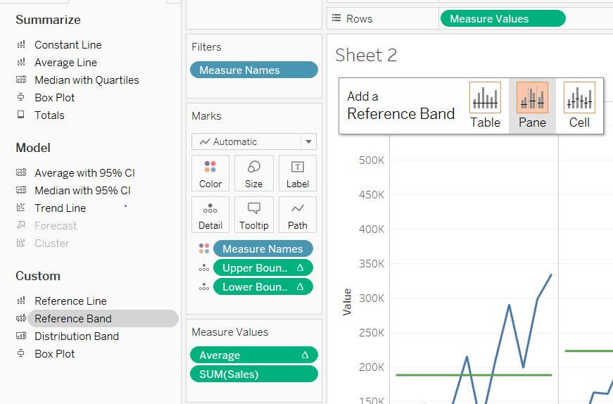
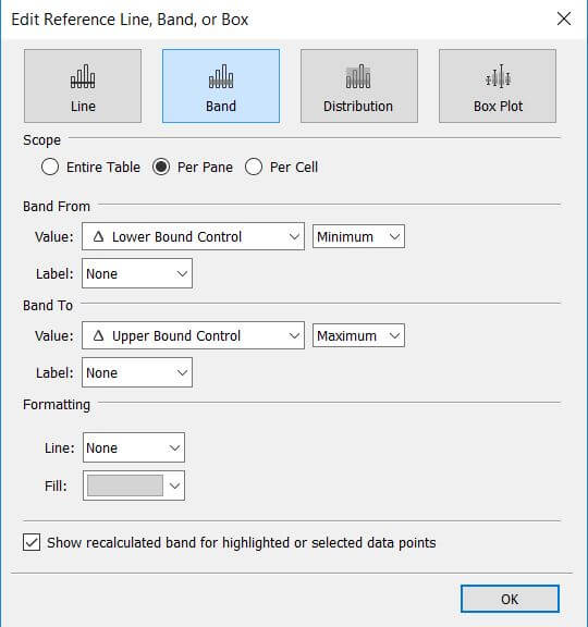
- Now that you’re facing the configuration menu, you’re going to want to change the Band From value to your lower bound calculation – mine is called Lower Bound Control – and change the Band To value to your upper bound calculation. If you hadn’t dragged both of your calculations into the Marks card in the previous step, they would not have appeared in the value options!
Step 4: Adding individual circles for each value
This next step may seem a bit confusing at first, but it really isn’t. A quick thing to remember about Tableau is that if you are seeing different mark types on a chart – like the lines and circles in our control chart – you are almost always looking at a dual-axis. What this means is that you are viewing the same measure twice on a chart, but each of them is set to a different mark type. Let’s look at how this is done.
- First, you’re going to want to drag Sales into your rows one more time, hit the caret on the pill, and select Dual Axis in the menu. Just like magic, your two charts have now been converted into one, with a Y-axis for Sales on either side.
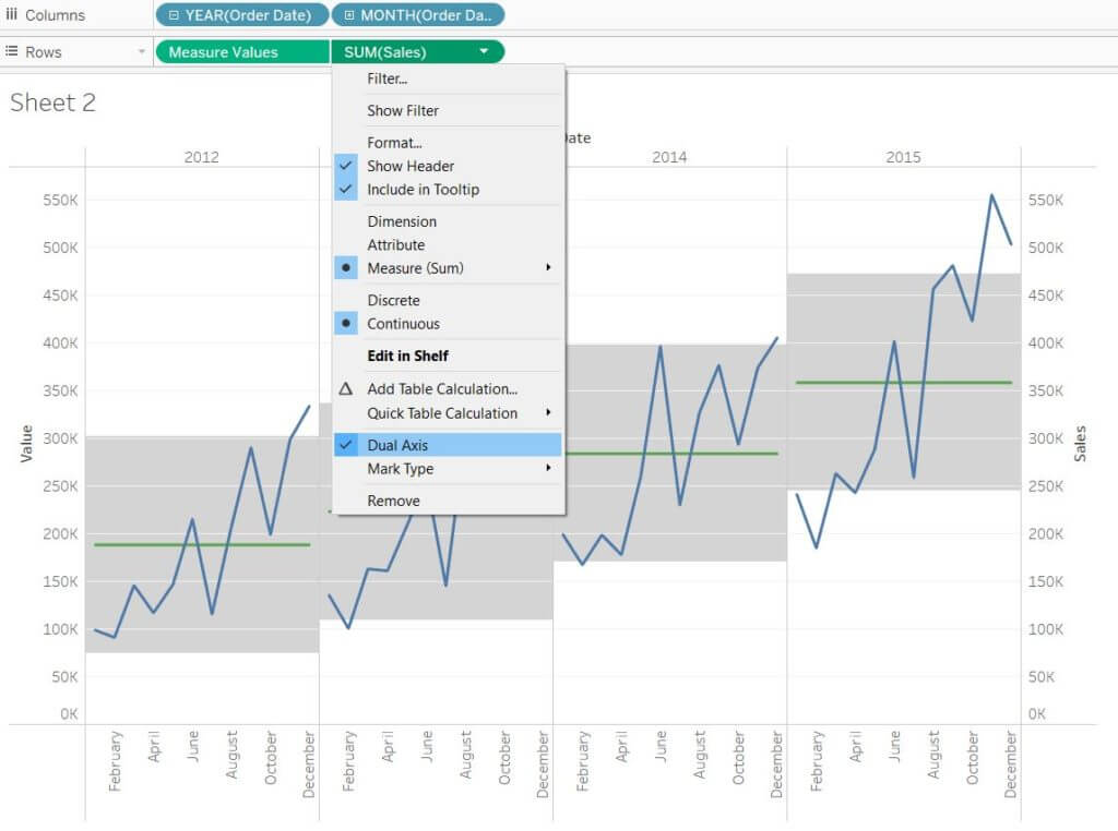
- Next, you are going to want to synchronize the axis. To do so, right-click on the Sales axis on the right, and hit Synchronize axis. You can also untick Show Header to clean up your chart a bit and keep only one axis on the left side.
- Next, you’re going to change the marks type of this new Sales measure to Circle. Make sure you are selecting the right measure! If you are not sure, the little caret on the measure you have selected in your mark card will be pointing upwards, whereas the other ones will be facing downwards.
Step 5: Adding in your key performance indicator filter
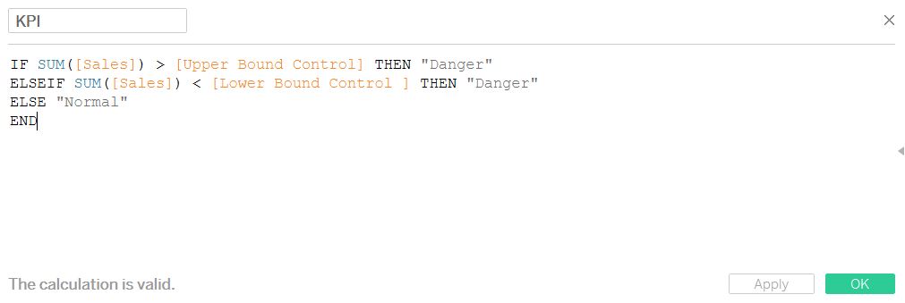
You’ve reached the final step, congratulations for making it this far! In this step, we are going to build a calculation to allow us to differentiate between the values that lie within the reference band and those that do not. This will make extremely easy for anyone to identify which outliers should be looked into.
- First, hit Create a Calculated field and type in the command showed below. This simple IF statement is telling Tableau that if a value is either higher or lower than our upper or lower bound, respectively, to label it as Danger, and to label is as normal otherwise.
- After you’ve done this, simply drag on your key performance indicator filter into Color in the marks card, and watch the magic happen! After messing with the colors and adjusting the formatting, you should have something that looks like this.
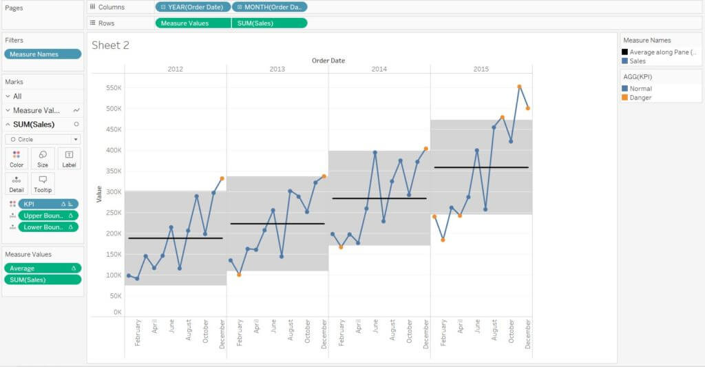
Congratulations, you have successfully built your first control chart! Tune in next week for more Tableau and Alteryx tips.