


Tableau Server contains a number of dashboard views within the Status page that show metrics and trends on a whole host of topics, such as:
- Traffic to Views and Data Sources
- Actions by All Users
- Stats for Load Times
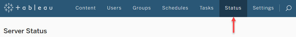
To access these views, click on the Status page link in the top menu:
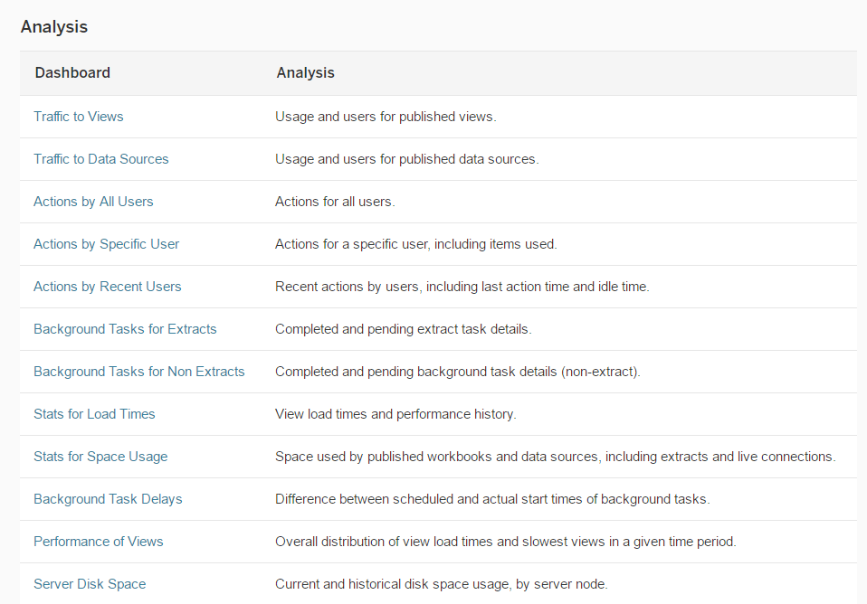
Scroll down and you will see a full list of all the analysis dashboards that are available:
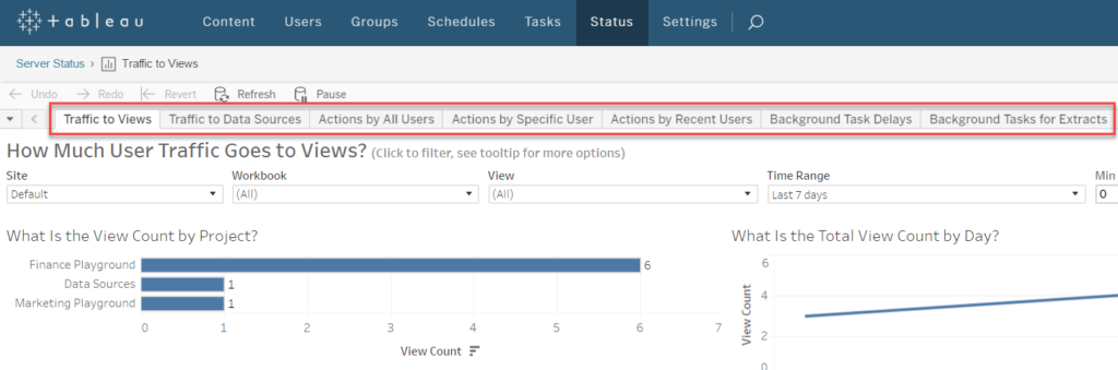
Clicking on any of these links will take you to that dashboard and it will also show tabs at the top of the dashboard to navigate to any of the other dashboards:
These analysis dashboards are really powerful and allow you to essentially use Tableau to analyse your Tableau installation and usage – what better tool to use!
But wait – it gets better. It’s also possible to download the workbook with all of these dashboards and connect to the Tableau server PostgreSQL database that holds all of this information and then proceed to edit/customise/improve the dashboards for your own particular requirements.
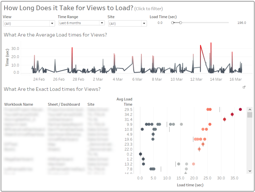
For example, below is the default view of the “How Long Does it Take for Views to Load?” dashboard:
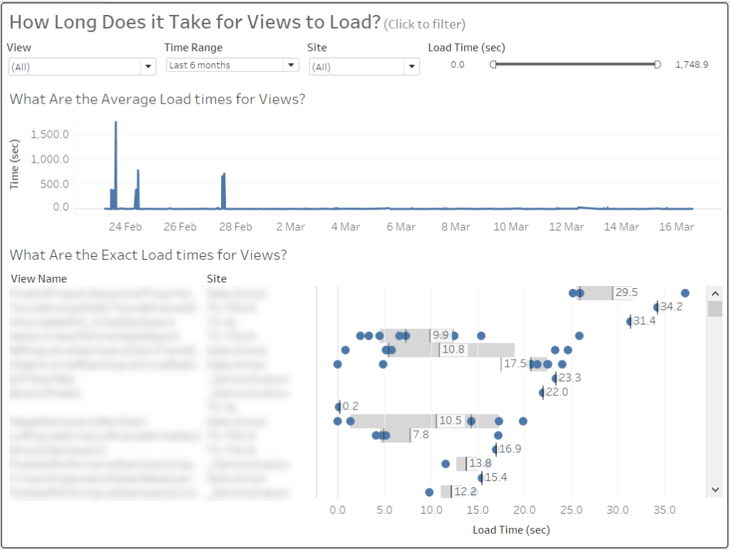
This is a great dashboard, with all kinds of insights, such as: how often are views being loaded (the number of dots per row), which view are taking the longest to load, what is the average load time per view (using the box plot). However, I wanted to make the chart in the bottom-right a bit less cluttered as well as introduce some colour and still be able to clearly see the average time for a view to load. Additionally I wanted to be able to see not just the view name (which is essentially the workbook name concatenated to the view name with a “/” in the middle). Below is my updated version:
The workbook name is now separated from the view (i.e. Sheet or Dashboard) name and the average load time has been added as a separate discrete measure in the table, so the dot plot chart is a bit cleaner and easier to read.