


Tableau is a pretty straightforward program and it’s been built on the idea that anybody can learn to create some pretty awesome data visualizations with limited experience. However, there are some elements of Tableau that need a bit deeper of an understanding if folks really want to understand what they’re building, why Tableau does what it does, and ultimately how they can make their visualizations really sparkle. Understanding these differences might seem small, but it shapes your understanding of how Tableau works and ultimately makes your life so much easier when you’re trying to translate what’s in your head to the screen.
This week we learned about a lot of these comparison points in Tableau, and understanding the similarities and differences between these elements has been a crucial part of my learning process. Although there are probably a ton more to look into, here I give a brief explanation of three common Tableau comparisons that hopefully give a better understanding of how to work with the program.
Shared Axis v. Dual Axis
Shared and dual axes are a great way to present more than one type of data in the same field. However, they can serve entirely different purposes. Generally speaking, shared axes are better to start off with because they give a bit more flexibility than dual axes. This is because, as their name indicates, dual axes can only reflect TWO axes, whereas shared axes allow you to include more than two data types (actually, I lied, there is a way to get dual axes to reflect more than one measure through a combined dual+shared, but let’s keep things simple).
However, dual axes do have their pros over shared axes. For example, with shared axes you cannot have two different chart types in the same axis. In other words, they can only reflect measures of two things with the same dimensions. Dual axes can be used to reflect things on completely different scales. For example:
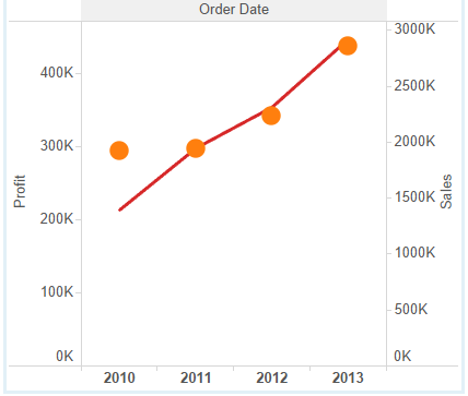
Here you can overlay sales on profit to see how things are trending over time, even though the scale is completely different for each measure.
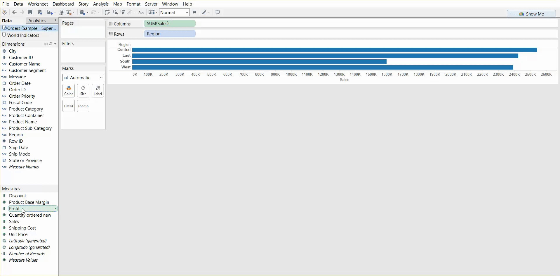
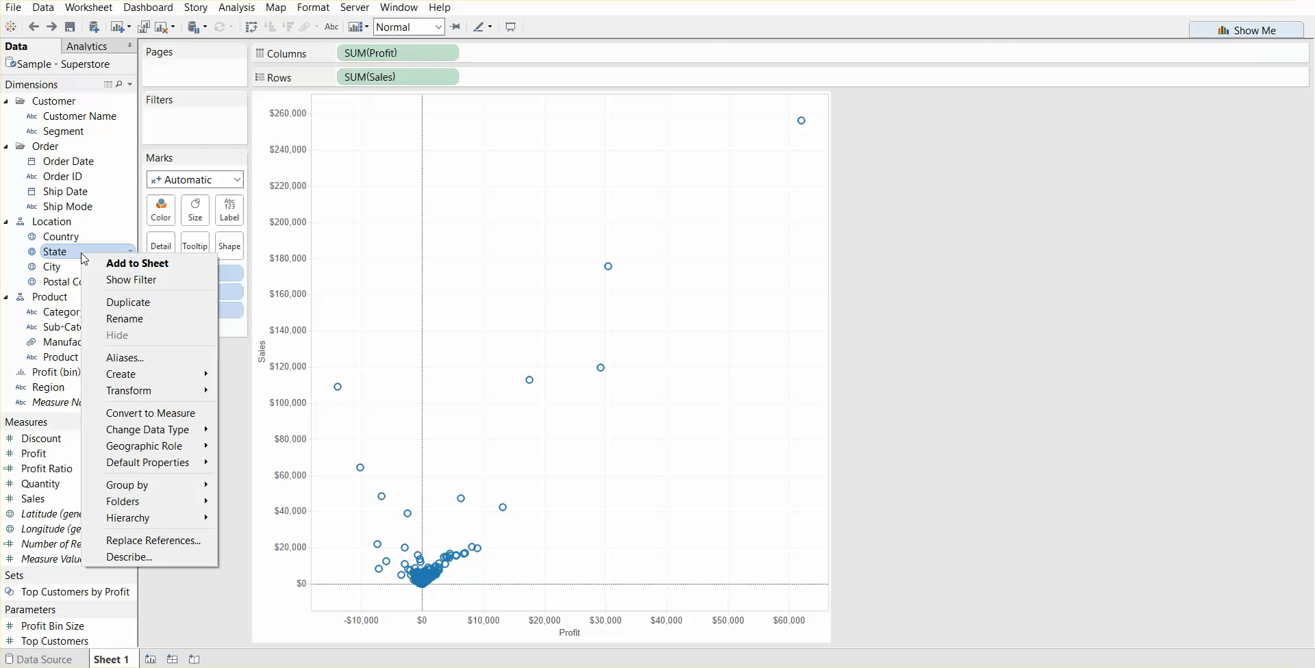
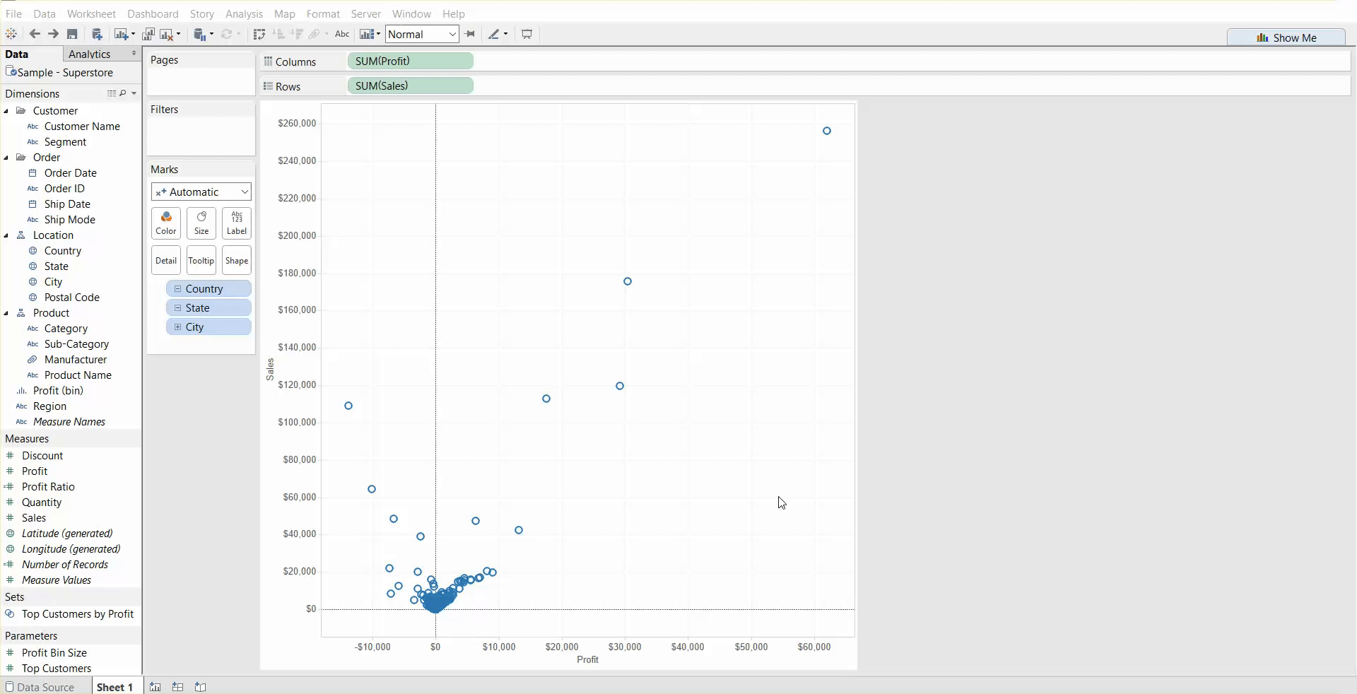
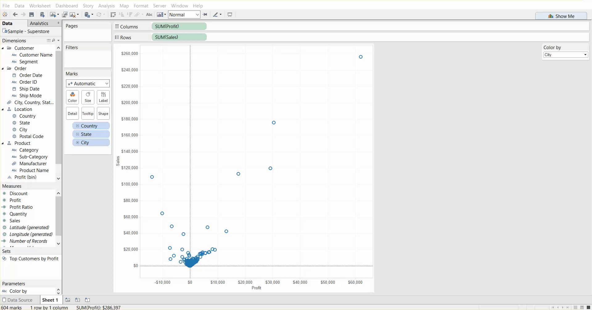
One way you can tell if you’re creating a shared or dual axis is by paying attention to what happens when you drag a pill into your screen. If you see two green boxes, you’re creating a shared axis:
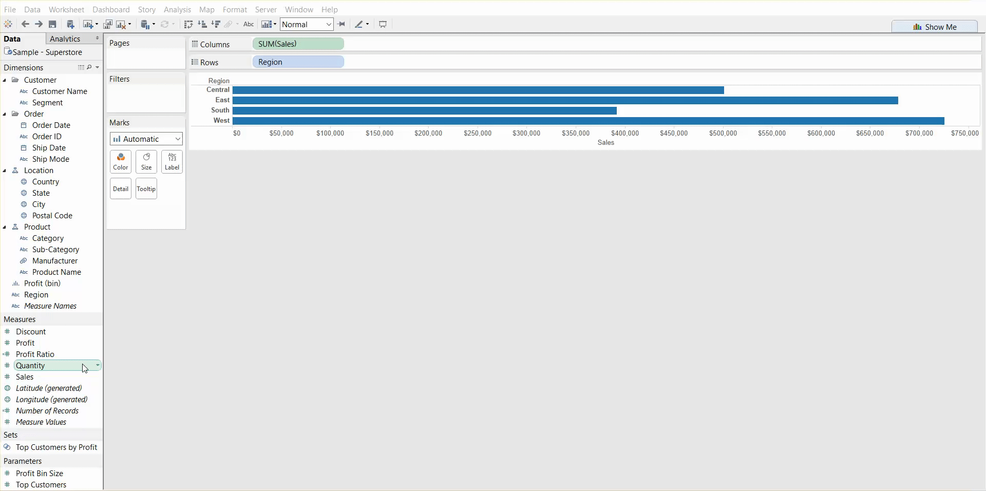
But if you see dots/dashes, you’re creating a dual axis. REMEMBER: Dots = dual, shapes = shared.
Sets v. Groups
Both sets and groups are great for organizing your data dimensions and working with multiple levels of data at one go. However, sets are dynamic and can be updated with new data, whereas groups are static. Sets can be used to filter data in or out, they can be used in calculations, and they can also be used to create mega-sets.
In this example, I’ve used sets to highlight profitable cities compared to non-profitable cities.
Groups are still useful in highlighting groups of data on your sheet, but be aware that they have limitations and are mostly just a useful way of pointing interesting things out such as outliers.
Here I’ve used visual grouping to pick out my top 3 profitable cities. However, if I included new data that had more profitable cites, my grouping would still only highlight the three cities I initially selected. With my set example, if I added new data, the set would adapt to account for the profitability of the new information.
Parameters v. Calculated Fields
I’m still working my way through these, but they’re really important to know because they are the core of what makes Tableau do amazingly interactive things. They kind of go hand in hand together where parameters set up the instructions for your users and calculated fields set up the instructions for Tableau to carry out whatever task you command of it.
Although I’ve created a parameter in this example giving the user a chance to colour the data by state or by city, you can see that nothing changes when I made a selection. This is because I still have to create a calculated field to tell Tableau what to do with the parameter I have created.
And here’s how you can create a calculated field to connect to your parameter:
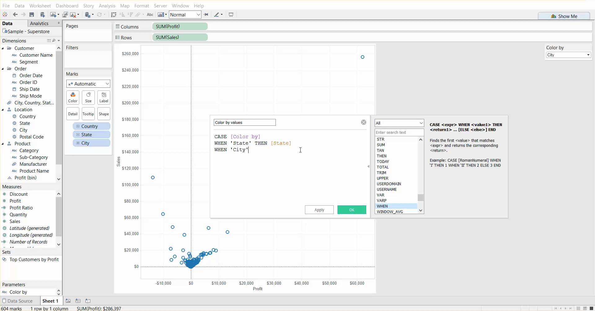
NOTE: This is purely for demonstration purposes. DO NOT create this psychedelic wreck. Use your colours sparingly.
One important difference to remember with parameters and calculated fields is that parameters are “global” – they can be used throughout your entire workbook. However, calculated fields can only be used for one data source at a time. Although parameters are “global,” it’s important to remember that this does not mean that they can do multiple things. One parameter can only do one thing at a time such as filter, customize a view, or pick an aggregation.