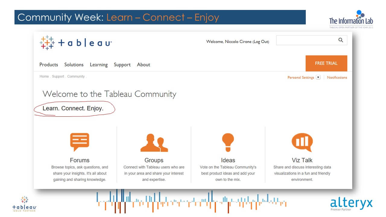
Click on the image to go to Tableau Forum!
Learn – Connect – Enjoy is the slogan of the Tableau Community, and I find it really appropriate.
I spent the last week having a lot of fun on the forum, connecting with people with different skill levels but with a passion (or duty…) in common: Visualizing and Understanding Data with Tableau!
The first thing I want to highlight, is that the Community is an extraordinary place to learn, and it is also super rewarding:
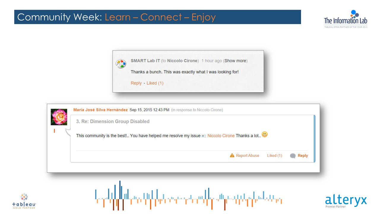
Thank you guys, I definitely received more than I gave in terms of learning!
I also have to say that sometimes things can go a little bit crazy out there…
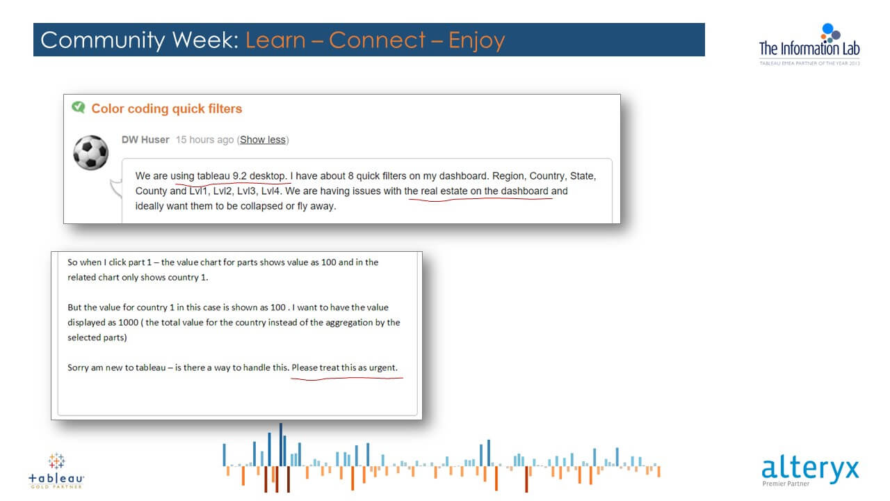
Wow…Tableau 9.2! … “Yes Sir, I will treat that as urgent, please don’t fire me!”
At the end of the week, I can summarize what I learnt about the most common user experience with tableau in two bullet points:
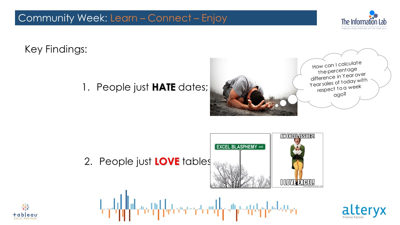
Yeah Date Calcs can be tricky, my friend… and tables are ok but… why not using Tableau for what it is really good, i.e. visualizing your Data?
Despite the love for tables, during the week I was able to accept a lot of visualization challenges. I tried to do my best in providing people with the best solution not only for achieving their concrete needs, but for learning the most out of it.
I always tried to explain properly the whys and hows of each step, and to provide some hint or some alternative solution when I thought there could have been a better way to visualize those figures.
I mean, Data Visualization without meaningfulness is just a nice drawing. After four months of training, I would feel bad if I could only be able to advice people on how to drag and drop stuff properly.
Here below I collected four example of four questions I found interesting, for different reasons.
All the examples are in a packaged workbooks downloadable here.
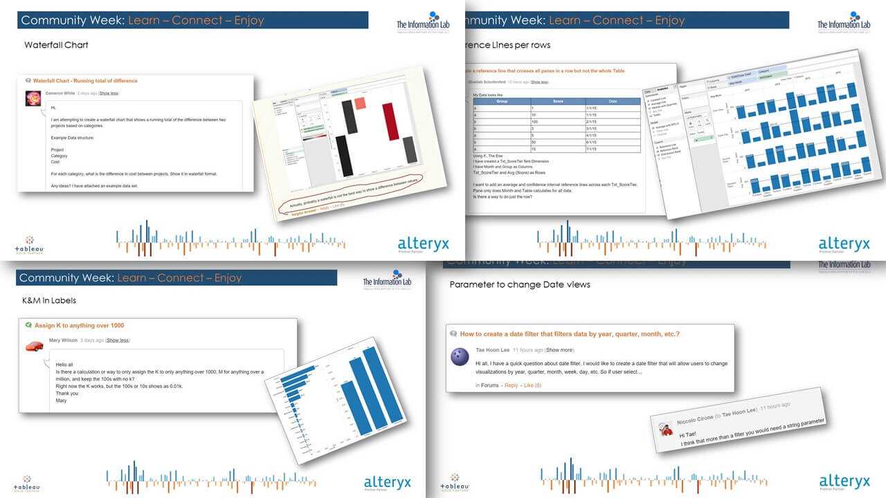
Click on the image to download the packaged workbook!
In the end, after a week of nights spent on the community, I really have to say I am pretty satisfied of my results, in terms of people helped and stuff learnt!
After all, in just five days, I made my journey from a zero-points “Vizitor”, to a five-hundreds-one “Data Cowboy”!
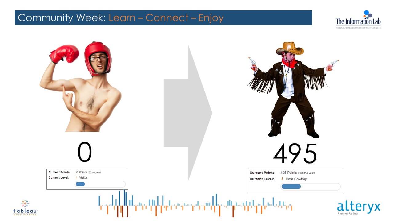
Five days from 0 to 500!