


[et_pb_section bb_built=”1″][et_pb_row _builder_version=”3.1.1″][et_pb_column type=”3_4″][et_pb_text _builder_version=”3.1.1″]
For day 2, the team had to visualize the American Time Use Survey. Read all about it here. There were multiple methods for getting the data, which made for interesting presentations this morning. Some chose to parse the PDFs, others chose to join all of the individual text files. Both methods work, but some are more repeatable than others.
So how did their vizzes turn out? Have a look at each of them and their accompanying blog posts.
[/et_pb_text][/et_pb_column][et_pb_column type=”1_4″][/et_pb_column][/et_pb_row][et_pb_row][et_pb_column type=”1_3″][et_pb_text _builder_version=”3.1.1″]
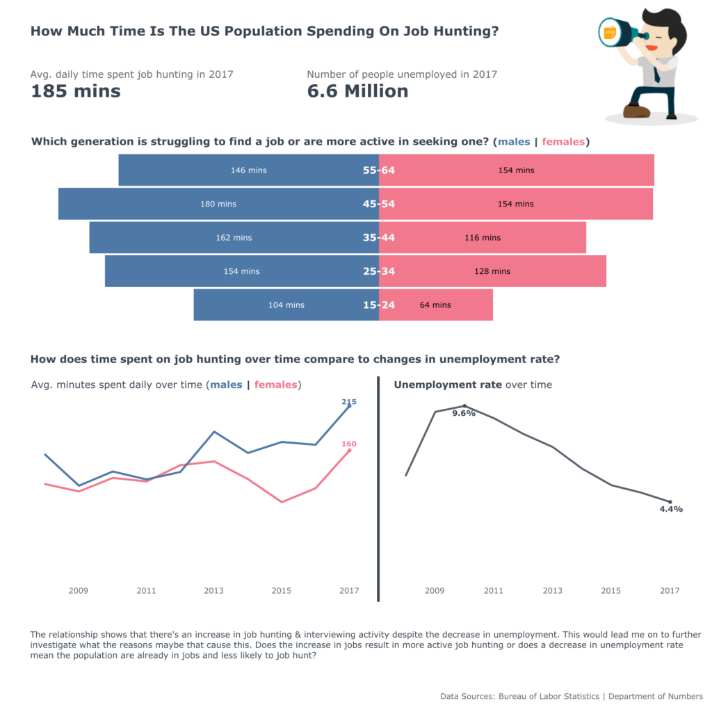
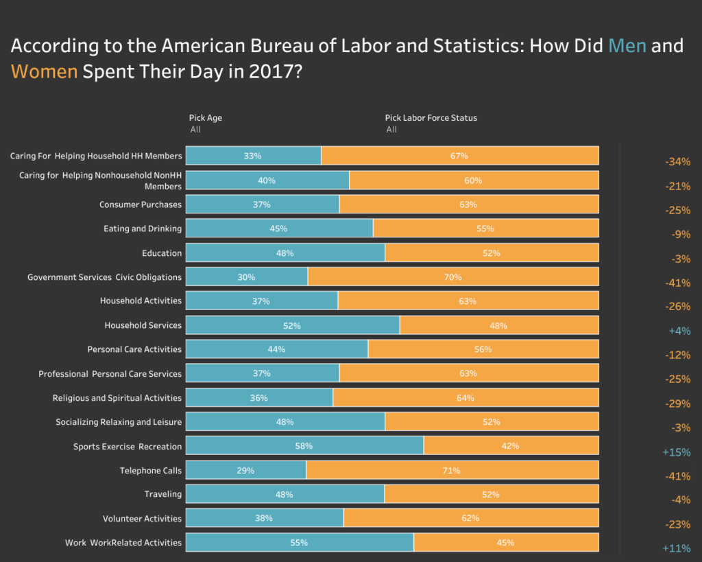
Fuad Ahmed
[/et_pb_text][et_pb_text _builder_version=”3.1.1″]
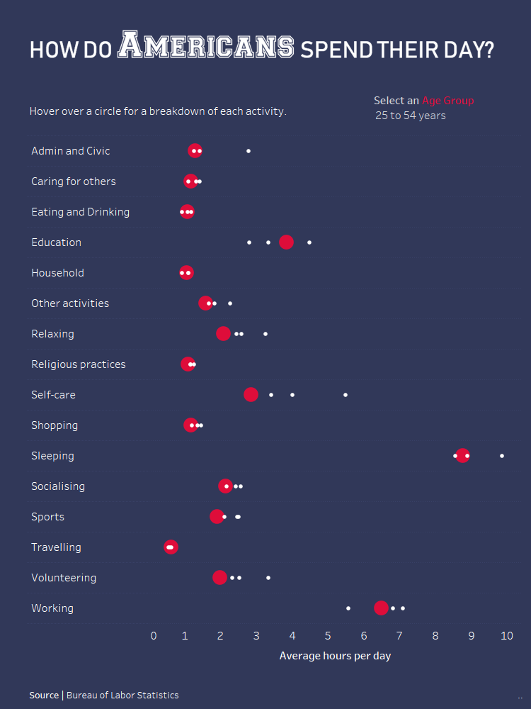
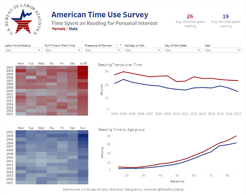
Luisa Bez
[/et_pb_text][et_pb_text _builder_version=”3.1.1″]
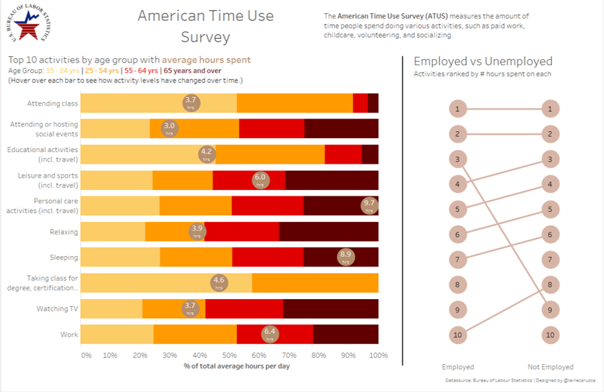
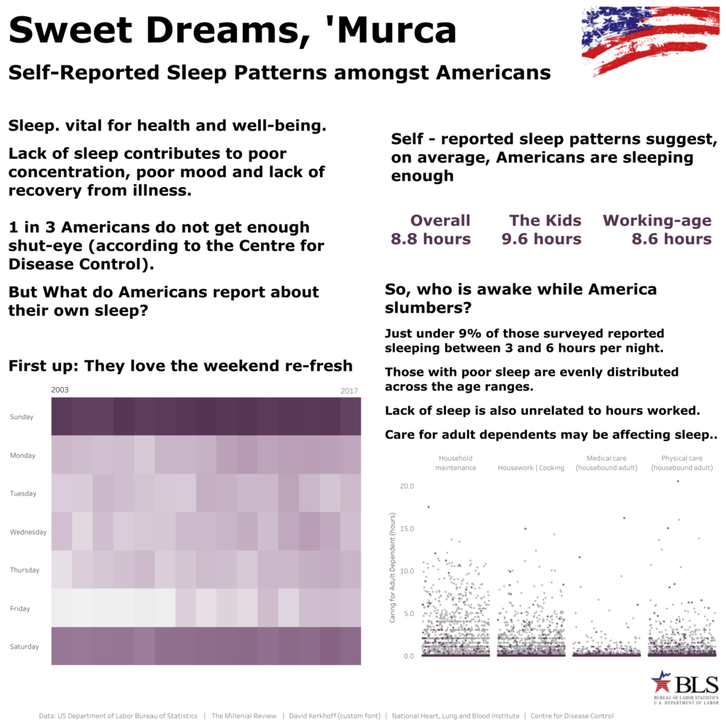
Laine Caruzca
[/et_pb_text][et_pb_text _builder_version=”3.1.1″]
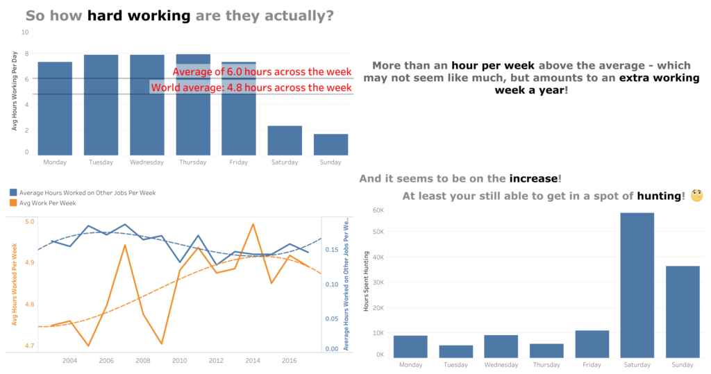
Alex Harrison-Wood
[/et_pb_text][/et_pb_column][et_pb_column type=”1_3″][et_pb_text _builder_version=”3.1.1″]
Nils Macher
[/et_pb_text][et_pb_text _builder_version=”3.1.1″]
Alexander Fridriksson
[/et_pb_text][et_pb_text _builder_version=”3.1.1″]
Adi McCrea
[/et_pb_text][et_pb_text _builder_version=”3.1.1″]
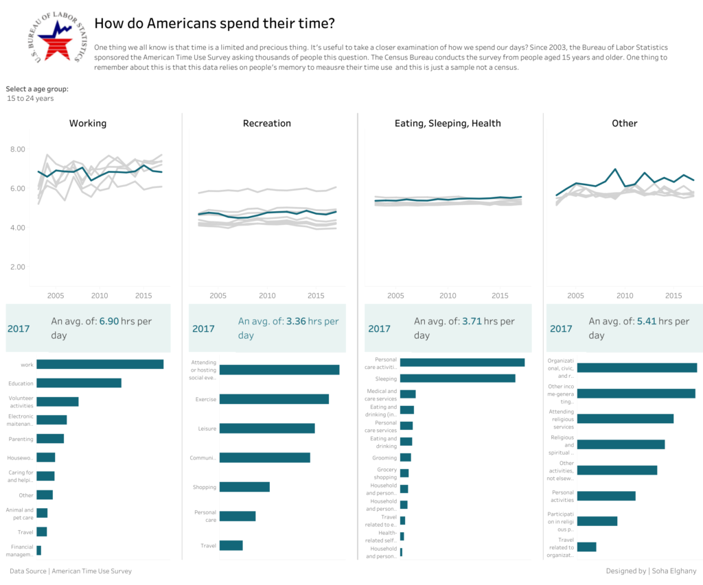
Soha Elghany
[/et_pb_text][/et_pb_column][et_pb_column type=”1_3″][/et_pb_column][/et_pb_row][/et_pb_section]