Control Charts, also known as Shewhart charts or statistical process control charts, are a way of studying how a process changes over time. The chart consists of an average line through the data points, with an upper boundary and a lower boundary also shown on the chart. It can be used to understand if a data point is consistent, within the boundaries (a.k.a 'in-control') or unpredictable, out of the boundaries (a.k.a out of control).
Control Charts are used for various reasons, falling into two categories. Either to determine the quality of data, i.e. looking at specific outliers or correcting problems in a dataset, and predicting data, i.e. predicting a set of outcomes from a process.
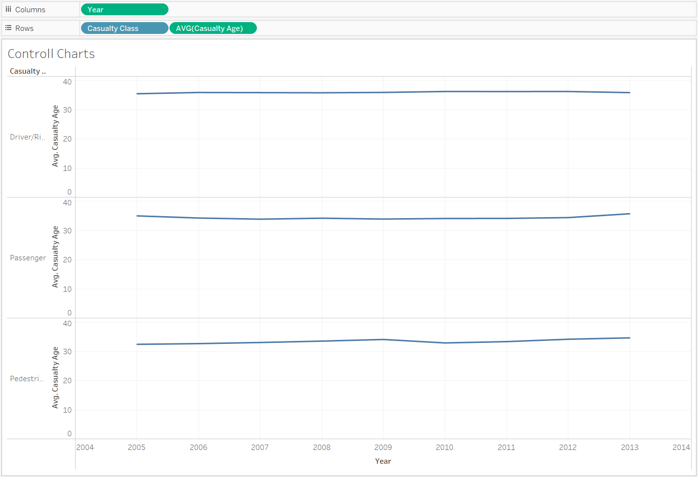
To create a Control Chart in Tableau, one must first build a chart, in this case a line chart, and bring an average line from the Analytics pane onto the view. This will create the middle boundary which acts as our 'anchor point' for our boundaries and data points.
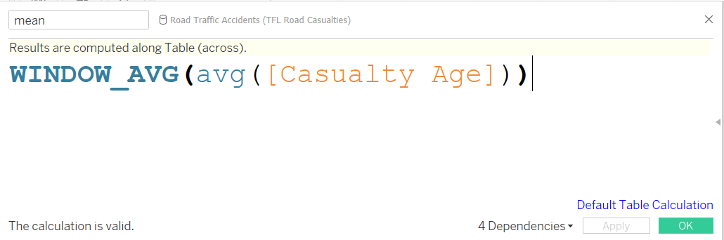
When looking at a range of data sets, or the data set is split into categories (for example), one can create the average line by creating a calculated field. A window average must be found on the average of the measure in question (field on the Y axis). This is also finding the mean, and using this as a value for an average line will give the desired value for each section of data.
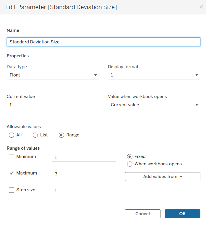
The boundaries must next be created. Standard deviations are the typical way to set the boundaries' value. The upper boundary being typically one standard deviation above the average, whilst the lower boundary is one below the average. Sometimes, the boundaries are required to be multiples of the standard deviation, though rarely higher than 3. To give added interactivity for users, a parameter should be created holding a range of 1-3, to give users this option of setting boundaries.
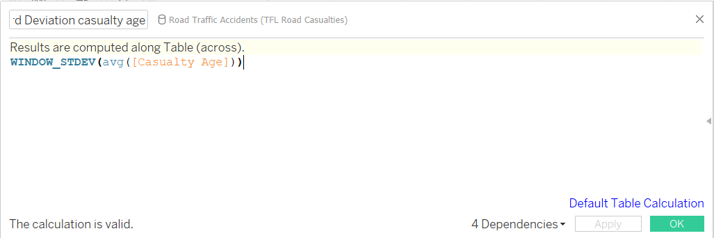
The boundaries must be calculated in separate calculated fields for each the upper and lower boundary. First create the standard deviation value. In a calculated field, use WINDOW_STDEV with the same measure as used in the mean calculation, with the same aggregation, in this case it is avg().
Next, make the value of the boundary by creating another calculated field and calling on the mean calculation made earlier. For the upper boundary, adding the standard deviation multiplied by the Standard Deviation parameter to the mean. For the lower boundary, do the same but use a minus.

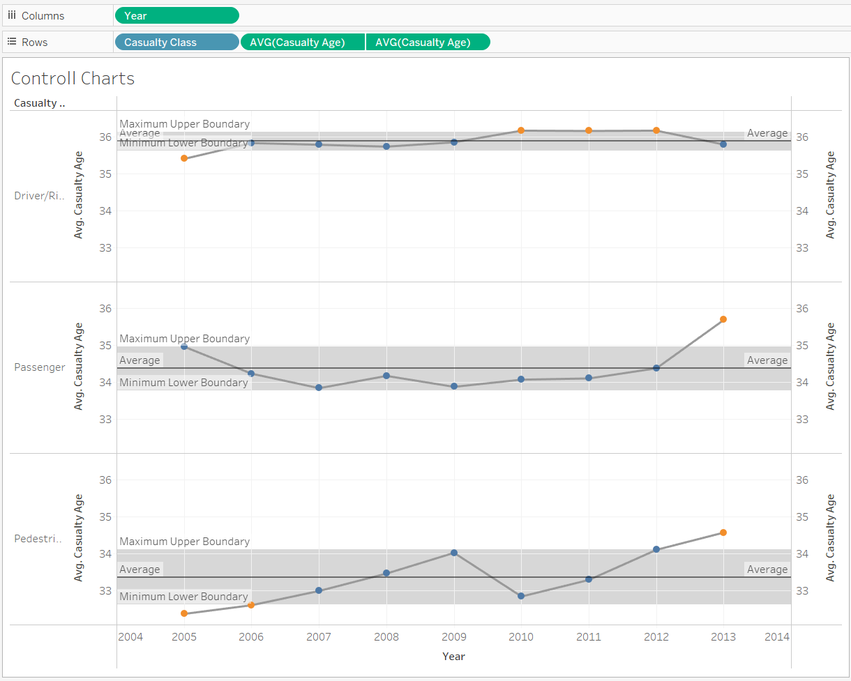
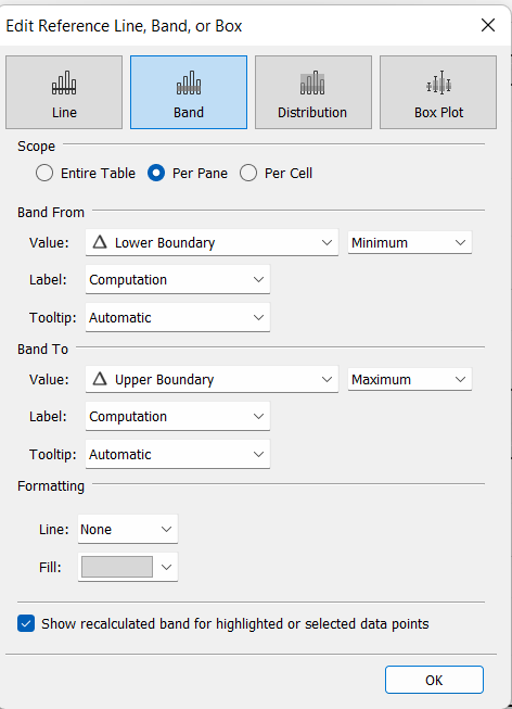
Next drag a reference and onto the view via the analytics pane and set the upper and lower boundaries to the calculated fields made, respectively. This band will be the range for data points 'in-control', whilst points outside of this banding are out-of-control, or unpredictable. Using the parameter should change the size of these bandings.
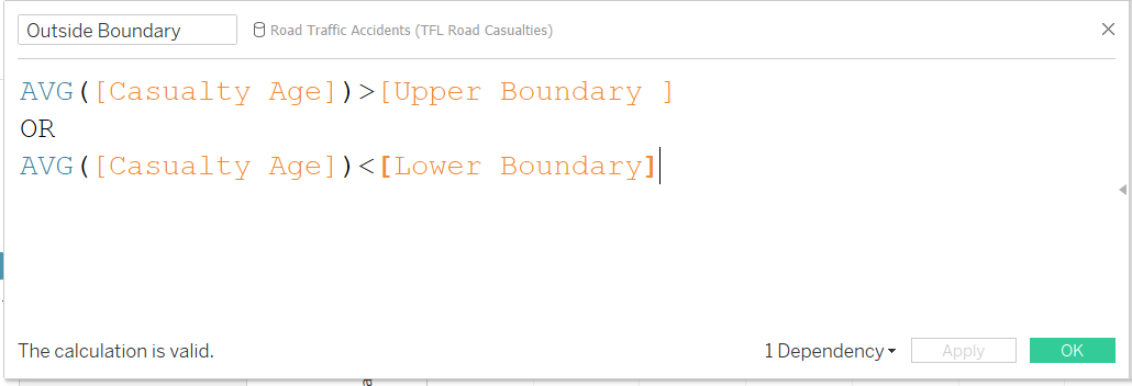
To make this chart more dynamic, duplicating the measure, making this into a duel axis and turning it into a circle chart (dropdown on marks card), we can highlight the data points on our line. We can then create a calculated field to determine if a data point is in or out of the boundaries. We can then drag this onto colour to highlight points as they fall within or outside of the reference bands.
Your final chart(s) should look more like this.