The Comet Chart is a simple visualisation that can be used very effectively to show Year on Year change; we instinctively recognise the comet shape, and can immediately infer direction of travel.
In terms of construction, they work similarly to dumbell charts in Tableau.
One drawback of this chart to consider would be labelling conventions, since including both the current and previous year values as well as the difference between them can lead to slightly busy-looking charts.
The brief
Using Superstore data, build a comet chart that shows Year on Year Sales growth for the Canadian states and provinces, for the most recent year available. Use colour formatting to help users identify locations of interest, i.e. the states/provinces that had lower sales this year than last. The chart should be future-proofed, i.e. we cannot hard-code the years 2021 and 2022.
1. Create a calculation to always return the Latest Year
In order to future-proof this chart, we can use a FIXED LOD calc to find the latest available Year of Order Date in our dataset:
{ FIXED: MAX(YEAR([Order Date])) }
This will automatically reflect any changes to the dataset if more years' data is added.
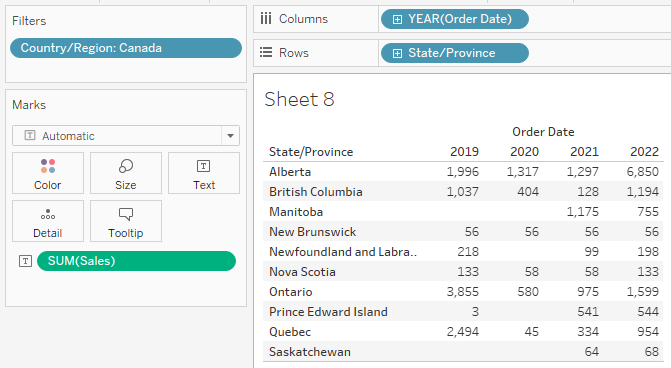
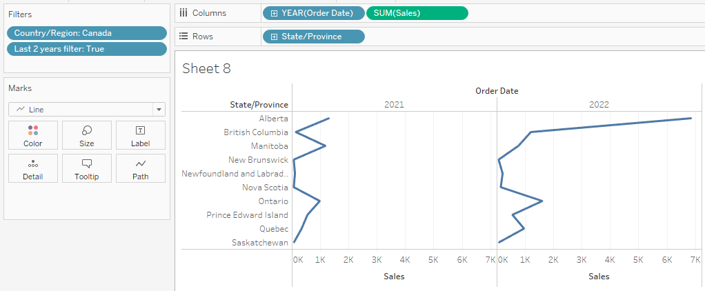
2. Start constructing a table, and add a filter
We will create some more LODs, and this is often easiest to do when we have a table to check against.
The brief asks for only the Canadian states/provinces, so we can drag State/Province onto rows, Year of Order Date onto Columns, SUM of Sales onto the Text marks card, and filter the Country dimension to Canada only.
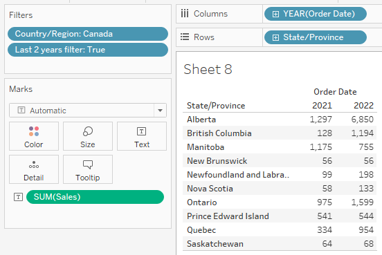
We are only interested in the latest 2 years, but we do not want to just hard-code this by dragging the Year of Order Date onto filters and selecting 2021 and 2022.
Instead, we can create a calculated field based on our first LOD:
YEAR([Order Date]) >= [Latest Year LOD]-1
This calc returns a Boolean value, 'True' if the Year is greater than or equal to the Latest Year - 1 (in this case 2021), otherwise 'False'.
We can drag this onto the Filters card and select 'True'.
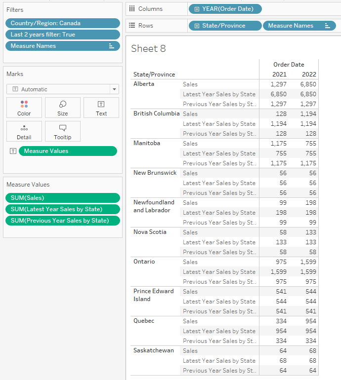
3. Create LODs for CY and PY Sales by State/Province
While we have this neat table to check against, we can build out tow more FIXED LOD calculated fields. These will be necessary for finding the difference between the two Year values for each row, and we will come back to them later during the formatting stage.
For finding the current or latest year's Sales figure for each location, we can construct the following LOD:
{FIXED [State/Province]:
SUM(IF YEAR([Order Date]) = [Latest Year LOD]
THEN [Sales] END)
}
The LOD for the penultimate or previous year's Sales figure for each location is very similar, but subtracts 1 from the year:
{FIXED [State/Province]:
SUM(IF YEAR([Order Date]) = [Latest Year LOD]-1
THEN [Sales] END)
}
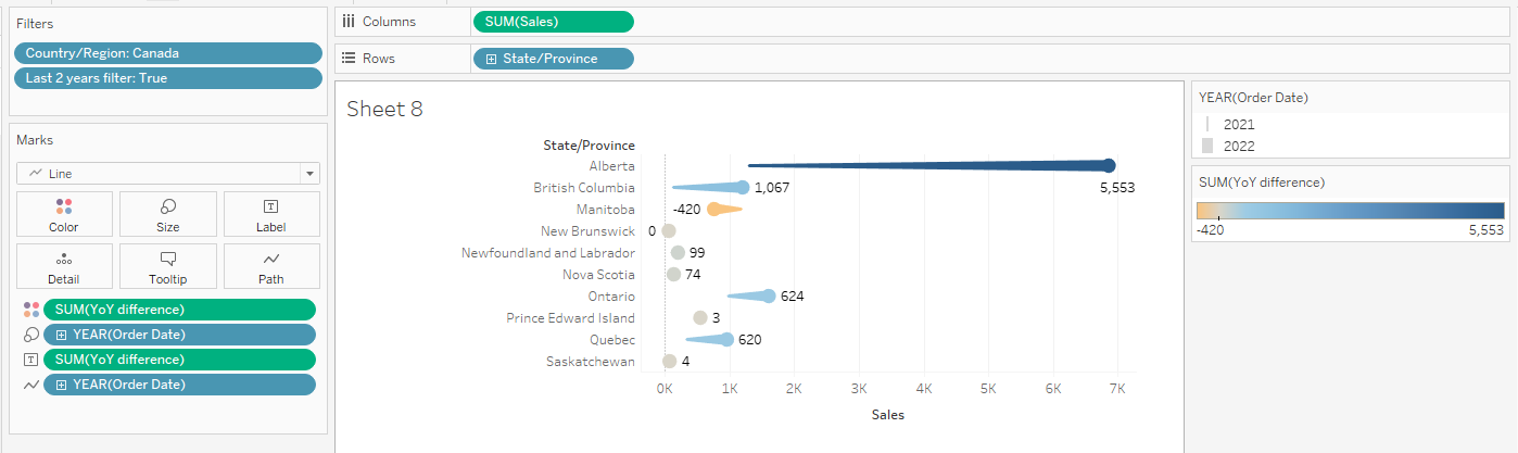
We can drag these into the view to check that they are correct and match our other Sales totals:
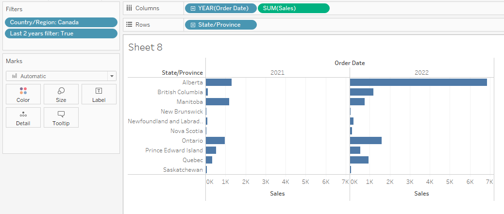
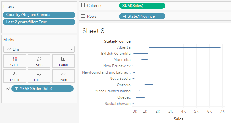
4. Create the Comet shapes
Constructing the chart itself is straightforward, and we can use our existing table as the starting point.
Remove the two new LODs for now, and drag the green SUM of Sales pill onto the Columns shelf:
First we will need to change our mark type to Line:
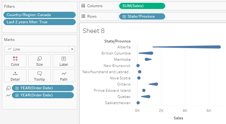
Now we will need to remove our discrete Year of Order Date pill from the Columns shelf, and instead drop it onto the Path mark card:
Finally, to get that comet shape with a nucleus and a tail, we will also want to drop Year of Order Date onto the Size marks card. Hold down Ctrl and drag the Year of Order Date pill onto Size in order to duplicate it:
5. Add colour and labels to highlight locations of interest
Now our two LODs for Sales by State in the latest and penultimate years can be used to calculate Year on Year change.
We can create one more calculated field that subtracts 'Latest Year Sales by State' from 'Previous Year Sales by State', and drag this onto the Label marks card.
Initially Tableau will label both ends of the comet, which can look rather crowded and adds confusion; we can counter this by clicking the Label marks card and selecting the 'Most Recent' option from the 'Marks to Label' menu:
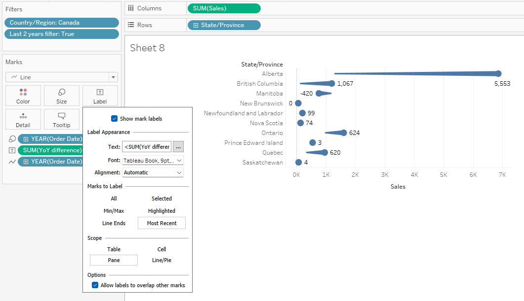
As per our brief, we also want to make it very clear which locations have made a lesser sales total this year compared to the year before.
Again, we can hold Ctrl and drag our new YoY difference calculation from Label to the Color marks card to duplicate it there.
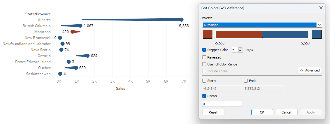
Initially Tableau may default to using a continuous colour pallete:
If we want greater clarity in this chart, we can simplify by right clicking the colour legend, going to 'Edit Colors', and changing to Stepped colours with 2 steps centred around zero:
6. Any further formatting
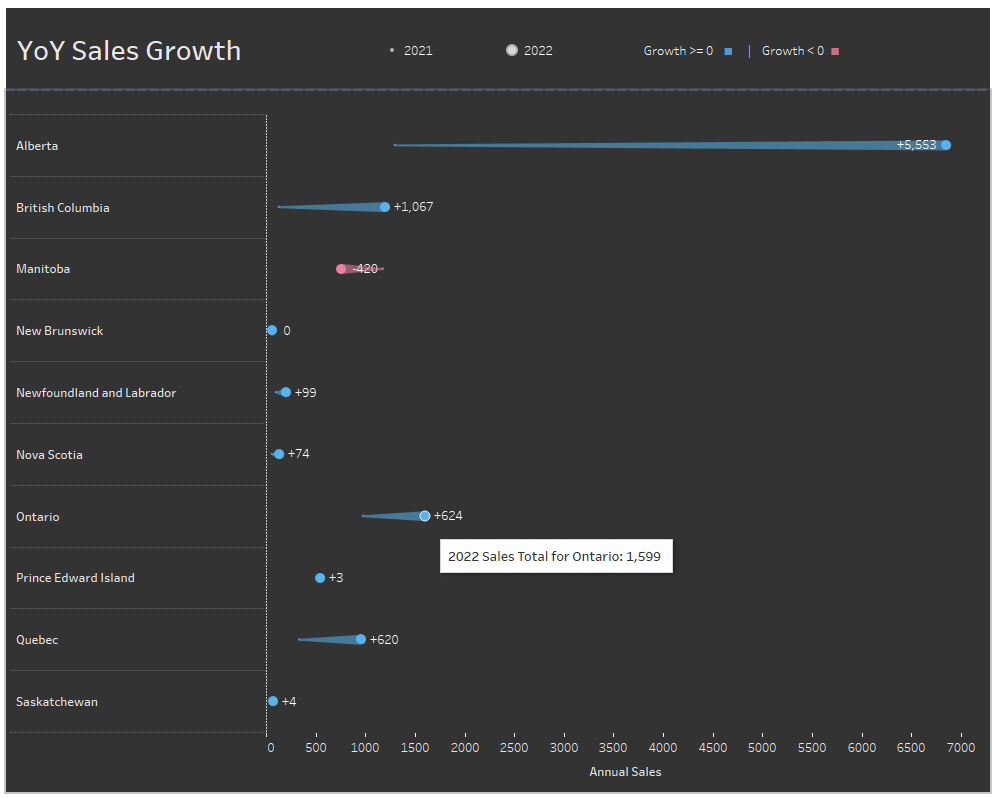
We have built a Comet Chart that meets the requirements of our brief.
However, there are still a few things to consider that might improve the look and feel of the chart, as well as making sure it is readable and clear for users.
- Clear legends and signposting: assume users have not encountered this chart type before - what questions might they ask? Questions about the comet shape and colour formatting can be answered neatly using automatic legends, or by adding a descriptive subtitle to the chart.
- Custom number formatting: the chart labels should not be confused for the Sales values, and one way we can clarify this is by adding + or -, or up and down arrows to show that the comets represent positive or negative change from the previous year.
- Tooltips with actual Sales values for each Year: the chart is looking at growth, but users will still want to know exact Sales figures for each year. We could either look at adding more labels, or for a cleaner look we can include this is hover tooltips.
- Dual axis for the comet and tail: another aesthetic enhancement would be to add a dual axis Circle mark to the chart for Sales values. This essentially just adds two circles on top of the comet shape (one large, one small), but we can then lower the opacity of the comet underneath to really imitate the look of a comet and streaming tail. It also better defines the points where users can hover for a tooltip.
Finished chart
Comet Charts might not be the best solution for every occasion, but they definitely provide an interesting alternative to more standard chart types when depicting Year on Year growth and change.