It is almost inevitable that at some point during your journey as a Tableau user, you will encounter the age-old request: 'can you remake my Excel chart, but in Tableau instead?'
Usually, we can be confident that anything Excel can visualize, Tableau can do even better... but there are some edge cases.
Today's example is the 'grouped' or 'clustered' bar chart, where values are shown directly side-by-side in the view.
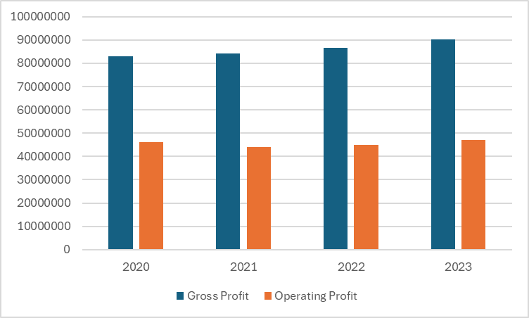
In the Excel chart below, we can see two measures being compared for each Year: colour is used to help us recognize the different measures, while the spacing between each cluster of bars makes it easy to see which ones correspond to the different Years.
As a chart type, clustered bars can certainly be recreated in Tableau, albeit with less spacing between clusters: the chart below presents Sales for each Quarter, split out according to Product Segment.
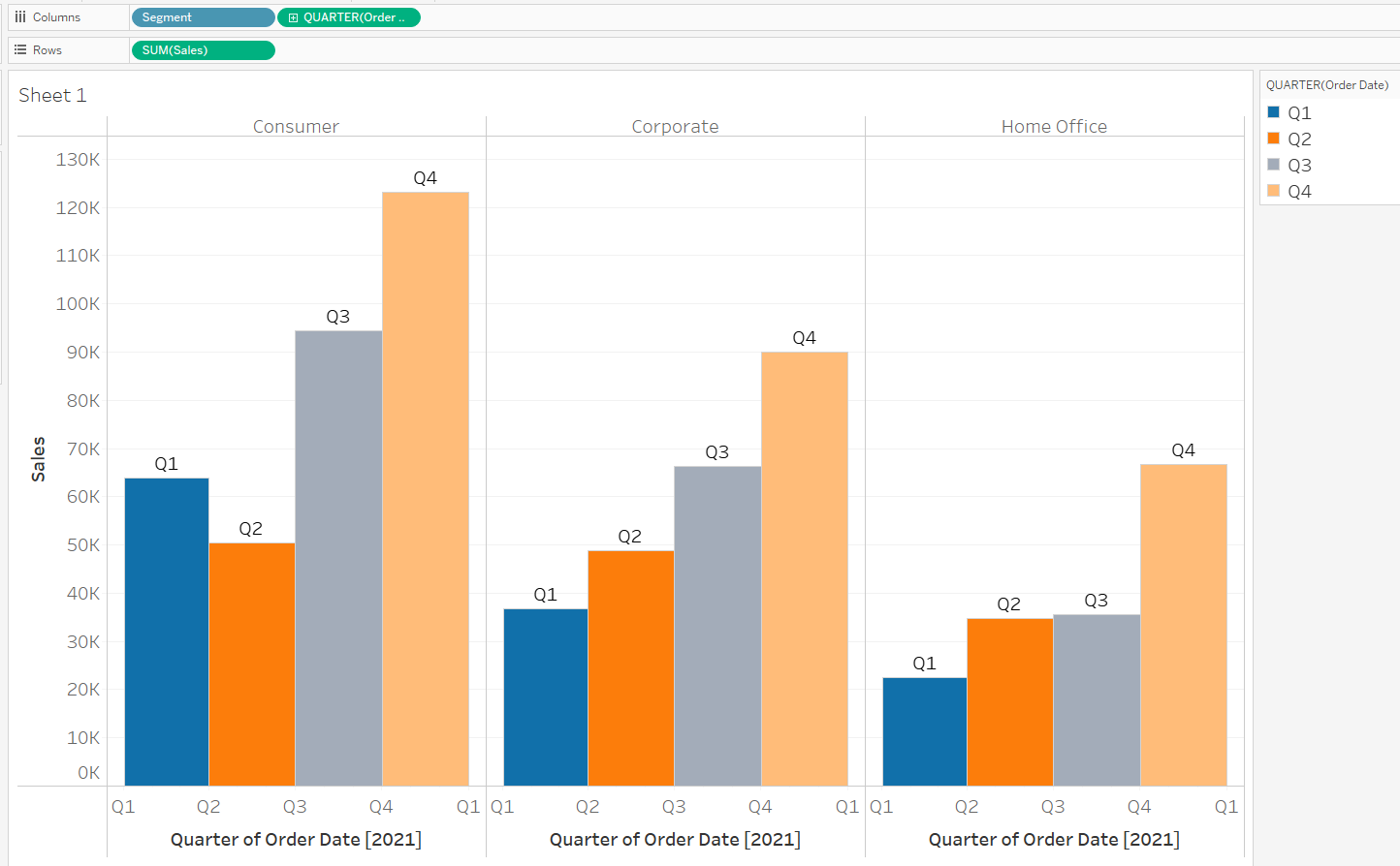
However, this is Superstore data, and we are presenting it in a different way: the clustered bars are being plotted on a continuous axis (Quarter of Order Date, a green field), while the discrete Segment dimension (a blue field) is used to split out columns and assign colours.
What does it look like if we try creating clustered bars in Tableau using the same dataset?
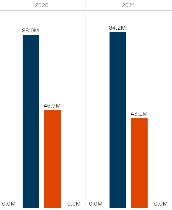
| ORDER DATE | GROSS PROFIT | OPERATING PROFIT |
| 2020 | 82970000 | 46890000 |
| 2021 | 84220000 | 43114000 |
| 2022 | 86445000 | 45600000 |
| 2023 | 90076000 | 47240000 |
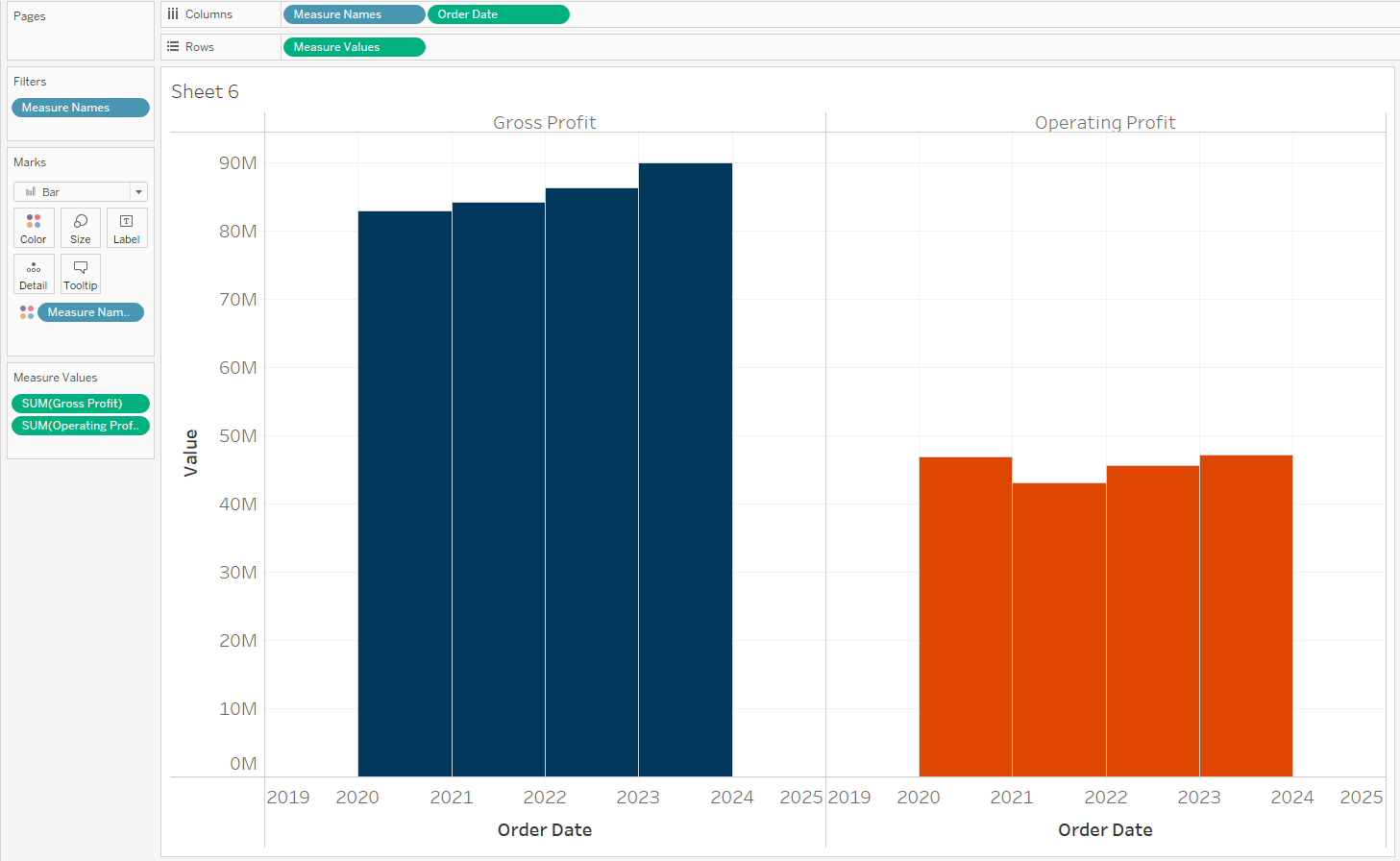
Since we want to show multiple measures on the same axis, we might build this as a Measure Values chart, dragging our Order Date onto columns, then the two measures 'Gross Profit' and 'Operating Profit' onto the same y-axis.
Copying the Measure Names field onto colour gives us a chart like this:

We have a bar chart, but it isn't clustered...
The same information is being displayed, and some users will be satisfied with the look and feel of this chart as it is; but what about those users who find this more challenging to interpret? Is it clear enough which Year lines up with each pair of bars?
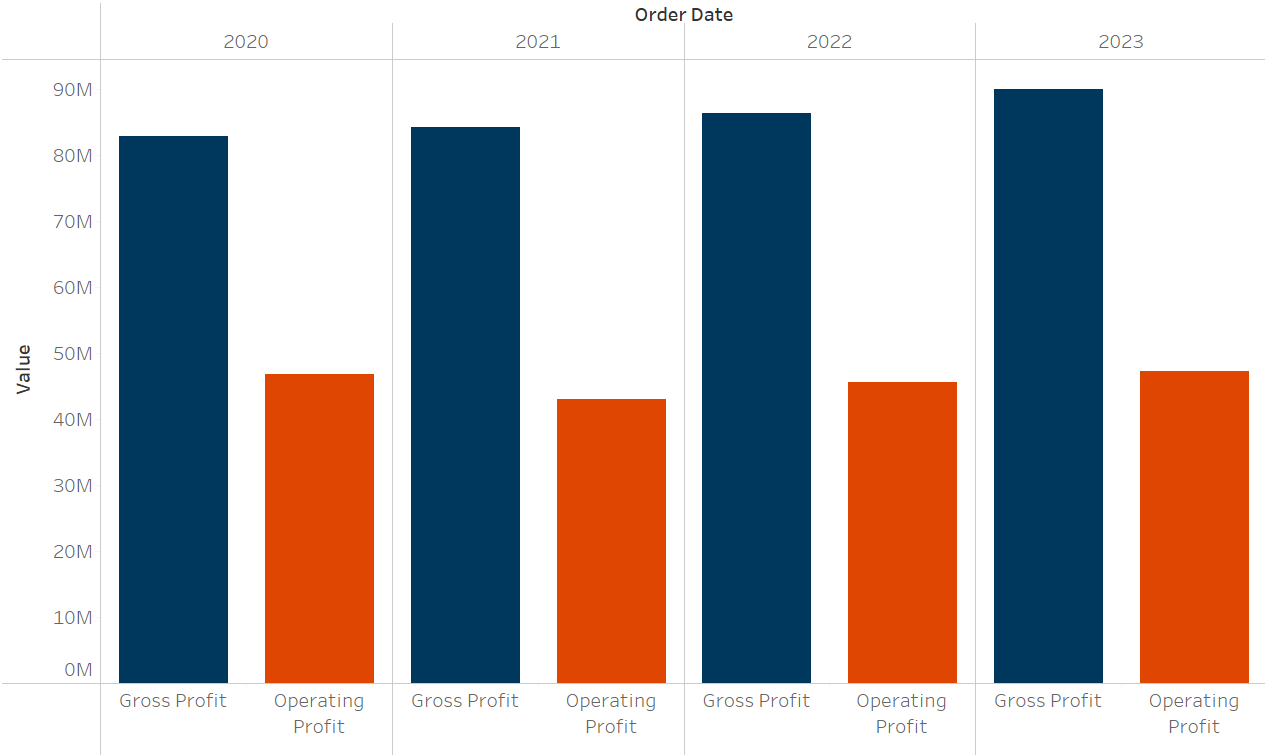
We can try emulating the previous clustered bar chart that used Superstore data, but we immediately run into an issue: continuous fields in Tableau always come after discrete ones.
In order to have the measures side-by-side, we need the discrete 'Measure Names' field to come after the date field in our view. Swapping the order of the fields in our columns shelf, in order to create a continuous Order Date axis like the other chart, means that the measures are split up instead of being clustered:
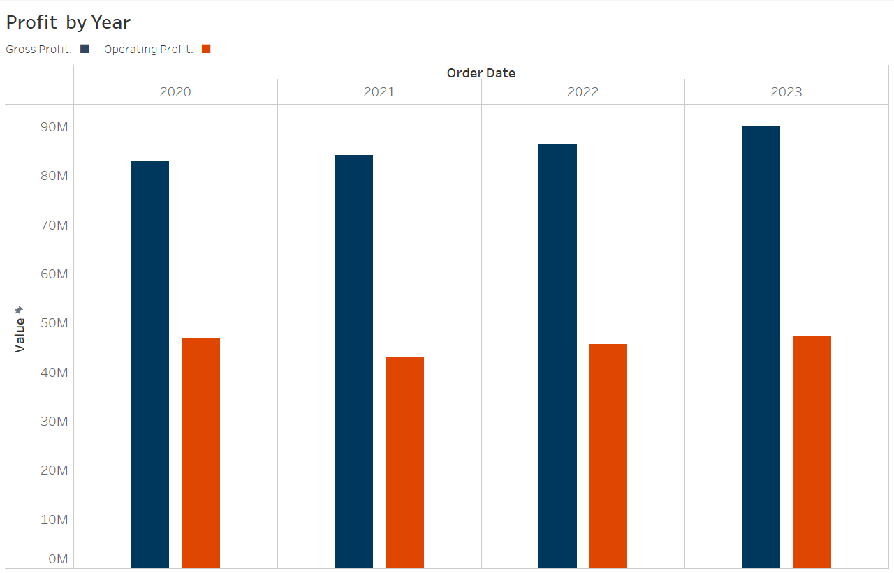
We might consider two options here.
The first, and simpler option, is to add borders into the original bar chart. While some Tableau developers are not keen on 'chart junk' and the busy appearance of grid lines and borders, this is one quick way to make the first chart slightly clearer:
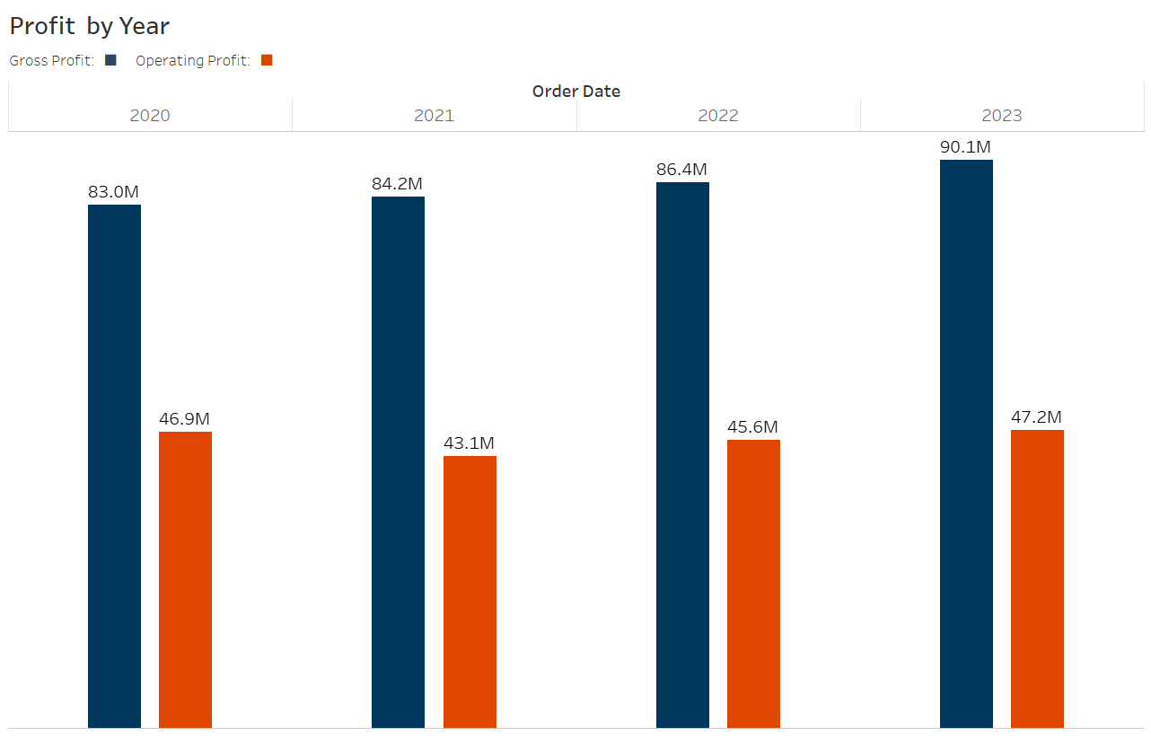
The second option gives us the chart below:
How to build:
- Start with our standard Measure Values bar chart, with borders off.
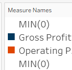
- To the Measure Values shelf, add two placeholder measures, e.g. MIN(0):
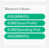
- Order the Measure Values so that the placeholders sit in the first and last slots.
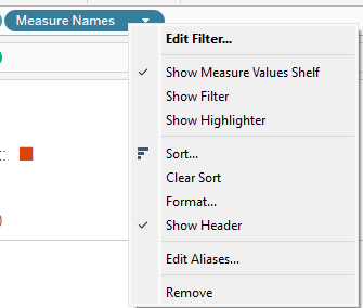
- Hide the x-axis of the chart by right clicking Measure Names in the column shelf, and make sure 'Show Header' is unticked:
- Now that we don't have this bottom axis, we will rely on colour coding for users to recognize the different measures. The automatic colour legend will continue to show 'MIN(0)' values, so we can instead edit the chart title to include a legend in its subtitle, using unicode '■' to define colours.
- If you are seeing a mark in the zero position for either of the MIN(0) placeholders, consider changing the Measure Names colour to the same as the background:
- If you are including mark labels in your chart, you might see MIN(0) values showing their 0 values:
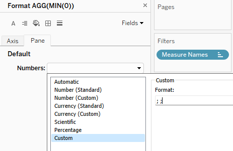
You can combat this using custom number formatting: right click the MIN(0) fields in the Measure Values shelf, and select 'Format'. The string ';;' will cause Tableau to show blank labels for positive, negative and zero values.