For the Wednesday of DS30's Dashboard Week, we were tasked with once again designing a Dashboard that focused on users with accessibility requirements, incorporating universal design wherever possible.
This was a really good chance to consolidate some of the concepts from Tuesday's introduction to Accessibility, while also letting us all incorporate our own design styles.
The brief:
"Imagine that Glasgow City Council are trying to make their city’s data more accessible to residents, and have given us a sample of road repair data from FixMyStreet.com to show what we can do.
Create a product which enables users who are not well served by current interfaces to access data about their surroundings."
From this brief, I focused on two key points...
- The use case: this Dashboard would be used by residents of Glasgow to investigate road repair issues reported around the city. We should set the level of entry nice and low, since the average person might not have high data literacy or be familiar with Tableau.
- The design priority for this Dashboard is to make it suitable for as wide a range of users as possible, especially any with accessibility requirements.
The data we were given provided the latitude and longitude of sites where road repair issues had been reported, along with details of the area and street name and the type of issue.
Challenges:
I wanted to focus on 4 main qualities when designing and building this Dashboard:
- Clear interpretation for visual impairments (including issues around color-blindness, text contrast, and visibility of Tab selector box)
- Ease of use with a Screen Reader (including alternatives to charts and features which cannot be read with this feature)
- Navigability without a mouse (including focus order and avoidance of Tooltips)
- Avoiding cognitive load and overwhelm (keeping design clean and straightforward, limiting number of points/bars in each chart, and summarising key findings)
Further Improvements:
I received some positive feedback around the design of this Dashboard, but there were a few features that would need a bit more thought!
I had included some dynamic titles with KPIs that would technically be readable with a Screen Reader, but in fact the phrasing of these titles would be unclear if a Screen Reader elided the text together without clear pauses and breaks; I updated this to make it simpler for a user to interpret KPIs when using this feature.
I had also made use of slider bar filters as I knew these could be easily used without a mouse or tracker pad, but it was pointed out that the text was fairly small, and the user would not be able to see a list of all filter options without flicking through the entire list.
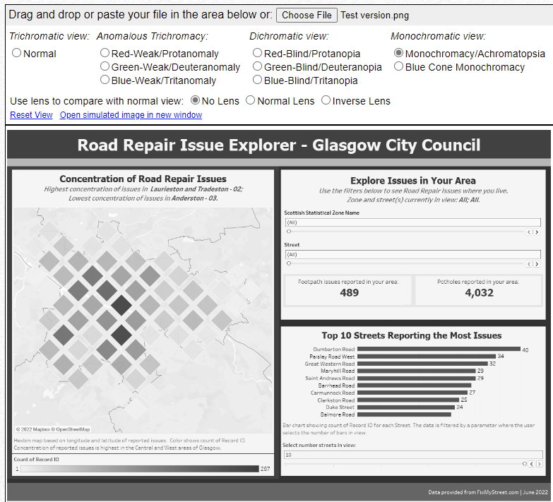
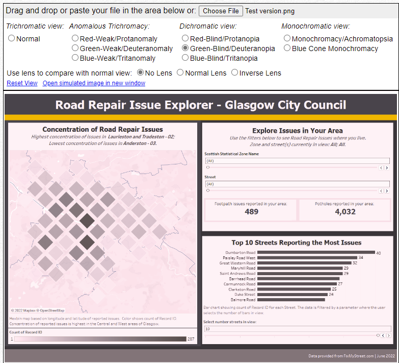
One feature which split opinions was the use of a hex bin map. I felt this would be a good interpretation of universal design - many normative users would likely expect to see spatial data in some visual format, but the use of hexbins limits the number of points on the chart to reduce cognitive load, and conveys concentration of road issues through depth of colour.
However, it was noted that hexbins do not represent clear-cut, familiar areas in a city or region, and can actually be misleading for users who have not encountered them before:
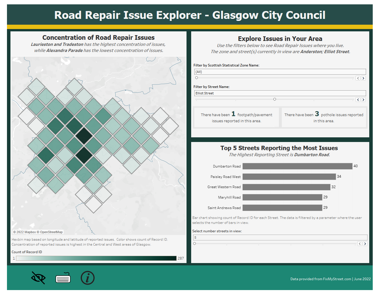
My finished Dashboard can be viewed here, or seen below:
And again, with some color-blindess simulations applied: