This week we had an afternoon trying out one of Tableau's main competitors, Power BI. If you have been in the analytics or visualization space for a while, it's likely you've heard of Microsoft's BI offering.
As a regular user of Tableau at the Data School, I obviously went in with a slightly biased view to Power BI, and at first the feeling of trying a different BI software was akin to putting your slippers on the wrong way round - resulting in that feeling of 'I know this is what I'm meant to do but something feels... off.' Regardless after a few hours of using the tool, I have decided to compile a list of pros and cons of Power BI when compared to Tableau.
The Pros:
- The interface in Power BI is quite intuitive and easy to pick up at a first glance.
- The visualization tab, where you can easily change charts, is a better offering than Tableau's 'show me' feature, and allows those without much chart experience to experiment easily.
- The canvas is easy to use, and simple yet effective dashboards are easy to make.
- User made chart types in the visualization window are easy to download and use, although your mileage may vary.
The Cons:
- Formatting is hidden behind a lot of drop down menus, a lot of which are confusingly named.
- There is no dedicated space for making sheets, leading to having to do everything in one window, which can get confusing with complex datasets and analysis.
- No 'fit to x' feature, making tables and charts that could be smaller take up a lot more room.
- Lack of axis and label controls.
- Lack of calculated fields within the Power BI Desktop software, with calculations having to be made at the data preparation level.
Overall, I think Power BI is worth a go if you are interested in a free BI software, but I think Tableau covers all the bases that any analyst could ever need, and has thought a lot more about what tools an analyst needs to succeed in creating a good viz.
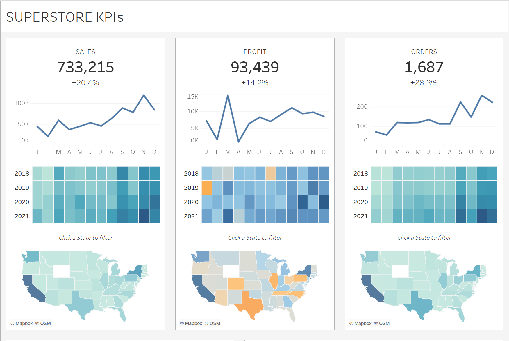
To round off, I have an example of my work. The first picture is a visualization by Andy Kriebel using the Tableau Superstore dataset which is on his Tableau Public (link below image), and below that is the recreation I attempted in Power BI.


