Today we put in use what we had learnt about making dashboard accessible to different needs for those with disabilities and impairments.
When I built my dashboard visualising road issue reports in Glasgow, I accommodated for dyslexia and visual impairment by making the background of the dashboard a light blue colour instead of white, and made sure to use sans-serif fonts with a high contrast and large size.
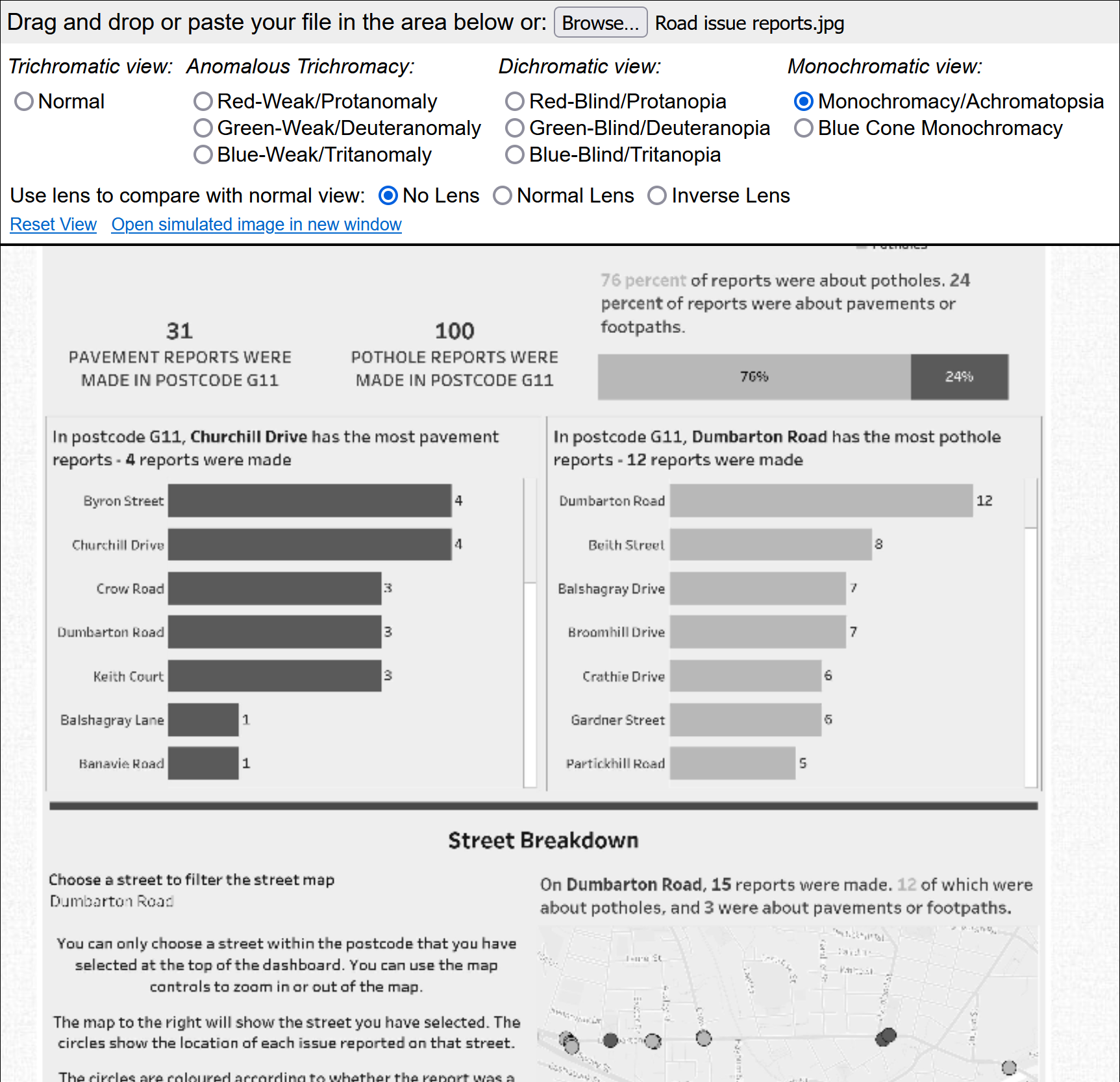
The colour palette was tested against different types of colour blindness (on this simulator) to ensure the colours for pavement and pothole reports were still distinguishable. I found that having one dark colour and one light colour works best for monochromatic colour blindness, but this made the orange text a little difficult to read as it was too light, so the colours still need some tweaking.
I made sure to include summaries of the key findings of the charts in the titles, since screen readers cannot read the charts - only the titles. To reduce cognitive load, I removed some elements of the map and added an explanation so that users are fully aware of how the chart works, and how it fits with the rest of the dashboard. I also ensured the marks were large, with dark borders to properly distinguish them from the map.
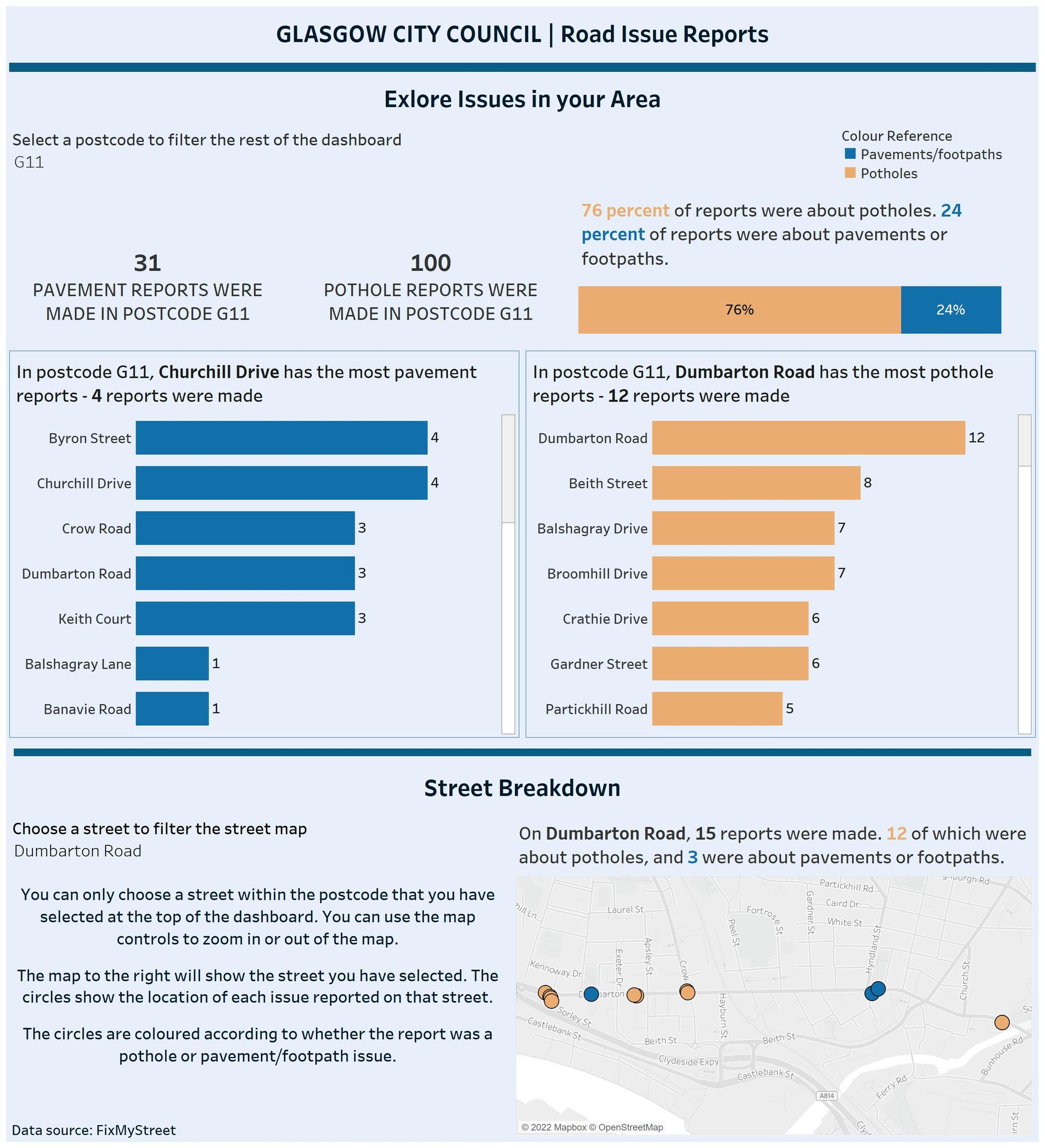
Overall, I built this dashboard to be usable by screen readers, clear enough for the visually impaired, and simple enough to use and understand for those with cognitive disabilities.