For our final project of dashboard week, we were tasked with creating a dashboard using HR attrition data for a mock company.
I decided to create a dashboard that would help a decision maker understand what the level of attrition is in the company, where it’s happening, and then start to explore the drivers behind it.
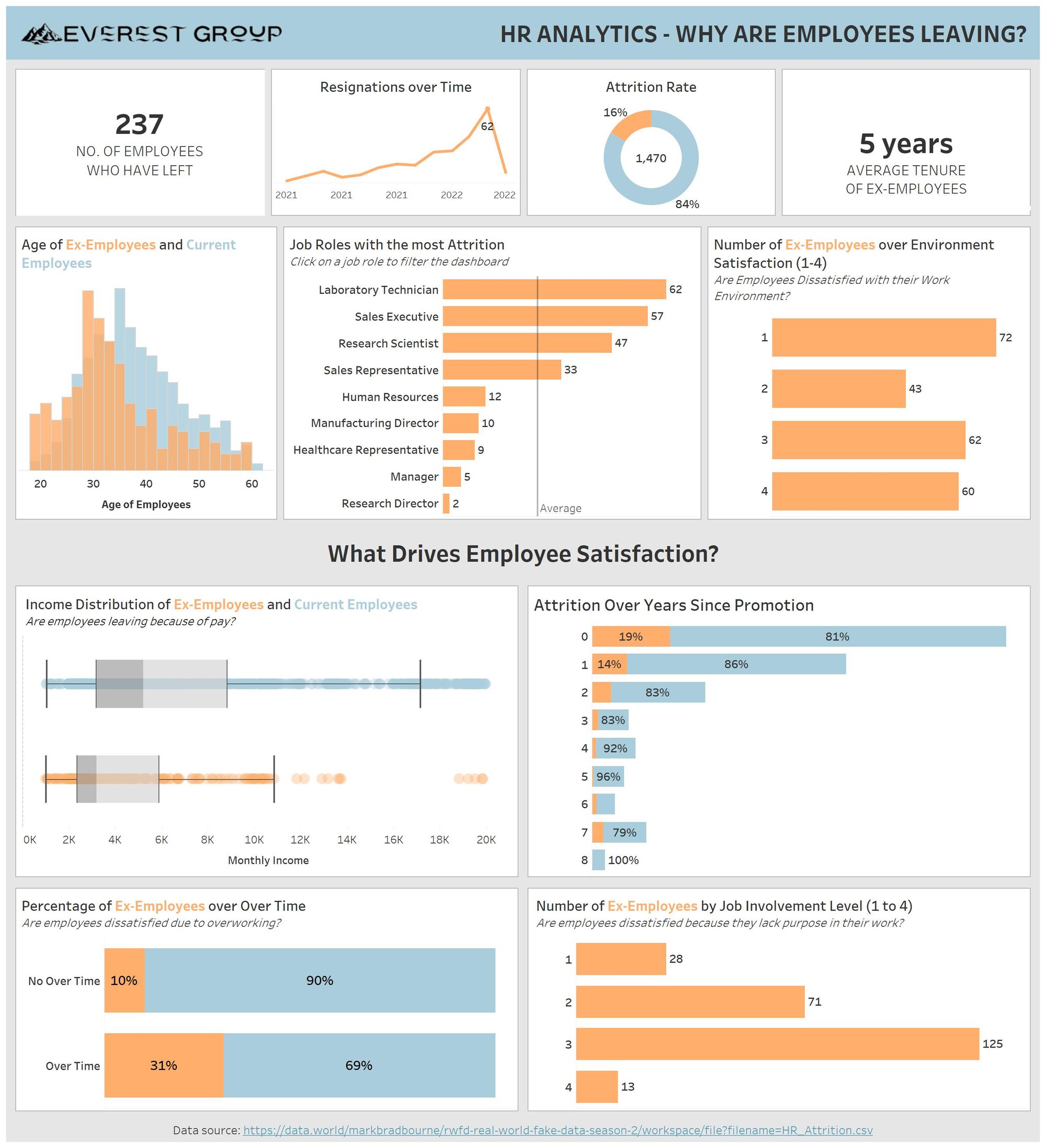
With my final dashboard, you can view the attritions and attrition rate, the trend over time, and average tenure of employees who left.
To see where the attritions are happening the most, you can compare the ages of current and ex-employees, resignations by job role, and job satisfaction of ex-employees.
Leading on from the job satisfaction, a user can begin to explore what actually drives employee dissatisfaction through different factors – income, promotions, over-time and job involvement. This can be filtered by job role so a HR manager can see where they need to focus their efforts to reduce attrition in that role. For example, lab tech employees who worked over-time have a much higher attrition rate than those that did not, suggesting staff shortages and overworking.
As a dashboard to conclude my training, I feel that I was able to incorporate a lot of the techniques and concepts we have learnt to provide some insightful analysis, such as filters, appropriate chart types and clean formatting.