As someone who rarely follows football, I figured it would be interesting to have an overview of how a country has historically performed at world cup tournaments. I also wanted to include the ability to compare to other countries, as some may have fun rivalries.
My final dashboard allows you to choose your main country, three other teams to compare it to, and the year range. The bump chart shows how each of these countries' rank compared to each other has changed over the years. For instance, Portugal ranked highest in 2006 so is placed above the other countries. The number labels show what the country's rank was overall in that tournament, i.e. over all participating countries.
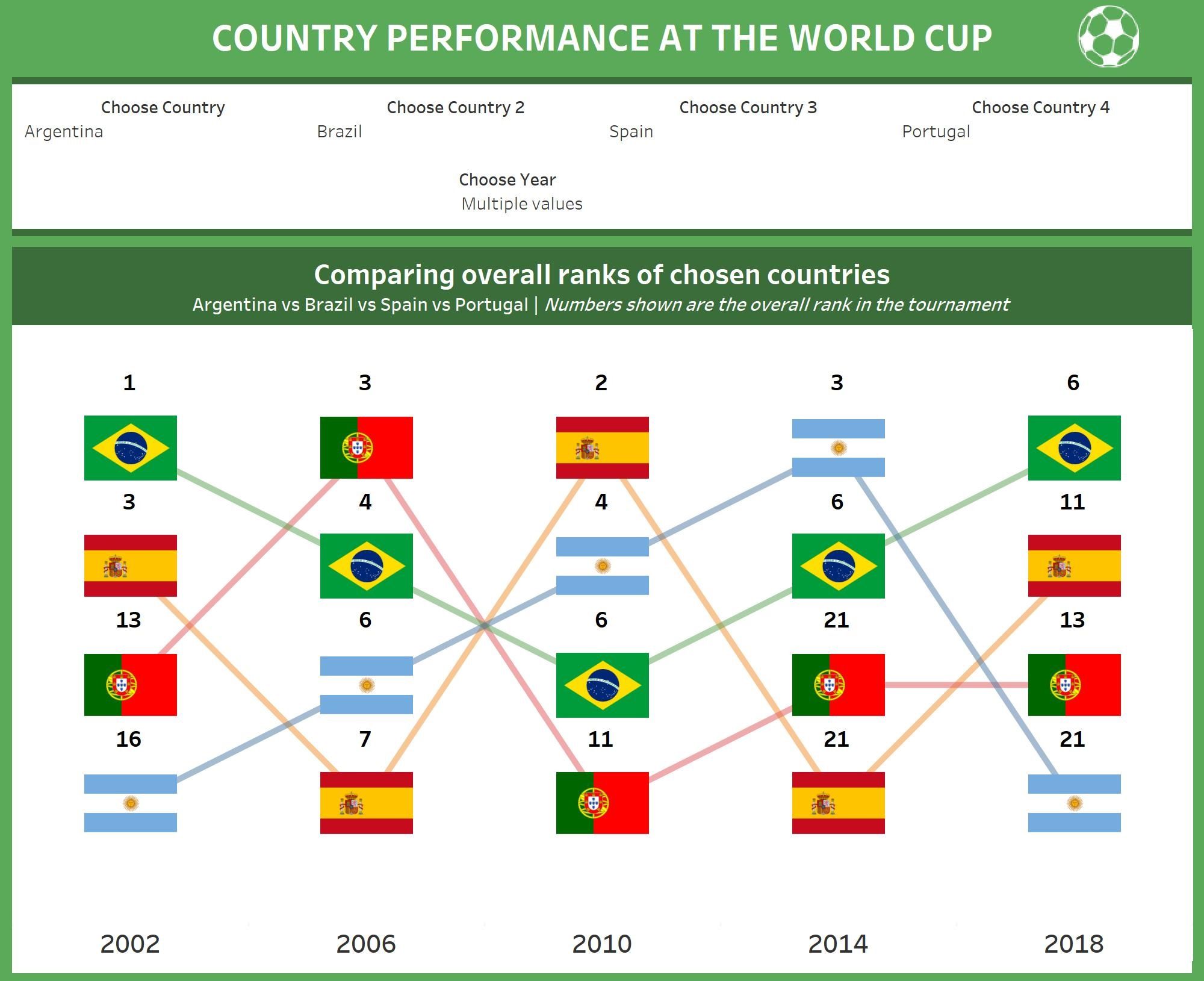
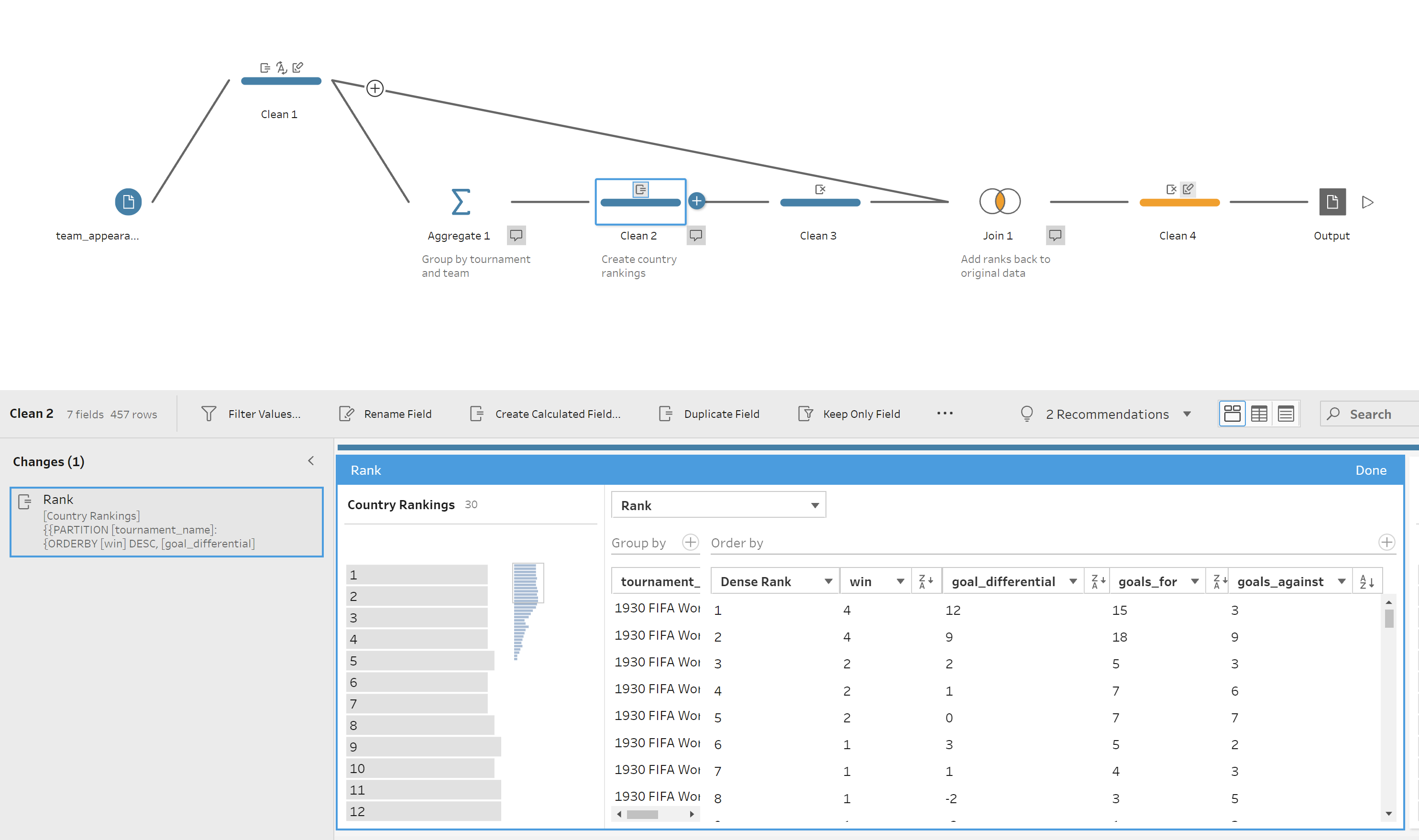
Final standings were only available in the data for countries who came 1st to 4th, so I had to create a rank myself. I used the rank calculation in Tableau Prep to order the countries first by number of matches won, then goals scored, goal difference and goals against. Even this wasn't enough to get a unique rank for every country in each year though, so with more time I would either find more data on the rankings, or research how the final standings are calculated officially.
I also had some country-specific information according to the first country selected. This includes an overview of the matches played by that team in the tournaments selected, and which country they have played against most often in the knockout stages.
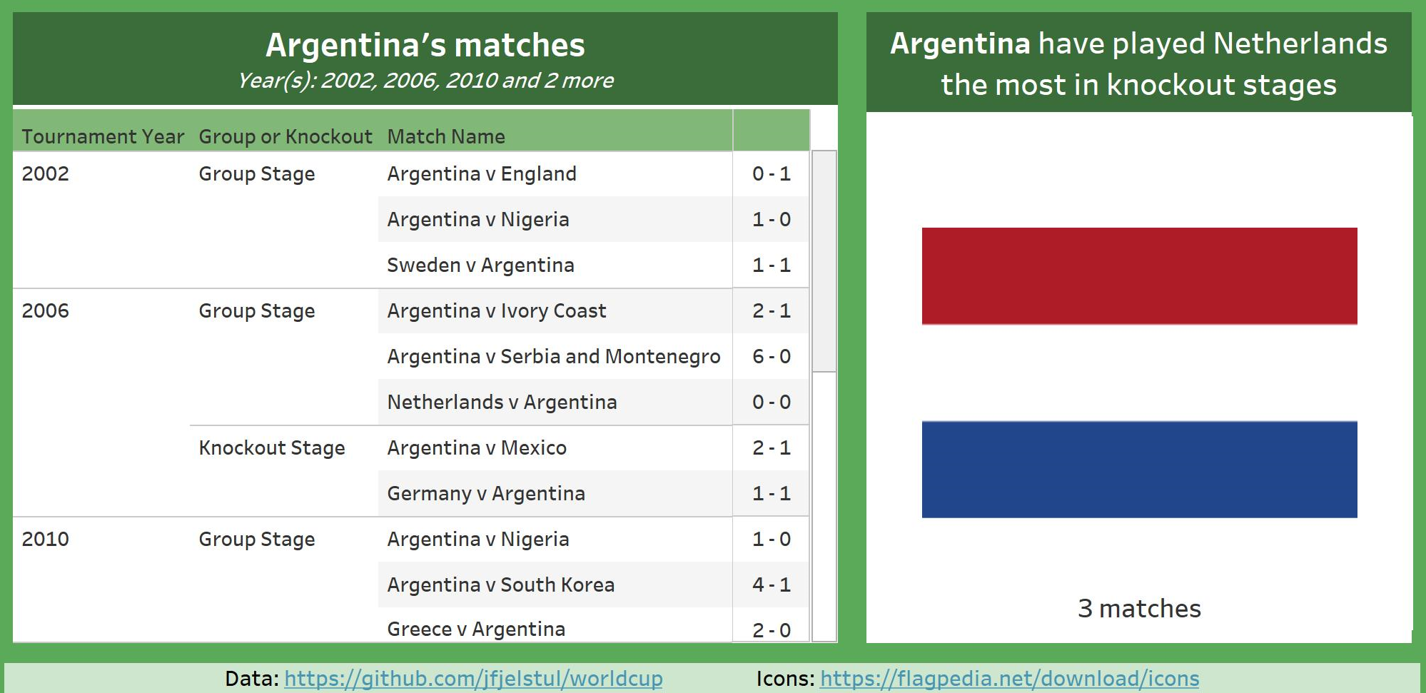
Given more time I would include more statistics such as match with highest number of goals scored, and figure out a more visual way of representing the table. It would also be better if I visualised the overall number of times the country has played against different countries rather than just having the flag image, because there were some ties where there was more than one country that a team had played against the most.