


I love donuts and donut charts. I have written about donut charts previously on the blog here, and now I present a guide to building a donut chart that no one asked for.

A donut chart is a dual axis chart, meaning that there are two elements of this chart. There is the standard pie chart and then the donut hole that rests in the center of the pie chart.
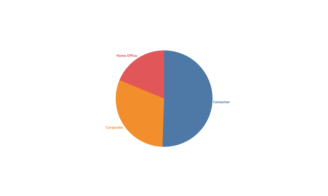
First, let’s review how to build a standard pie chart.
1. Select Pie from the drop down menu in the Marks card.

2. Drag your categorical field into the Color card. (Remember, it’s best if there are 2-4 elements in this pie chart.)
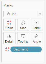
3. Then drag your measure into the Angle card.

4. Add labels of your choice and ta-da! You have a pie chart.
Now, let’s transform it into a donut chart.
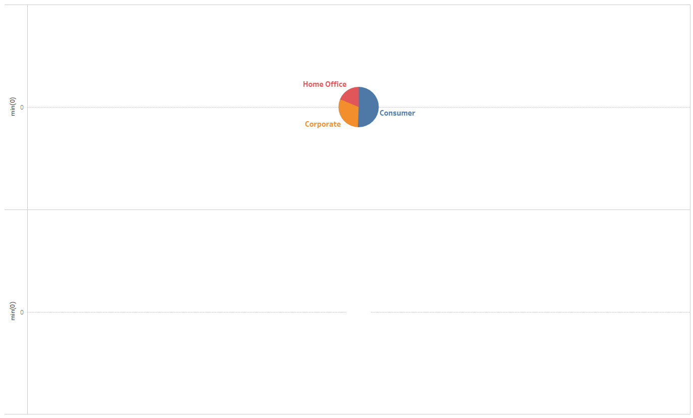
As mentioned earlier, a donut chart is a dual axis chart. There are currently no fields in the Columns or Rows shelf, but we need to create axes. Therefore, first we need to add dummy measures.
1. In the Rows shelf, type in MIN(0). This is a custom calculation that can create an axis.

2. Add another of the same custom calculation. You can do this by holding Ctrl and dragging the AGG(MIN(0)) field to the right or by typing MIN(0) again.


3. There are now two pie charts! Before you select Dual Axis, I recommend going into the second Marks card, removing the fields, changing the color to white, and decreasing the size.

Your canvas should look similar to this:
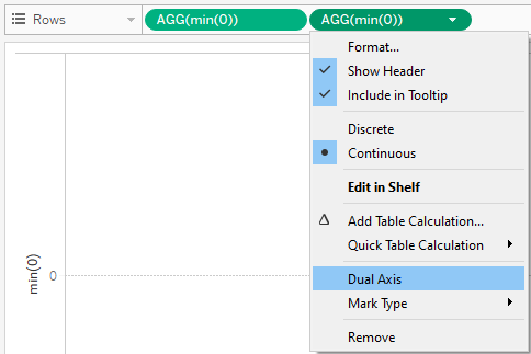
4. Now, right-click the second AGG(MIN(0)) field on the Rows shelf and select Dual Axis.
Your canvas should look similar to this:
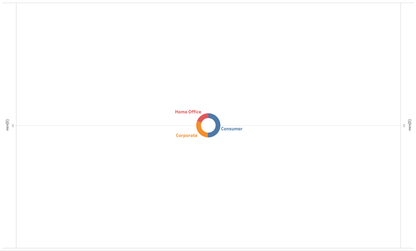
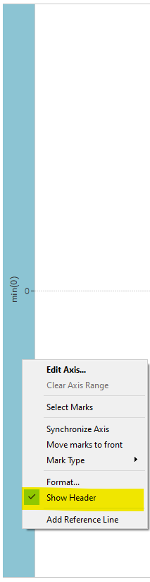
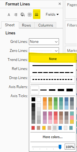
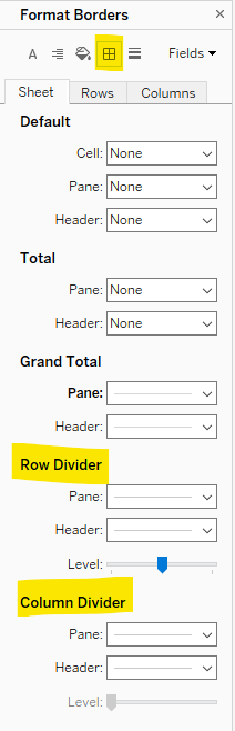
5. Before you enjoy your donut, format your visualization. Remove the headers, the zero line, the row dividers, and the column dividers. Adjust the sizing of the pie chart and donut hole to your liking and customize the donut chart as you would like.
6. Finally, enjoy your donut chart!
