


In this week’s Friday project, we were challenged to use our newly acquired knowledge of Alteryx to supplement our application viz with a new data set. My original data set looked at the Global Peace Index (GPI) and I wanted to supplement this with information on refugee inflows. I managed to find a data set that shows refugee inflows into the US.
My final alteryx workflow looked like this:
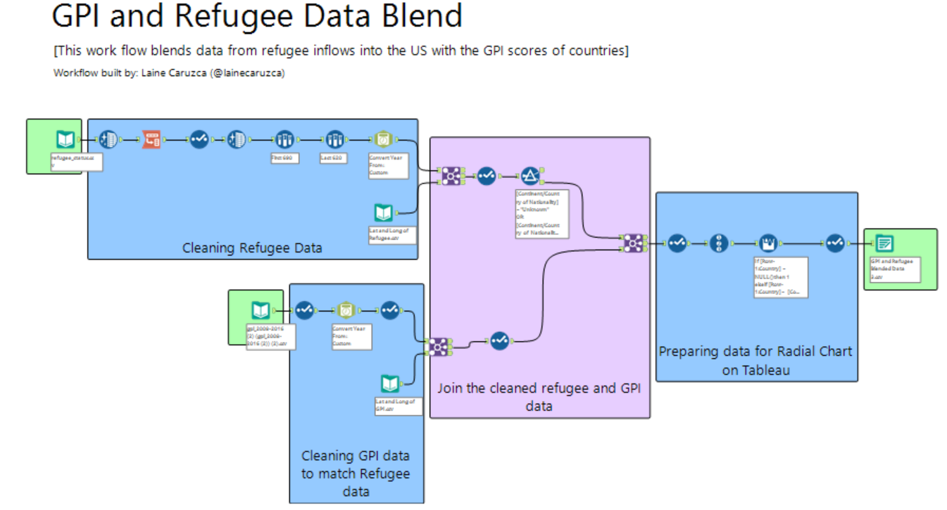
You can see that I prepared each dataset separately before joining them together.
Cleaning Refugee Data:
In this section, I mainly used the data cleansing, transpose, DateTime and sample tools to get rid of any punctuation in the numbers, select the relevant countries, change the format of the years to match the original data and to pivot the data set.
Cleaning GPI data:
In this section, I mostly used the DateTime tool to convert my dates into a format that would match the new refugee data.
Joining the data together
When I tried to join the two datasets together, I came across a problem. The data sets could not be joined using the country fields, as some country names had different formats and changing them manually would have taken far too long.
To get around this problem, I found each country’s longitude and latitude values using Tableau. To see how I did this, see my previous blog post here.
Once I got a common field (longitude and latitude values), I was then able to join the dataset together. In the end, I joined 4 datasets together instead of the proposed 2.
Preparing the data for Tableau
As part of my final viz, I wanted to create a radial chart on Tableau. However, in order to do this, I had to have a field that measured each country. So I prepared this using Alteryx.
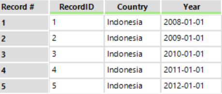
First, I created a record ID for each line. However, this wasn’t much use as each country appeared in several rows (one for each year), as you can see below.
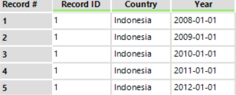
To get around this problem, I created a formula using the Multi-Row Formula tool, which allows me to apply the formula across multiple rows.
I used the following formula:
If [Row-1:Country] = NULL()then 1 elseif [Row-1:Country]= [Country] then [Row-1:New Field] else [Row-1:New Field] + 1 Endif
This formula essentially means that if the value in the row before the current one is the same, then return the same number. If not, then return the number of the current field +1. This enabled me to get a unique ID for each country listed, which could then be used to draw the rays of the radial chart.
The new field now looked like this:
The result:
Before
After
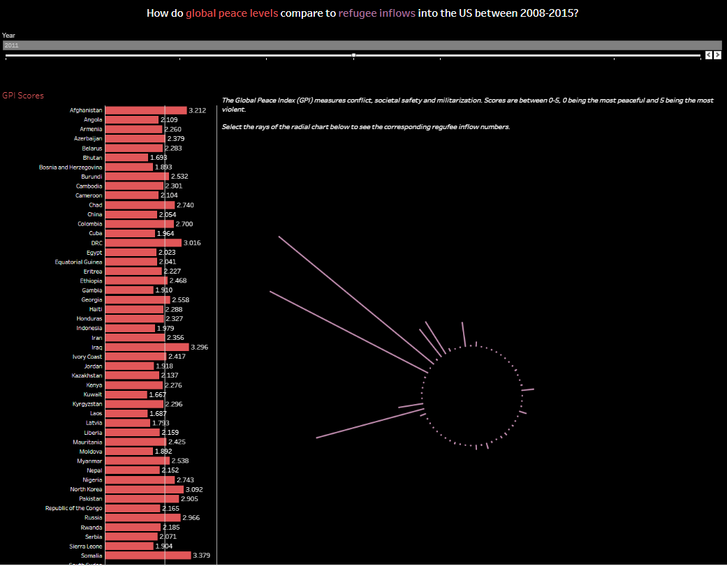
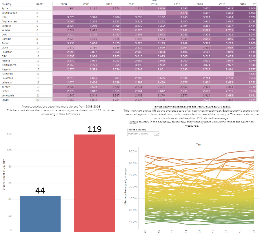
In the new chart, you can filter by year and see clearly which countries are producing the most refugee inflows into the US between 2008-2015. In the filter, you can also see the corresponding GPI scores for those countries and see how they relate to the average of that year. By doing this, you can see that the countries producing the highest refugee inflows into the US also have high GPI scores (meaning they are more violent). You can also see that the countries producing the highest refugee flows are mostly the same for each year.